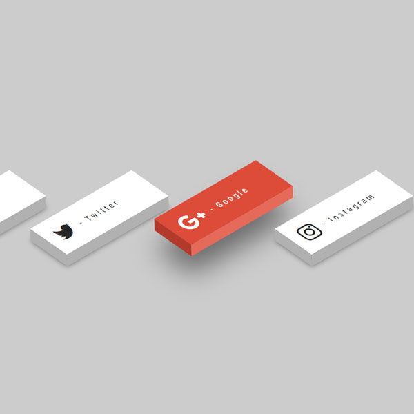
You can use this code to differentiate your website from other websites. In this code, there are social buttons that are displayed in three dimensions and diagonally. Each button has a gray theme along with its background, and by placing the mouse cursor on the button, it changes the color of that social network. For example, the Twitter button turns blue and the Google button turns red. In addition, the button in the hover mode moves slightly upwards.
HTML
<!-- This script got from www.devanswer.com -->
<link rel="stylesheet" href="https://cdnjs.cloudflare.com/ajax/libs/font-awesome/4.7.0/css/font-awesome.min.css">
<ul>
  <li>
    <a href="#">
      <i class="fa fa-facebook" aria-hidden="true"></i>
      <span> - Facebook</span>
    </a>
  </li>
  <li>
    <a href="#">
      <i class="fa fa-twitter" aria-hidden="true"></i>
      <span> - Twitter</span>
    </a>
  </li>
  <li>
    <a href="#">
      <i class="fa fa-google-plus" aria-hidden="true"></i>
      <span> - Google</span>
    </a>
  </li>
  <li>
    <a href="#">
      <i class="fa fa-instagram" aria-hidden="true"></i>
      <span> - Instagram</span>
    </a>
  </li>
</ul><div id="bcl"><a style="font-size:8pt;text-decoration:none;" href="http://www.devanswer.com">Developers Answer</a></div>
CSS
@import url('https://fonts.googleapis.com/css?family=Roboto+Condensed:300,400');
body {
  margin:0;
  padding:0;
  background:#ccc;
  font-family: 'Roboto Condensed', sans-serif;
}
ul {
  position:absolute;
  top:50%;
  left:50%;
  transform:translate(-50%, -50%);
  display:flex;
  margin:0;
  padding:0;
}
ul li {
  list-style:none;
  margin:0 5px;
}
ul li a .fa {
  font-size: 40px;
  color: #262626;
  line-height:80px;
  transition: .5s;
  padding-right: 14px;
}
ul li a span {
  padding:0;
  margin:0;
  position:absolute;
  top: 30px;
  color: #262626;
  letter-spacing: 4px;
  transition: .5s;
}
ul li a {
  text-decoration: none;
  display:absolute;
  display:block;
  width:210px;
  height:80px;
  background: #fff;
  text-align:left;
  padding-left: 20px;
  transform: rotate(-30deg) skew(25deg) translate(0,0);
  transition:.5s;
  box-shadow: -20px 20px 10px rgba(0,0,0,.5);
}
ul li a:before {
  content: '';
  position: absolute;
  top:10px;
  left:-20px;
  height:100%;
  width:20px;
  background: #b1b1b1;
  transform: .5s;
  transform: rotate(0deg) skewY(-45deg);
}
ul li a:after {
  content: '';
  position: absolute;
  bottom:-20px;
  left:-10px;
  height:20px;
  width:100%;
  background: #b1b1b1;
  transform: .5s;
  transform: rotate(0deg) skewX(-45deg);
}
ul li a:hover {
  transform: rotate(-30deg) skew(25deg) translate(20px,-15px);
  box-shadow: -50px 50px 50px rgba(0,0,0,.5);
}
ul li:hover .fa {
  color:#fff;
}
ul li:hover span {
  color:#fff;
}
ul li:hover:nth-child(1) a{
  background: #3b5998;
}
ul li:hover:nth-child(1) a:before{
  background: #365492;
}
ul li:hover:nth-child(1) a:after{
  background: #4a69ad;
}
ul li:hover:nth-child(2) a{
  background: #00aced;
}
ul li:hover:nth-child(2) a:before{
  background: #097aa5;
}
ul li:hover:nth-child(2) a:after{
  background: #53b9e0;
}
ul li:hover:nth-child(3) a{
  background: #dd4b39;
}
ul li:hover:nth-child(3) a:before{
  background: #b33a2b;
}
ul li:hover:nth-child(3) a:after{
  background: #e66a5a;
}
ul li:hover:nth-child(4) a{
  background: #e4405f;
}
ul li:hover:nth-child(4) a:before{
  background: #d81c3f;
}
ul li:hover:nth-child(4) a:after{
  background: #e46880;
}
@media (max-width: 960px){
  ul{
    display: block;
  }
  ul li {
    margin: 22px;
  }
}