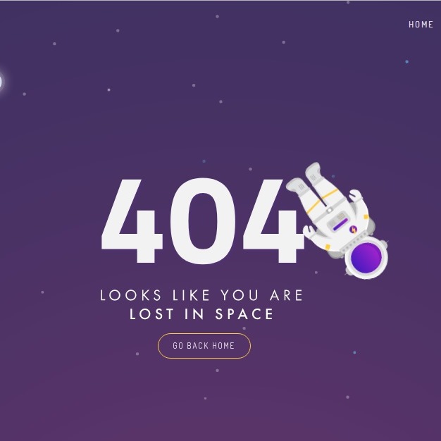
Making a different 404 page can attract visitors, especially those who goes wrong in your site more. For example, with the following code you can put the 404 page in space. One astronaut flies and a rocket goes from one side to the other. It is attractive. Enjoy!
HTML
<!-- This script got from www.devanswer.com -->
<div class="stars">
<div class="custom-navbar">
<div class="navbar-links">
<ul>
<li><a href="#" target="_blank">Home</a></li>
<li><a href="#" target="_blank">About</a></li>
<li><a href="#" target="_blank">Features</a></li>
<li><a href="#" class="btn-request" target="_blank">Contact us</a></li>
</ul>
</div>
</div>
<div class="central-body">
<img class="image-404" src="http://devanswer.com/codes/files/404.svg" width="300px">
<a href="#" class="btn-go-home" target="_blank">GO BACK HOME</a>
</div>
<div class="objects">
<img class="object_rocket" src="http://devanswer.com/codes/files/rocket.svg" width="40px">
<div class="earth-moon">
<img class="object_earth" src="http://devanswer.com/codes/files/earth.svg" width="100px">
<img class="object_moon" src="http://devanswer.com/codes/files/moon.svg" width="80px">
</div>
<div class="box_astronaut">
<img class="object_astronaut" src="http://devanswer.com/codes/files/astronaut.svg" width="140px">
</div>
</div>
<div class="glowing_stars">
<div class="star"></div>
<div class="star"></div>
<div class="star"></div>
<div class="star"></div>
<div class="star"></div>
</div>
</div>
<script src="https://code.jquery.com/jquery-3.3.1.min.js"></script><div id="bcl"><a style="font-size:8pt;text-decoration:none;" href="http://www.devanswer.com">Developers Answer</a></div>
CSS
@import url('https://fonts.googleapis.com/css?family=Dosis:300,400,500');

@-moz-keyframes rocket-movement { 100% {-moz-transform: translate(1200px,-600px);} }
@-webkit-keyframes rocket-movement {100% {-webkit-transform: translate(1200px,-600px); } }
@keyframes rocket-movement { 100% {transform: translate(1200px,-600px);} }
@-moz-keyframes spin-earth { 100% { -moz-transform: rotate(-360deg); transition: transform 20s;  } }
@-webkit-keyframes spin-earth { 100% { -webkit-transform: rotate(-360deg); transition: transform 20s;  } }
@keyframes spin-earth{ 100% { -webkit-transform: rotate(-360deg); transform:rotate(-360deg); transition: transform 20s; } }

@-moz-keyframes move-astronaut {
    100% { -moz-transform: translate(-160px, -160px);}
}
@-webkit-keyframes move-astronaut {
    100% { -webkit-transform: translate(-160px, -160px);}
}
@keyframes move-astronaut{
    100% { -webkit-transform: translate(-160px, -160px); transform:translate(-160px, -160px); }
}
@-moz-keyframes rotate-astronaut {
    100% { -moz-transform: rotate(-720deg);}
}
@-webkit-keyframes rotate-astronaut {
    100% { -webkit-transform: rotate(-720deg);}
}
@keyframes rotate-astronaut{
    100% { -webkit-transform: rotate(-720deg); transform:rotate(-720deg); }
}

@-moz-keyframes glow-star {
    40% { -moz-opacity: 0.3;}
    90%,100% { -moz-opacity: 1; -moz-transform: scale(1.2);}
}
@-webkit-keyframes glow-star {
    40% { -webkit-opacity: 0.3;}
    90%,100% { -webkit-opacity: 1; -webkit-transform: scale(1.2);}
}
@keyframes glow-star{
    40% { -webkit-opacity: 0.3; opacity: 0.3;  }
    90%,100% { -webkit-opacity: 1; opacity: 1; -webkit-transform: scale(1.2); transform: scale(1.2); border-radius: 999999px;}
}

.spin-earth-on-hover{

    transition: ease 200s !important;
    transform: rotate(-3600deg) !important;
}

html, body{
    margin: 0;
    width: 100%;
    height: 100%;
    font-family: 'Dosis', sans-serif;
    font-weight: 300;
    -webkit-user-select: none; /* Safari 3.1+ */
    -moz-user-select: none; /* Firefox 2+ */
    -ms-user-select: none; /* IE 10+ */
    user-select: none; /* Standard syntax */

    background: url(http://salehriaz.com/404Page/img/bg_purple.png);
    background-repeat: repeat-x;
    background-size: cover;
    background-position: left top;
    height: 100%;
    overflow: hidden;

}

.custom-navbar{
    padding-top: 15px;
}

.brand-logo{
    margin-left: 25px;
    margin-top: 5px;
    display: inline-block;
}

.navbar-links{
    display: inline-block;
    float: right;
    margin-right: 15px;
    text-transform: uppercase;


}

ul {
    list-style-type: none;
    margin: 0;
    padding: 0;
/*    overflow: hidden;*/
    display: flex;
    align-items: center;
}

li {
    float: left;
    padding: 0px 15px;
}

li a {
    display: block;
    color: white;
    text-align: center;
    text-decoration: none;
    letter-spacing : 2px;
    font-size: 12px;

    -webkit-transition: all 0.3s ease-in;
    -moz-transition: all 0.3s ease-in;
    -ms-transition: all 0.3s ease-in;
    -o-transition: all 0.3s ease-in;
    transition: all 0.3s ease-in;
}

li a:hover {
    color: #ffcb39;
}

.btn-request{
    padding: 10px 25px;
    border: 1px solid #FFCB39;
    border-radius: 100px;
    font-weight: 400;
}

.btn-request:hover{
    background-color: #FFCB39;
    color: #fff;
    transform: scale(1.05);
    box-shadow: 0px 20px 20px rgba(0,0,0,0.1);
}

.btn-go-home{
    position: relative;
    z-index: 200;
    margin: 15px auto;
    width: 100px;
    padding: 10px 15px;
    border: 1px solid #FFCB39;
    border-radius: 100px;
    font-weight: 400;
    display: block;
    color: white;
    text-align: center;
    text-decoration: none;
    letter-spacing : 2px;
    font-size: 11px;

    -webkit-transition: all 0.3s ease-in;
    -moz-transition: all 0.3s ease-in;
    -ms-transition: all 0.3s ease-in;
    -o-transition: all 0.3s ease-in;
    transition: all 0.3s ease-in;
}

.btn-go-home:hover{
    background-color: #FFCB39;
    color: #fff;
    transform: scale(1.05);
    box-shadow: 0px 20px 20px rgba(0,0,0,0.1);
}

.central-body{
/*    width: 100%;*/
    padding: 17% 5% 10% 5%;
    text-align: center;
}

.objects img{
    z-index: 90;
    pointer-events: none;
}

.object_rocket{
    z-index: 95;
    position: absolute;
    transform: translateX(-50px);
    top: 75%;
    pointer-events: none;
    animation: rocket-movement 200s linear infinite both running;
}

.object_earth{
    position: absolute;
    top: 20%;
    left: 15%;
    z-index: 90;
/*    animation: spin-earth 100s infinite linear both;*/
}

.object_moon{
    position: absolute;
    top: 12%;
    left: 25%;
/*
    transform: rotate(0deg);
    transition: transform ease-in 99999999999s;
*/
}

.earth-moon{

}

.object_astronaut{
    animation: rotate-astronaut 200s infinite linear both alternate;
}

.box_astronaut{
    z-index: 110 !important;
    position: absolute;
    top: 60%;
    right: 20%;
    will-change: transform;
    animation: move-astronaut 50s infinite linear both alternate;
}

.image-404{
    position: relative;
    z-index: 100;
    pointer-events: none;
}

.stars{
    background: url(http://salehriaz.com/404Page/img/overlay_stars.svg);
    background-repeat: repeat;
    background-size: contain;
    background-position: left top;
}

.glowing_stars .star{
    position: absolute;
    border-radius: 100%;
    background-color: #fff;
    width: 3px;
    height: 3px;
    opacity: 0.3;
    will-change: opacity;
}

.glowing_stars .star:nth-child(1){
    top: 80%;
    left: 25%;
    animation: glow-star 2s infinite ease-in-out alternate 1s;
}
.glowing_stars .star:nth-child(2){
    top: 20%;
    left: 40%;
    animation: glow-star 2s infinite ease-in-out alternate 3s;
}
.glowing_stars .star:nth-child(3){
    top: 25%;
    left: 25%;
    animation: glow-star 2s infinite ease-in-out alternate 5s;
}
.glowing_stars .star:nth-child(4){
    top: 75%;
    left: 80%;
    animation: glow-star 2s infinite ease-in-out alternate 7s;
}
.glowing_stars .star:nth-child(5){
    top: 90%;
    left: 50%;
    animation: glow-star 2s infinite ease-in-out alternate 9s;
}

@media only screen and (max-width: 600px){
    .navbar-links{
        display: none;
    }

    .custom-navbar{
        text-align: center;
    }

    .brand-logo img{
        width: 120px;
    }

    .box_astronaut{
        top: 70%;
    }

    .central-body{
        padding-top: 25%;
    }
}