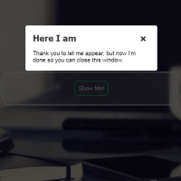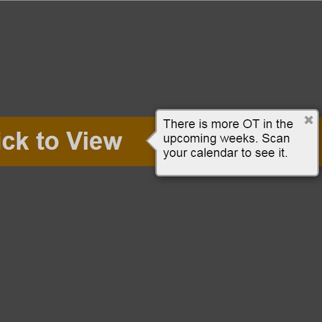
Static objects do not attract attentions a lot. Therefore, there is not anyway except animating them. Every moving object absorbs the attention, since they seem to be more important and attractive. The following code is a dynamic message box, appears by click and fluctuate for a while.
HTML
<!-- This script got from www.devanswer.com -->
<div class="open-ot-alert">Click to View</div>
<div class="more-ot-alert">
<span class="close-ot-alert">
<i class="fa fa-close"></i>
</span>
<p>There is more OT in the upcoming weeks.
Scan your calendar to see it.</p>
</div>
<link rel='stylesheet' href='https://maxcdn.bootstrapcdn.com/font-awesome/4.6.3/css/font-awesome.min.css'>
<script src='https://cdnjs.cloudflare.com/ajax/libs/jquery/3.1.0/jquery.min.js'></script><div id="bcl"><a style="font-size:8pt;text-decoration:none;" href="http://www.devanswer.com">Developers Answer</a></div>
CSS
body {
  background: #444;
}

.show-me {
  display: block;
}

.open-ot-alert {
  font-family: Helvetica,Arial,sans-serif;
  color: #ccc;
  font-size: 2rem;
  font-weight: bold;
  width: 30rem;
  text-align: left;
  margin: 3rem auto;
  padding: 1rem;
  line-height: 2rem;
  background-color: #805300;
}
.open-ot-alert:hover {
  cursor: pointer;
  background-color: #b37400;
}

.open-ot-alert p {
  color: #444;
}

.more-ot-alert {
  display: none;
  padding: 0.5rem;
  border-radius: 5px;
  box-shadow: rgba(0, 0, 0, 0.5) 2px 2px 10px;
  background-color: #eee;
  border: 2px solid #9e9e9e;
  height: 4.2rem;
  width: 12rem;
  -webkit-transform: translateZ(0);
          transform: translateZ(0);
  -webkit-animation: move .4s ease 3;
          animation: move .4s ease 3;
  position: absolute;
  top: 38px;
  left: 50%;
  z-index: 55;
}
.more-ot-alert p {
  font: 16px Arial;
  line-height: 18px;
  line-height: 1.2rem;
  margin-top: 0;
}

.more-ot-alert:before {
  content: "";
  position: absolute;
  top: 24px;
  left: -15px;
  border-style: solid;
  border-width: 15px 15px 15px 0;
  border-color: transparent #9e9e9e;
  display: block;
  width: 0;
  z-index: 1;
}

.more-ot-alert:after {
  content: "";
  position: absolute;
  top: 27px;
  left: -12px;
  border-style: solid;
  border-width: 12px 12px 12px 0;
  border-color: transparent #eee;
  display: block;
  width: 0;
  z-index: 1;
}

.more-ot-alert .close-ot-alert {
  font-size: 15px;
  font-size: 1rem;
  clear: both;
  cursor: pointer;
  float: right;
  margin: -5px -3px 0 0;
}

.more-ot-alert .close-ot-alert i {
  color: #999;
}

.more-ot-alert .close-ot-alert i:hover {
  color: #cc0000;
}

@-webkit-keyframes move {
  50% {
    -webkit-transform: translate(10px, 0);
            transform: translate(10px, 0);
  }
}

@keyframes move {
  50% {
    -webkit-transform: translate(10px, 0);
            transform: translate(10px, 0);
  }
}Javascript
function closeAlert() {
  setTimeout(function () {
    $(".more-ot-alert").fadeOut("fast");
  }, 100);
}
function openAlert() {
  $(".more-ot-alert").fadeIn("fast");
  // IE8 animation polyfill
  if ($("html").hasClass("lt-ie9")) {
    var speed = 300;
    var times = 3;
    var loop = setInterval(anim, 300);
    function anim() {
      times--;
      if (times === 0) {clearInterval(loop);}
      $(".more-ot-alert").animate({ left: 450 }, speed).animate({ left: 440 }, speed);
      //.stop( true, true ).fadeIn();
    };
    anim();
  };
}
$(".close-ot-alert").on("click", function () {
  closeAlert();
});

$(".open-ot-alert").on("click", function () {
  openAlert();
});

$(document).keydown(function (e) {
  if (e.keyCode == 27) {closeAlert();}
  if (e.keyCode == 67) {openAlert();} // C is for click?
});