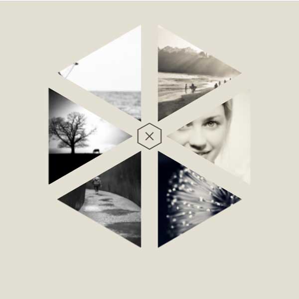
You can use different styles for the website menu to make your website different and more beautiful. In this code, the menu is not visible at the top of the page, but only a specific toggle button is clicked to open the menu. This menu looks like a hexagon. Each item has a triangular shape and a photo is placed in the background of that item. By placing the mouse cursor on that item, the desired title is displayed.
HTML
<!-- This script got from www.devanswer.com -->
<link href='https://fonts.googleapis.com/css?family=Open+Sans:400,800' rel='stylesheet' type='text/css'>
<nav id="hexNav">
  <div id="menuBtn">
    <svg viewbox="0 0 100 100">
      <polygon points="50 2 7 26 7 74 50 98 93 74 93 26" fill="transparent" stroke-width="4" stroke="#585247" stroke-dasharray="0,0,300"/>
    </svg>
    <span></span>
  </div>
  <ul id="hex">
    <li class="tr"><div class="clip"><a href="#" class="content">
      <img src="http://www.devanswer.com/img/hexonmenu-1.jpg" alt="" />
      <h2 class="title">Title</h2><p>Catch phrase</p>
    </a></div></li>
    <li class="tr"><div class="clip"><a href="#" class="content">
      <img src="http://www.devanswer.com/img/hexonmenu-2.jpg" alt="" />
      <h2 class="title">Title</h2><p>Catch phrase</p>
    </a></div></li>
    <li class="tr"><div class="clip"><a href="#" class="content">
      <img src="http://www.devanswer.com/img/hexonmenu-3.jpg" alt="" />
      <h2 class="title">Title</h2><p>Catch phrase</p>
    </a></div></li>
    <li class="tr"><div class="clip"><a href="#" class="content">
      <img src="http://www.devanswer.com/img/hexonmenu-4.jpg" alt="" />
      <h2 class="title">Title</h2><p>Catch phrase</p>
    </a></div></li>
    <li class="tr"><div class="clip"><a href="#" class="content">
      <img src="http://www.devanswer.com/img/hexonmenu-5.jpg" alt="" />
      <h2 class="title">Title</h2><p>Catch phrase</p>
    </a></div></li>
    <li class="tr"><div class="clip"><a href="#" class="content">
      <img src="http://www.devanswer.com/img/hexonmenu-6.jpg" alt="" />
      <h2 class="title">Title</h2><p>Catch phrase</p>
    </a></div></li>
  </ul>
</nav><div id="bcl"><a style="font-size:8pt;text-decoration:none;" href="http://www.devanswer.com">Developers Answer</a></div>
CSS
* {
  margin: 0;
  padding: 0;
}
html, body {
  height: 100%;
}
body {
  font-family: 'Open Sans', sans-serif;
  background: #E3DFD2;
}
ul {
  list-style-type: none;
}
a, a:hover, a:focus, a:visited {
  text-decoration: none;
}
nav {
  position: relative;
  width: 70vmin;
  height: 70vmin;
  min-width: 500px;
  min-height: 500px;
  margin: 0 auto;
  overflow: hidden;
}
/** MENU BUTTON ******************************************/
#menuBtn {
  position: absolute;
  top: 45%;
  left: 45%;
  width: 10%;
  height: 10%;
  z-index: 2;
  will-change: transform;
}
#menuBtn svg {
  display: block;
}
#menuBtn svg polygon:hover {
  -webkit-animation: hexHover 0.7s;
  animation: hexHover 0.7s;
  cursor: pointer;
}
#menuBtn span {
  position: absolute;
  top: 50%;
  left: 50%;
  width: 20px;
  height: 2px;
  padding: 8px 0;
  background-clip: content-box;
  background-color: #585247;
  transform: translate(-50%, -50%);
  transition: background-color 0.3s;
  pointer-events: none;
}
#menuBtn span:before, #menuBtn span:after {
  position: absolute;
  background-color: #585247;
  content: '';
  width: 20px;
  height: 2px;
  transition: transform 0.3s;
}
#menuBtn span:before {
  top: 0;
}
#menuBtn span:after {
  bottom: 0px;
}
@-webkit-keyframes hexHover {
  0% {
    stroke-dasharray: 0,0,300;
  }
  10% {
    stroke-dasharray: 0,20,300;
  }
  100% {
    stroke-dasharray: 300,20,300;
  }
}
@keyframes hexHover {
  0% {
    stroke-dasharray: 0,0,300;
  }
  10% {
    stroke-dasharray: 0,20,300;
  }
  100% {
    stroke-dasharray: 300,20,300;
  }
}
/** MENU ITEMS *******************************************/
#hex {
  position: absolute;
  top: 0;
  left: 0;
  width: 100%;
  height: 100%;
  transform: scale(0.1) translatez(0);
  transition: transform 0.05s 0.3s;
}
.tr {
  position: absolute;
  left: 50%;
  bottom: 50%;
  width: 34.6%;
  height: 40%;
  transform-origin: 0 100%;
  overflow: hidden;
  transform: skewY(-30deg);
  opacity: 0;
}
.tr:nth-child(1) {
  transform: rotate(0deg) skewY(-30deg);
  transition: opacity 0.3s, transform 0.3s;
}
.tr:nth-child(1) .clip {
  transform: skewY(30deg) rotate(30deg);
}
.tr:nth-child(1) .content {
  transform: rotate(-30deg);
  transform-origin: 0 0;
  padding-left: 15%;
  perspective-origin: 30% 70%;
}
.active .tr:nth-child(1) {
  transform: rotate(0deg) skewY(-30deg) translate(10%, -10%);
  transition: opacity 0.3s 0.05s, transform 0.3s 0.05s cubic-bezier(0, 2.3, 0.8, 1);
}
.tr:nth-child(2) {
  transform: rotate(60deg) skewY(-30deg);
  transition: opacity 0.3s, transform 0.3s;
}
.tr:nth-child(2) .clip {
  transform: skewY(30deg) rotate(30deg);
}
.tr:nth-child(2) .content {
  transform: rotate(-90deg);
  top: -8%;
  left: 6.67%;
  padding-left: 30%;
  perspective-origin: 30% 50%;
}
.active .tr:nth-child(2) {
  transform: rotate(60deg) skewY(-30deg) translate(10%, -10%);
  transition: opacity 0.3s 0.08s, transform 0.3s 0.08s cubic-bezier(0, 2.3, 0.8, 1);
}
.tr:nth-child(3) {
  transform: rotate(120deg) skewY(-30deg);
  transition: opacity 0.3s, transform 0.3s;
}
.tr:nth-child(3) .clip {
  transform: skewY(30deg) rotate(30deg);
}
.tr:nth-child(3) .content {
  transform: rotate(-150deg);
  transform-origin: 42.3% 36.5%;
  padding-left: 10%;
  perspective-origin: 30% 30%;
}
.active .tr:nth-child(3) {
  transform: rotate(120deg) skewY(-30deg) translate(10%, -10%);
  transition: opacity 0.3s 0.11s, transform 0.3s 0.11s cubic-bezier(0, 2.3, 0.8, 1);
}
.tr:nth-child(4) {
  transform: rotate(180deg) skewY(-30deg);
  transition: opacity 0.3s, transform 0.3s;
}
.tr:nth-child(4) .clip {
  transform: skewY(30deg) rotate(30deg);
}
.tr:nth-child(4) .content {
  transform: rotate(-210deg);
  transform-origin: 65.4% 38.4%;
  padding-left: 30%;
  perspective-origin: 70% 30%;
}
.active .tr:nth-child(4) {
  transform: rotate(180deg) skewY(-30deg) translate(10%, -10%);
  transition: opacity 0.3s 0.14s, transform 0.3s 0.14s cubic-bezier(0, 2.3, 0.8, 1);
}
.tr:nth-child(5) {
  transform: rotate(240deg) skewY(-30deg);
  transition: opacity 0.3s, transform 0.3s;
}
.tr:nth-child(5) .clip {
  transform: skewY(30deg) rotate(30deg);
}
.tr:nth-child(5) .content {
  transform: rotate(-270deg);
  top: -8%;
  left: 6.67%;
  padding-left: 15%;
  perspective-origin: 70% 50%;
}
.active .tr:nth-child(5) {
  transform: rotate(240deg) skewY(-30deg) translate(10%, -10%);
  transition: opacity 0.3s 0.17s, transform 0.3s 0.17s cubic-bezier(0, 2.3, 0.8, 1);
}
.tr:nth-child(6) {
  transform: rotate(300deg) skewY(-30deg);
  transition: opacity 0.3s, transform 0.3s;
}
.tr:nth-child(6) .clip {
  transform: skewY(30deg) rotate(30deg);
}
.tr:nth-child(6) .content {
  transform: rotate(-330deg);
  transform-origin: 106.7% 25.2%;
  padding-left: 30%;
  perspective-origin: 70% 70%;
}
.active .tr:nth-child(6) {
  transform: rotate(300deg) skewY(-30deg) translate(10%, -10%);
  transition: opacity 0.3s 0.2s, transform 0.3s 0.2s cubic-bezier(0, 2.3, 0.8, 1);
}
.tr:nth-child(7) {
  transform: rotate(360deg) skewY(-30deg);
  transition: opacity 0.3s, transform 0.3s;
}
.tr:nth-child(7) .clip {
  transform: skewY(30deg) rotate(30deg);
}
.tr:nth-child(7) .content {
  transform: rotate(-390deg);
}
.active .tr:nth-child(7) {
  transform: rotate(360deg) skewY(-30deg) translate(10%, -10%);
  transition: opacity 0.3s 0.23s, transform 0.3s 0.23s cubic-bezier(0, 2.3, 0.8, 1);
}
.clip {
  position: absolute;
  top: 0;
  left: 0;
  width: 116%;
  height: 86.66%;
  overflow: hidden;
  transform-origin: 0 0;
}
.content {
  position: absolute;
  width: 86.6%;
  height: 116%;
  top: 0;
  left: 0;
  box-sizing: border-box;
  font-size: 2vmin;
  perspective: 500px;
  background: #000;
}
.content img {
  position: absolute;
  top: 0;
  left: -50%;
  right: -50%;
  margin: auto;
  height: 100%;
  z-index: -1;
  transition: opacity 0.3s;
  pointer-events: none;
}
.content h2, .content p {
  position: absolute;
  width: 60%;
  line-height: 1em;
  color: #fff;
  opacity: 0;
  transform: translateZ(-50px);
}
.content h2 {
  bottom: 50%;
  text-transform: uppercase;
  font-weight: 900;
  font-size: 2em;
  transition: transform 0.3s cubic-bezier(0, 2.3, 0.8, 1), opacity 0.3s;
}
.content p {
  position: absolute;
  top: 50%;
  font-size: 1em;
  transition: transform 0.3s 0.075s cubic-bezier(0, 2.3, 0.8, 1), opacity 0.3s 0.075s;
}
.content:hover h2, .content:hover p {
  opacity: 1;
  transform: translatez(0);
}
.content:hover img {
  opacity: 0.4;
}
.active #menuBtn:hover svg polygon {
  -webkit-animation: none;
  animation: none;
}
.active #menuBtn span {
  background-color: transparent;
}
.active #menuBtn span:before {
  transform: translatey(8px) rotate(45deg);
}
.active #menuBtn span:after {
  transform: translatey(-8px) rotate(-45deg);
}
.active #hex {
  transform: scale(0.9) translatez(0);
  transition: none;
  will-change: transform;
}
.active .tr {
  opacity: 1;
  will-change: transform;
}Javascript
var hexNav = document.getElementById('hexNav');
document.getElementById('menuBtn').onclick = function() {
  var className = ' ' + hexNav.className + ' ';
  if ( ~className.indexOf(' active ') ) {
    hexNav.className = className.replace(' active ', ' ');
  } else {
    hexNav.className += ' active';
  }
}