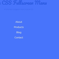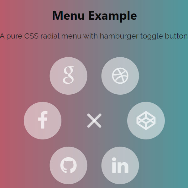
To make your website more beautiful, you should use different codes than usual. One of these codes is circular menus. Most menus on websites are horizontal or vertical, but the circular menu is rarely seen anywhere. This menu opens with the click of a hamburger button. Menu items are also circular and all have icons instead of titles. Item icons are all white.
HTML
<!-- This script got from www.devanswer.com -->
<link rel='stylesheet' href='https://maxcdn.bootstrapcdn.com/font-awesome/4.3.0/css/font-awesome.min.css'>
<header class="ScriptHeader">
    <div class="rt-container">
        <div class="col-rt-12">
            <div class="rt-heading">
                <h1>Pure CSS Radial Menu Example</h1>
                <p>A pure CSS radial menu with hamburger toggle button.</p>
            </div>
        </div>
    </div>
</header>
<section>
    <div class="rt-container">
        <div class="col-rt-12">
            <div class="Scriptcontent">
                <div class="menu-container">
                    <nav class='menu'>
                        <input checked='checked' class='menu-toggler' id='menu-toggler' type='checkbox'>
                        <label for='menu-toggler'></label>
                        <ul>
                            <li class='menu-item'>
                                <a class='fa fa-facebook' href='http://www.devanswer.com/' target='_blank'></a>
                            </li>
                            <li class='menu-item'>
                                <a class='fa fa-google' href='http://www.devanswer.com/' target='_blank'></a>
                            </li>
                            <li class='menu-item'>
                                <a class='fa fa-dribbble' href='http://www.devanswer.com/' target='_blank'></a>
                            </li>
                            <li class='menu-item'>
                                <a class='fa fa-codepen' href='http://www.devanswer.com/' target='_blank'></a>
                            </li>
                            <li class='menu-item'>
                                <a class='fa fa-linkedin' href='http://www.devanswer.com/' target='_blank'></a>
                            </li>
                            <li class='menu-item'>
                                <a class='fa fa-github' href='http://www.devanswer.com/' target='_blank'></a>
                            </li>
                        </ul>
                    </nav>
                </div>
            </div>
        </div>
    </div>
</section><div id="bcl"><a style="font-size:8pt;text-decoration:none;" href="http://www.devanswer.com">Developers Answer</a></div>
CSS
@import url('https://fonts.googleapis.com/css?family=Raleway:400,500,600,700,800,900');
html {
  box-sizing: border-box;
}
*, *:before, *:after {
  box-sizing: inherit;
}
article, header, section, aside, details, figcaption, figure, footer, header, hgroup, main, nav, section, summary {
    display: block;
}
body {
    color: #222;
    font-size: 100%;
    line-height: 24px;
    margin: 0;
	padding:0;
	font-family: "Raleway",sans-serif;
}
a{
	font-family: "Raleway",sans-serif;
	text-decoration: none;
	outline: none;
}
a:hover, a:focus {
	color: #373e18;
}
section {
    float: left;
    width: 100%;
	padding-bottom:3em;
}
h2 {
    color: #1a0e0e;
    font-size: 26px;
    font-weight: 700;
    margin: 0;
    line-height: normal;
	text-transform:uppercase;
}
h2 span {
    display: block;
    padding: 0;
    font-size: 18px;
    opacity: 0.7;
    margin-top: 5px;
	text-transform:uppercase;
}
#float-right{
	float:right;
}
/* ******************************************************
	Script Top
*********************************************************/
.ScriptTop {
    background: #fff none repeat scroll 0 0;
    float: left;
    font-size: 0.69em;
    font-weight: 600;
    line-height: 2.2;
    padding: 12px 0;
    text-transform: uppercase;
    width: 100%;
}
/* To Navigation Style 1*/
.ScriptTop ul {
    margin: 24px 0;
    padding: 0;
    text-align: left;
}
.ScriptTop li{
	list-style:none;
	display:inline-block;
}
.ScriptTop li a {
    background: #6a4aed none repeat scroll 0 0;
    color: #fff;
    display: inline-block;
    font-size: 14px;
    font-weight: 600;
    padding: 5px 18px;
    text-decoration: none;
    text-transform: capitalize;
}
.ScriptTop li a:hover{
	background:#000;
	color:#fff;
}
/* ******************************************************
	Script Header
********************************************************/
.ScriptHeader {
    float: left;
    width: 100%;
    padding: 2em 0;
}
.rt-heading {
    margin: 0 auto;
	text-align:center;
}
.Scriptcontent{
	line-height:28px;
}
.ScriptHeader h1{
	font-family: "brandon-grotesque", "Brandon Grotesque", "Source Sans Pro", "Segoe UI", Frutiger, "Frutiger Linotype", "Dejavu Sans", "Helvetica Neue", Arial, sans-serif;
  text-rendering: optimizeLegibility;
  -webkit-font-smoothing: antialiased;
    color: #0b0b0b;
    font-size: 26px;
    font-weight: 700;
    margin: 0;
    line-height: normal;
}
.ScriptHeader h2 {
    color: #312c8f;
    font-size: 20px;
    font-weight: 400;
    margin: 5px 0 0;
    line-height: normal;
}
.ScriptHeader h1 span {
    display: block;
    padding: 0;
    font-size: 22px;
    opacity: 0.7;
    margin-top: 5px;
}
.ScriptHeader span {
    display: block;
    padding: 0;
    font-size: 22px;
    opacity: 0.7;
    margin-top: 5px;
}
/* ******************************************************
	Responsive Grids
*********************************************************/
.rt-container {
	margin: 0 auto;
	padding-left:12px;
	padding-right:12px;
}
.rt-row:before, .rt-row:after {
  display: table;
  line-height: 0;
  content: "";
}
.rt-row:after {
  clear: both;
}
[class^="col-rt-"] {
  box-sizing: border-box;
  -webkit-box-sizing: border-box;
  -moz-box-sizing: border-box;
  -o-box-sizing: border-box;
  -ms-box-sizing: border-box;
  padding: 0 15px;
  min-height: 1px;
  position: relative;
}
@media (min-width: 768px) {
  .rt-container {
    width: 750px;
  }
  [class^="col-rt-"] {
    float: left;
    width: 49.9999999999%;
  }
  .col-rt-6, .col-rt-12 {
    width: 100%;
  }
}
@media (min-width: 1200px) {
	.rt-container {
		width: 1170px;
	}
	.col-rt-1 {
		width:16.6%;
	}
	.col-rt-2 {
		width:30.33%;
	}
	.col-rt-3 {
		width:50%;
	}
	.col-rt-4 {
		width: 67.664%;
	}
	.col-rt-5 {
		width: 83.33%;
	}
}
@media only screen and (min-width:240px) and (max-width: 768px){
	 .ScriptTop h1, .ScriptTop ul {
		text-align: center;
	}
	.ScriptTop h1{
		margin-top:0;
		margin-bottom:15px;
	}
	.ScriptTop ul{
		 margin-top:12px;
	}
	.ScriptHeader h1,
	.ScriptHeader h2,
	.scriptnav ul{
		text-align:center;
	}
	.scriptnav ul{
		 margin-top:12px;
	}
	#float-right{
		float:none;
	}
}
body {
  overflow: hidden;
  background: linear-gradient(to right, #fc354c, #0abfbc);
}
.menu-container{
    position: relative;
    margin-top: 120px;
}
.menu-toggler {
  position: absolute;
  display: block;
  top: 0;
  bottom: 0;
  right: 0;
  left: 0;
  margin: auto;
  width: 40px;
  height: 40px;
  z-index: 2;
  opacity: 0;
  cursor: pointer;
}
.menu-toggler:hover + label, .menu-toggler:hover + label:before, .menu-toggler:hover + label:after {
  background: white;
}
.menu-toggler:checked + label {
  background: transparent;
}
.menu-toggler:checked + label:before, .menu-toggler:checked + label:after {
  top: 0;
  width: 40px;
  transform-origin: 50% 50%;
}
.menu-toggler:checked + label:before {
  transform: rotate(45deg);
}
.menu-toggler:checked + label:after {
  transform: rotate(-45deg);
}
.menu-toggler:checked ~ ul .menu-item {
  opacity: 1;
}
.menu-toggler:checked ~ ul .menu-item:nth-child(1) {
  transform: rotate(0deg) translateX(-110px);
}
.menu-toggler:checked ~ ul .menu-item:nth-child(2) {
  transform: rotate(60deg) translateX(-110px);
}
.menu-toggler:checked ~ ul .menu-item:nth-child(3) {
  transform: rotate(120deg) translateX(-110px);
}
.menu-toggler:checked ~ ul .menu-item:nth-child(4) {
  transform: rotate(180deg) translateX(-110px);
}
.menu-toggler:checked ~ ul .menu-item:nth-child(5) {
  transform: rotate(240deg) translateX(-110px);
}
.menu-toggler:checked ~ ul .menu-item:nth-child(6) {
  transform: rotate(300deg) translateX(-110px);
}
.menu-toggler:checked ~ ul .menu-item a {
  pointer-events: auto;
}
.menu-toggler + label {
  width: 40px;
  height: 5px;
  display: block;
  z-index: 1;
  border-radius: 2.5px;
  background: rgba(255, 255, 255, 0.7);
  transition: transform 0.5s, top 0.5s;
  position: absolute;
  display: block;
  top: 0;
  bottom: 0;
  right: 0;
  left: 0;
  margin: auto;
}
.menu-toggler + label:before, .menu-toggler + label:after {
  width: 40px;
  height: 5px;
  display: block;
  z-index: 1;
  border-radius: 2.5px;
  background: rgba(255, 255, 255, 0.7);
  transition: transform 0.5s, top 0.5s;
  content: "";
  position: absolute;
  left: 0;
}
.menu-toggler + label:before {
  top: 10px;
}
.menu-toggler + label:after {
  top: -10px;
}
.menu-item:nth-child(1) a {
  transform: rotate(0deg);
}
.menu-item:nth-child(2) a {
  transform: rotate(-60deg);
}
.menu-item:nth-child(3) a {
  transform: rotate(-120deg);
}
.menu-item:nth-child(4) a {
  transform: rotate(-180deg);
}
.menu-item:nth-child(5) a {
  transform: rotate(-240deg);
}
.menu-item:nth-child(6) a {
  transform: rotate(-300deg);
}
.menu-item {
  position: absolute;
  display: block;
  top: 0;
  bottom: 0;
  right: 0;
  left: 0;
  margin: auto;
  width: 80px;
  height: 80px;
  display: block;
  opacity: 0;
  transition: 0.5s;
}
.menu-item a {
  display: block;
  width: inherit;
  height: inherit;
  line-height: 80px;
  color: rgba(255, 255, 255, 0.7);
  background: rgba(255, 255, 255, 0.5);
  border-radius: 50%;
  text-align: center;
  text-decoration: none;
  font-size: 40px;
  pointer-events: none;
  transition: 0.2s;
}
.menu-item a:hover {
  box-shadow: 0 0 0 2px rgba(255, 255, 255, 0.3);
  color: white;
  background: rgba(255, 255, 255, 0.3);
  font-size: 44.4444444444px;
}