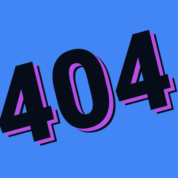
It can have a bad effect when a user of your website searches for a specific page and does not find the page they are looking for. But having a beautiful 404 page can reduce its negative impact on the website audience. In this code, the phrase 404 is capitalized in the middle of the page and in italics. This phrase includes a shadow. This shadow is colored. The shadow color of phrase 404 changes automatically.
HTML
<!-- This script got from www.devanswer.com -->
<link rel="stylesheet" href="https://cdnjs.cloudflare.com/ajax/libs/meyer-reset/2.0/reset.min.css">
<h1 class="hero-title" id="backfont">404</h1><div id="bcl"><a style="font-size:8pt;text-decoration:none;" href="http://www.devanswer.com">Developers Answer</a></div>
CSS
@import url(https://fonts.googleapis.com/css?family=Russo+One&display=swap);
@import url(https://fonts.googleapis.com/css?family=Roboto:300,400,500,700,900);
@import url(https://fonts.googleapis.com/css?family=Anton|Fredoka+One&display=swap);
body {
  width: 100%;
  height: 100%;
  padding: 0;
  margin: 0;
  overflow: hidden;
  background-color: #4285F4;
  background-image: url(http://www.devanswer.com/img/tail-gray.png);
}
body {
  display: -webkit-box;
  display: flex;
  height: 100vh;
  -webkit-box-align: center;
          align-items: center;
  -webkit-box-pack: center;
          justify-content: center;
  -webkit-box-orient: vertical;
  -webkit-box-direction: normal;
          flex-flow: column;
}
.hero-title {
  position: absolute;
  top: 50%;
  left: 50%;
  font-size: 60vmin;
  letter-spacing: 0px;
  line-height: 0;
  opacity: .9;
  font-weight: 900;
  font-family: "Roboto", sans-serif;
  text-transform: uppercase;
  color: rgba(0, 0, 0, 1.0);
  transition: 750ms ease-in-out;
-webkit-transform: translate(-50%, -50%) rotate(-45deg);
        transform: translate(-50%, -50%) rotate(-45deg);
  text-shadow: 2vmin 2vmin #ff4655,
               3vmin 3vmin #000000;
  background: linear-gradient(60deg, #f79533, #F36F52, #ef4e7b, #a166ab, #5073b8, #1098ad, #07b39b, #6fba82);
  animation: colorrr 10s infinite;
}
@keyframes colorrr {
  0% {
       filter: hue-rotate(0deg)
      }
  50% {
       filter: hue-rotate(360deg)
      }
}