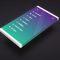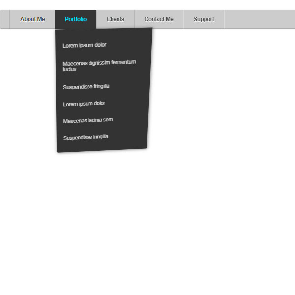
To make your website more beautiful, you can use codes with dark themes and animations. One of these codes is ready in this post. This post contains a menu with a gray background. Selecting one of the menu items opens a submenu. The background of the submenu is black and the submenu shakes like an object under the influence of gravity and is fixed after a few moments. The title of each item selected in the menu is also painted turquoise.
HTML
<!-- This script got from www.devanswer.com -->
<script src='https://public.stewart.com/seth/js/prefixfree.min.js'></script>
<div id="container">
<ul id="menu">
  <li><a href="#">About Me</a>
		<ul>
			<li><a href="#">Lorem ipsum dolor</a></li>
			<li><a href="#">Maecenas lacinia sem</a></li>
			<li><a href="#">Suspendisse fringilla</a></li>
		</ul>
	</li>
	<li><a href="#">Portfolio</a>
		<ul>
			<li><a href="#">Lorem ipsum dolor</a></li>
			<li><a href="#">Maecenas dignissim fermentum luctus</a></li>
			<li><a href="#">Suspendisse fringilla</a></li>
			<li><a href="#">Lorem ipsum dolor</a></li>
			<li><a href="#">Maecenas lacinia sem</a></li>
			<li><a href="#">Suspendisse fringilla</a></li>
		</ul>
	</li>
	<li><a href="#">Clients</a>
		<ul>
			<li><a href="#">Lorem ipsum dolor</a></li>
			<li><a href="#">Maecenas lacinia sem</a></li>
			<li><a href="#">Suspendisse fringilla</a></li>
		</ul>
	</li>
	<li><a href="#">Contact Me</a>
		<ul>
			<li><a href="#">Lorem ipsum dolor</a></li>
			<li><a href="#">Maecenas dignissim fermentum luctus</a></li>
			<li><a href="#">Suspendisse fringilla</a></li>
		</ul>
	</li>
	<li><a href="#">Support</a></li>
</ul>
</div><div id="bcl"><a style="font-size:8pt;text-decoration:none;" href="http://www.devanswer.com">Developers Answer</a></div>
CSS
* {
  	margin: 0;
		padding: 0;
		box-sizing: border-box;
	}
body {
	padding: 30px;
	font-family: "Helvetica Neue", helvetica, arial;
	background: url('http://devanswer.com/img/white_carbonfiber.jpg');
}
#container {
	position: relative;
	width: 940px;
}
#container:after {
	content: "";
	display: block;
	clear: both;
	height: 0;
}
#menu {
	position: relative;
	float: left;
	width: 100%;
	padding: 0 20px;
	border-radius: 3px;
	box-shadow: inset 0 1px 1px rgba(255,255,255,.5), inset 0 -1px 0 rgba(0,0,0,.15), 0 1px 3px rgba(0,0,0,.15);
	background: #ccc;
}
#menu, #menu ul {
	list-style: none;
}
#menu > li {
	float: left;
	position: relative;
	border-right: 1px solid rgba(0,0,0,.1);
	box-shadow: 1px 0 0 rgba(255,255,255,.25);
	perspective: 1000px;
}
#menu > li:first-child {
	border-left: 1px solid rgba(255,255,255,.25);
	box-shadow: -1px 0 0 rgba(0,0,0,.1), 1px 0 0 rgba(255,255,255,.25);
}
#menu a {
	display: block;
	position: relative;
	z-index: 10;
	padding: 13px 20px 13px 20px;
	text-decoration: none;
	color: rgba(75,75,75,1);
	line-height: 1;
	font-weight: 600;
	font-size: 12px;
	letter-spacing: -.05em;
	background: transparent;
	text-shadow: 0 1px 1px rgba(255,255,255,.9);
	transition: all .25s ease-in-out;

}
#menu > li:hover > a {
	background: #333;
	color: rgba(0,223,252,1);
	text-shadow: none;
}
#menu li ul  {
	position: absolute;
	left: 0;
	z-index: 1;
	width: 200px;
	padding: 0;
	opacity: 0;
	visibility: hidden;
	border-bottom-left-radius: 4px;
	border-bottom-right-radius: 4px;
	background: transparent;
	overflow: hidden;
	transform-origin: 50% 0%;
}
#menu li:hover ul {

	padding: 15px 0;
	background: #333;
	opacity: 1;
	visibility: visible;
	box-shadow: 1px 1px 7px rgba(0,0,0,.5);
	animation-name: swingdown;
	animation-duration: 1s;
	animation-timing-function: ease;

}
@keyframes swingdown {
	0% {
		opacity: .99999;
		transform: rotateX(90deg);
	}
	30% {
		transform: rotateX(-20deg) rotateY(5deg);
		animation-timing-function: ease-in-out;
	}
	65% {
		transform: rotateX(20deg) rotateY(-3deg);
		animation-timing-function: ease-in-out;
	}
	100% {
		transform: rotateX(0);
		animation-timing-function: ease-in-out;
	}
}
#menu li li a {
	padding-left: 15px;
	font-weight: 400;
	color: #ddd;
	text-shadow: none;
	border-top: dotted 1px transparent;
	border-bottom: dotted 1px transparent;
	transition: all .15s linear;
}
#menu li li a:hover {
	color: rgba(0,223,252,1);
	border-top: dotted 1px rgba(255,255,255,.15);
	border-bottom: dotted 1px rgba(255,255,255,.15);
	background: rgba(0,223,252,.02);
}