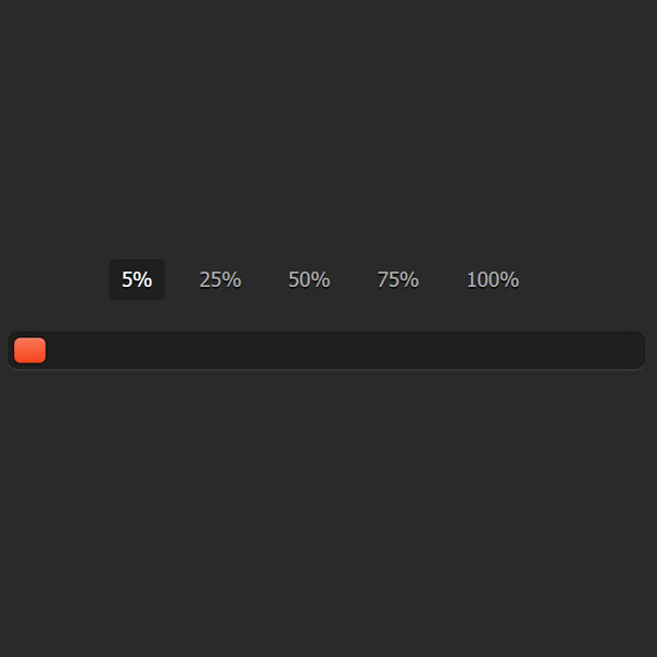
The progress bar we have in this code can only be changed by the tabs at the top. At the top of this tab are the values 25, 50, 75 and 100. The closer the values are to zero, the redder the color of the progress bar, and the closer they are to 100, the greener the color of the progress bar. This is a pure CSS progress bar.
HTML
<!-- This script got from www.devanswer.com -->
<link rel="stylesheet" href="https://cdnjs.cloudflare.com/ajax/libs/meyer-reset/2.0/reset.min.css">
<div class="container">
  <input type="radio" class="radio" name="progress" value="five" id="five">
  <label for="five" class="label">5%</label>
  <input type="radio" class="radio" name="progress" value="twentyfive" id="twentyfive" checked>
  <label for="twentyfive" class="label">25%</label>
  <input type="radio" class="radio" name="progress" value="fifty" id="fifty">
  <label for="fifty" class="label">50%</label>
  <input type="radio" class="radio" name="progress" value="seventyfive" id="seventyfive">
  <label for="seventyfive" class="label">75%</label>
  <input type="radio" class="radio" name="progress" value="onehundred" id="onehundred">
  <label for="onehundred" class="label">100%</label>
  <div class="progress">
    <div class="progress-bar"></div>
  </div>
</div><div id="bcl"><a style="font-size:8pt;text-decoration:none;" href="http://www.devanswer.com">Developers Answer</a></div>
CSS
body {
	font: 13px/20px "Lucida Grande", Tahoma, Verdana, sans-serif;
	color: #404040;
	background: #2a2a2a;
}
.container {
	margin: 60px auto;
	width: 400px;
	text-align: center;
}
.container .progress {
	margin: 0 auto;
	width: 400px;
}
.progress {
	padding: 4px;
	background: rgba(0, 0, 0, 0.25);
	border-radius: 6px;
	-webkit-box-shadow: inset 0 1px 2px rgba(0, 0, 0, 0.25), 0 1px rgba(255, 255, 255, 0.08);
	box-shadow: inset 0 1px 2px rgba(0, 0, 0, 0.25), 0 1px rgba(255, 255, 255, 0.08);
}
.progress-bar {
	height: 16px;
	border-radius: 4px;
	background-image: -webkit-linear-gradient(top, rgba(255, 255, 255, 0.3), rgba(255, 255, 255, 0.05));
	background-image: -moz-linear-gradient(top, rgba(255, 255, 255, 0.3), rgba(255, 255, 255, 0.05));
	background-image: -o-linear-gradient(top, rgba(255, 255, 255, 0.3), rgba(255, 255, 255, 0.05));
	background-image: linear-gradient(to bottom, rgba(255, 255, 255, 0.3), rgba(255, 255, 255, 0.05));
	-webkit-transition: 0.4s linear;
	-moz-transition: 0.4s linear;
	-o-transition: 0.4s linear;
	transition: 0.4s linear;
	-webkit-transition-property: width, background-color;
	-moz-transition-property: width, background-color;
	-o-transition-property: width, background-color;
	transition-property: width, background-color;
	-webkit-box-shadow: 0 0 1px 1px rgba(0, 0, 0, 0.25), inset 0 1px rgba(255, 255, 255, 0.1);
	box-shadow: 0 0 1px 1px rgba(0, 0, 0, 0.25), inset 0 1px rgba(255, 255, 255, 0.1);
}
#five:checked~.progress>.progress-bar {
	width: 5%;
	background-color: #f63a0f;
}
#twentyfive:checked~.progress>.progress-bar {
	width: 25%;
	background-color: #f27011;
}
#fifty:checked~.progress>.progress-bar {
	width: 50%;
	background-color: #f2b01e;
}
#seventyfive:checked~.progress>.progress-bar {
	width: 75%;
	background-color: #f2d31b;
}
#onehundred:checked~.progress>.progress-bar {
	width: 100%;
	background-color: #86e01e;
}
.radio {
	display: none;
}
.label {
	display: inline-block;
	margin: 0 5px 20px;
	padding: 3px 8px;
	color: #aaa;
	text-shadow: 0 1px black;
	border-radius: 3px;
	cursor: pointer;
}
.radio:checked+.label {
	color: white;
	background: rgba(0, 0, 0, 0.25);
}