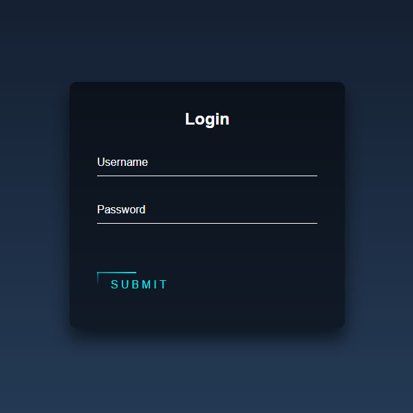
In this code, a form has been prepared for the user to enter the website. This form has a dark blue theme. All titles and logos in this code are white. The blue line moves around the button. When the mouse cursor is placed on this button, the button turns a turquoise background like a light that turns on. The whole form also has a shade of blue.
HTML
<!-- This script got from www.devanswer.com -->
<div class="login-box">
    <h2>Login</h2>
    <form>
        <div class="user-box">
            <input type="text" name="" required="">
            <label>Username</label>
        </div>
        <div class="user-box">
            <input type="password" name="" required="">
            <label>Password</label>
        </div>
        <a href="#">
            <span></span>
            <span></span>
            <span></span>
            <span></span>
            Submit
        </a>
    </form>
</div> <div id="bcl"><a style="font-size:8pt;text-decoration:none;" href="http://www.devanswer.com">Developers Answer</a></div>
CSS
html {
    height: 100%;
 }
body {
    margin:0;
    padding:0;
    font-family: sans-serif;
    background: linear-gradient(#141e30, #243b55);
 }
.login-box {
    position: absolute;
    top: 50%;
    left: 50%;
    width: 400px;
    padding: 40px;
    transform: translate(-50%, -50%);
    background: rgba(0,0,0,.5);
    box-sizing: border-box;
    box-shadow: 0 15px 25px rgba(0,0,0,.6);
    border-radius: 10px;
 }
.login-box h2 {
    margin: 0 0 30px;
    padding: 0;
    color: #fff;
    text-align: center;
 }
.login-box .user-box {
    position: relative;
 }
.login-box .user-box input {
    width: 100%;
    padding: 10px 0;
    font-size: 16px;
    color: #fff;
    margin-bottom: 30px;
    border: none;
    border-bottom: 1px solid #fff;
    outline: none;
    background: transparent;
 }
.login-box .user-box label {
    position: absolute;
    top:0;
    left: 0;
    padding: 10px 0;
    font-size: 16px;
    color: #fff;
    pointer-events: none;
    transition: .5s;
 }
.login-box .user-box input:focus ~ label,
.login-box .user-box input:valid ~ label {
    top: -20px;
    left: 0;
    color: #03e9f4;
    font-size: 12px;
 }
.login-box form a {
    position: relative;
    display: inline-block;
    padding: 10px 20px;
    color: #03e9f4;
    font-size: 16px;
    text-decoration: none;
    text-transform: uppercase;
    overflow: hidden;
    transition: .5s;
    margin-top: 40px;
    letter-spacing: 4px
 }
.login-box a:hover {
    background: #03e9f4;
    color: #fff;
    border-radius: 5px;
    box-shadow: 0 0 5px #03e9f4,
                0 0 25px #03e9f4,
                0 0 50px #03e9f4,
                0 0 100px #03e9f4;
 }
.login-box a span {
    position: absolute;
    display: block;
 }
.login-box a span:nth-child(1) {
    top: 0;
    left: -100%;
    width: 100%;
    height: 2px;
    background: linear-gradient(90deg, transparent, #03e9f4);
    animation: btn-anim1 1s linear infinite;
 }
@keyframes btn-anim1 {
    0% {
      left: -100%;
    }
    50%,100% {
      left: 100%;
    }
 }
.login-box a span:nth-child(2) {
    top: -100%;
    right: 0;
    width: 2px;
    height: 100%;
    background: linear-gradient(180deg, transparent, #03e9f4);
    animation: btn-anim2 1s linear infinite;
    animation-delay: .25s
 }
@keyframes btn-anim2 {
    0% {
      top: -100%;
    }
    50%,100% {
      top: 100%;
    }
 }
.login-box a span:nth-child(3) {
    bottom: 0;
    right: -100%;
    width: 100%;
    height: 2px;
    background: linear-gradient(270deg, transparent, #03e9f4);
    animation: btn-anim3 1s linear infinite;
    animation-delay: .5s
 }
@keyframes btn-anim3 {
    0% {
      right: -100%;
    }
    50%,100% {
      right: 100%;
    }
 }
.login-box a span:nth-child(4) {
    bottom: -100%;
    left: 0;
    width: 2px;
    height: 100%;
    background: linear-gradient(360deg, transparent, #03e9f4);
    animation: btn-anim4 1s linear infinite;
    animation-delay: .75s
 }
@keyframes btn-anim4 {
    0% {
      bottom: -100%;
    }
    50%,100% {
      bottom: 100%;
    }
 }