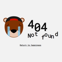
You can use a more beautiful 404 page to make your website more beautiful and special. In this code, we have prepared a similar page for you. This page has a light pink theme. The phrase 404 is in gray in the middle of the page. Instead of zero in phrase 404, an interval is displayed. This magnifying glass comes from the bottom of the page to the middle of the page when the page is loaded. There are also beautiful icons moving behind the screen.
HTML
<!-- This script got from www.devanswer.com -->
<svg version="1.1" id="error-404-img" xmlns="http://www.w3.org/2000/svg" xmlns:xlink="http://www.w3.org/1999/xlink" x="0px"
	 y="0px" viewBox="0 0 344.7 276.7" style="enable-background:new 0 0 344.7 276.7;" xml:space="preserve">
<g id="decorations">
	<polygon class="st0" points="245,52.8 241.7,49.5 238.5,52.6 235.4,49.5 232.1,52.8 235.2,55.9 232.1,59.1 235.4,62.4 238.5,59.2
		241.7,62.4 245,59.1 241.8,55.9 	"/>
	<polygon class="st0" points="42.7,172 39.4,168.7 36.2,171.8 33.1,168.7 29.8,172 32.9,175.1 29.8,178.3 33.1,181.6 36.2,178.4
		39.4,181.6 42.7,178.3 39.5,175.1 	"/>
	<polygon class="st0" points="102.9,30.8 99.6,27.5 96.4,30.7 93.3,27.5 90,30.8 93.1,34 90,37.2 93.3,40.5 96.4,37.3 99.6,40.5
		102.9,37.2 99.8,34 	"/>
	<polygon class="st0" points="311,196.3 307.7,192.9 304.5,196.1 301.4,192.9 298.1,196.3 301.2,199.4 298.1,202.6 301.4,205.9
		304.5,202.7 307.7,205.9 311,202.6 307.9,199.4 	"/>
	<g>
		<path class="st0" d="M42.7,67.2c-2.7,0-4.8-2.2-4.8-4.8c0-2.7,2.2-4.8,4.8-4.8c2.7,0,4.8,2.2,4.8,4.8
			C47.5,65.1,45.4,67.2,42.7,67.2z M42.7,59.6c-1.6,0-2.8,1.3-2.8,2.8s1.3,2.8,2.8,2.8s2.8-1.3,2.8-2.8S44.3,59.6,42.7,59.6z"/>
	</g>
	<g>
		<path class="st0" d="M183.1,23.3c-2.7,0-4.8-2.2-4.8-4.8s2.2-4.8,4.8-4.8c2.7,0,4.8,2.2,4.8,4.8S185.8,23.3,183.1,23.3z
			 M183.1,15.7c-1.6,0-2.8,1.3-2.8,2.8s1.3,2.8,2.8,2.8s2.8-1.3,2.8-2.8S184.7,15.7,183.1,15.7z"/>
	</g>
	<g>
		<path class="st0" d="M318.6,91c-2.7,0-4.8-2.2-4.8-4.8c0-2.7,2.2-4.8,4.8-4.8c2.7,0,4.8,2.2,4.8,4.8C323.5,88.9,321.3,91,318.6,91
			z M318.6,83.4c-1.6,0-2.8,1.3-2.8,2.8s1.3,2.8,2.8,2.8s2.8-1.3,2.8-2.8S320.2,83.4,318.6,83.4z"/>
	</g>
	<g>
		<path class="st0" d="M257,170.8c-2.7,0-4.8-2.2-4.8-4.8c0-2.7,2.2-4.8,4.8-4.8c2.7,0,4.8,2.2,4.8,4.8
			C261.8,168.7,259.6,170.8,257,170.8z M257,163.2c-1.6,0-2.8,1.3-2.8,2.8s1.3,2.8,2.8,2.8s2.8-1.3,2.8-2.8S258.5,163.2,257,163.2z"
			/>
	</g>
	<g>
		<path class="st0" d="M90,232c-2.7,0-4.8-2.2-4.8-4.8c0-2.7,2.2-4.8,4.8-4.8c2.7,0,4.8,2.2,4.8,4.8C94.8,229.8,92.6,232,90,232z
			 M90,224.3c-1.6,0-2.8,1.3-2.8,2.8s1.3,2.8,2.8,2.8s2.8-1.3,2.8-2.8S91.5,224.3,90,224.3z"/>
	</g>
	<circle class="st0" cx="98.9" cy="65.3" r="9"/>
	<circle class="st0" cx="103.3" cy="168.8" r="4.5"/>
	<path class="st0" d="M332.5,154.2c0,2.5-2,4.5-4.5,4.5s-4.5-2-4.5-4.5c0-2.5,2-4.5,4.5-4.5S332.5,151.8,332.5,154.2z"/>
	<path class="st0" d="M17.3,96.3c0,2.5-2,4.5-4.5,4.5c-2.5,0-4.5-2-4.5-4.5s2-4.5,4.5-4.5C15.3,91.8,17.3,93.9,17.3,96.3z"/>
	<path class="st0" d="M243.1,96.3c0,2.5-2,4.5-4.5,4.5c-2.5,0-4.5-2-4.5-4.5s2-4.5,4.5-4.5C241,91.8,243.1,93.9,243.1,96.3z"/>
	<circle class="st0" cx="229.1" cy="222.3" r="6.8"/>
</g>
<g id="_x34_-gauche">
	<g class="st1">
		<path class="st0" d="M60.6,168.4v-21.1H19.3v-16.8l47.4-60.8h12.9v60.7H92v17H79.5v21.1H60.6z M38.2,130.3h24.5v-32L38.2,130.3z"
			/>
	</g>
	<g>
		<path class="st2" d="M58.6,166.4v-21.1H17.3v-16.8l47.4-60.8h12.9v60.7H90v17H77.5v21.1H58.6z M36.2,128.3h24.5v-32L36.2,128.3z"
			/>
	</g>
</g>
<path id="ombre-loupe" class="st3" d="M238.6,173l0.4-0.3c0.6-0.5,0.6-1.4,0.1-1.9l-7.6-8.3c7.8-9.8,12.7-22.1,13.3-35.6
	c1.5-34.1-24.9-62.9-58.9-64.4c-34.1-1.5-62.9,24.9-64.4,58.9c-1.5,34.1,24.9,62.9,58.9,64.4c13.5,0.6,26.2-3.2,36.7-10.1l7.6,8.3
	c0.5,0.6,1.4,0.6,1.9,0.1l0.4-0.3l56.2,61.4h21.4L238.6,173z"/>
<g id="_x34_-droite">
	<g class="st1">
		<path class="st0" d="M281.3,168.4v-21.1H240v-16.8l47.4-60.8h12.9v60.7h12.4v17h-12.4v21.1H281.3z M259,130.3h24.5v-32L259,130.3z
			"/>
	</g>
	<g>
		<path class="st2" d="M279.3,166.4v-21.1H238v-16.8l47.4-60.8h12.9v60.7h12.4v17h-12.4v21.1H279.3z M257,128.3h24.5v-32L257,128.3z
			"/>
	</g>
</g>
<g id="loupe">
	<path class="st4" d="M311.4,252.6L219.8,161L208,172.8l91.6,91.6c3.4,3.4,9.1,3.2,12.2-0.5h0C314.6,260.5,314.4,255.6,311.4,252.6z
		"/>
	<path class="st5" d="M199.5,167.1l11.1,11.1c0.6,0.6,1.5,0.6,2,0l12.5-12.5c0.6-0.6,0.6-1.5,0-2l-11.1-11.1L199.5,167.1z"/>
	<polygon class="st6" points="215.8,154.2 217.2,155.7 205.4,173 200.2,167.8 	"/>
	<polygon class="st7" points="213,177.8 224.8,166 225.6,166.8 216.4,181.1 	"/>
	<path class="st8" d="M164,51.9c-36,0-65.1,29.2-65.1,65.1s29.2,65.1,65.1,65.1s65.1-29.2,65.1-65.1S200,51.9,164,51.9z M164,168.7
		c-28.5,0-51.7-23.1-51.7-51.7c0-28.5,23.1-51.7,51.7-51.7s51.7,23.1,51.7,51.7C215.7,145.5,192.5,168.7,164,168.7z"/>
	<circle class="st9" cx="164" cy="117" r="51.7"/>
	<path class="st2" d="M129.7,82.7c-7.5,7.5-12,15.1-10,17c1.9,1.9,9.6-2.6,17-10c7.5-7.5,12-15.1,10-17
		C144.8,70.7,137.2,75.2,129.7,82.7z"/>
</g>
</svg><div id="bcl"><a style="font-size:8pt;text-decoration:none;" href="http://www.devanswer.com">Developers Answer</a></div>
CSS
.st0{fill:#4C423B;}
.st1{opacity:0.2;}
.st2{fill:#FFFFFF;}
.st3{fill:rgba(132, 121, 114, .4);}
.st4{fill:#424242;}
.st5{fill:#E0E0E0;}
.st6{fill:#BDBDBD;}
.st7{opacity:0.64;fill:#212121;}
.st8{fill:#F5F5F5;}
.st9{opacity:0.8;fill:#4C423B;}
body {
  background-color: rgba(198, 155, 109, .3);
}
#error-404-img {
  max-width: 700px;
  display: block;
  margin: 0 auto;
}
#loupe {
	animation: bounceInUp 2s ease forwards;
	}

#ombre-loupe {
	animation: fadeIn 2s 3s ease forwards;
}
#_x34_-gauche, #_x34_-droite, #ombre-loupe, #decorations {
    opacity: 0;
}

#_x34_-gauche, #_x34_-droite {
	animation: fadeIn 2s ease forwards;
}
#_x34_-gauche {
	animation-delay: 1s;
}
#_x34_-droite {
	animation-delay: 2s;
}
#decorations {
  transform-origin: center;
  animation: fadeIn 2s ease forwards, rotate-grow 50s linear infinite alternate;
	animation-delay: 4s;
}
@-webkit-keyframes rotate-grow {
  from {
       -webkit-transform: rotate(0) scale(.8);
    transform: rotate(0) scale(.8);
  }

  to {
       -webkit-transform: rotate(360deg) scale(1.5);
    transform: rotate(360deg) scale(1.5);
  }
}
@keyframes rotate-grow {
  from {
       -webkit-transform: rotate(0) scale(.8);
    transform: rotate(0) scale(.8);
  }
  to {
       -webkit-transform: rotate(360deg) scale(1.5);
    transform: rotate(360deg) scale(1.5);
  }
}
@-webkit-keyframes fadeInLeft {
  from {
    opacity: 0;
    -webkit-transform: translate3d(-100%, 0, 0);
    transform: translate3d(-100%, 0, 0);
  }
  to {
    opacity: 1;
    -webkit-transform: translate3d(0, 0, 0);
    transform: translate3d(0, 0, 0);
  }
}
@-webkit-keyframes fadeInRight {
  from {
    opacity: 0;
    -webkit-transform: translate3d(100%, 0, 0);
    transform: translate3d(100%, 0, 0);
  }

  to {
    opacity: 1;
    -webkit-transform: translate3d(0, 0, 0);
    transform: translate3d(0, 0, 0);
  }
}
@keyframes fadeInRight {
  from {
    opacity: 0;
    -webkit-transform: translate3d(100%, 0, 0);
    transform: translate3d(100%, 0, 0);
  }
  to {
    opacity: 1;
    -webkit-transform: translate3d(0, 0, 0);
    transform: translate3d(0, 0, 0);
  }
}
@keyframes fadeInLeft {
  from {
    opacity: 0;
    -webkit-transform: translate3d(-100%, 0, 0);
    transform: translate3d(-100%, 0, 0);
  }
  to {
    opacity: 1;
    -webkit-transform: translate3d(0, 0, 0);
    transform: translate3d(0, 0, 0);
  }
}
@-webkit-keyframes fadeIn {
  from {
    opacity: 0;
  }

  to {
    opacity: 1;
  }
}
@keyframes fadeIn {
  from {
    opacity: 0;
  }

  to {
    opacity: 1;
  }
}
@-webkit-keyframes bounceInUp {
  from,
  60%,
  75%,
  90%,
  to {
    -webkit-animation-timing-function: cubic-bezier(0.215, 0.61, 0.355, 1);
    animation-timing-function: cubic-bezier(0.215, 0.61, 0.355, 1);
  }
  from {
    opacity: 0;
    -webkit-transform: translate3d(0, 3000px, 0);
    transform: translate3d(0, 3000px, 0);
  }
  60% {
    opacity: 1;
    -webkit-transform: translate3d(0, -20px, 0);
    transform: translate3d(0, -20px, 0);
  }
  75% {
    -webkit-transform: translate3d(0, 10px, 0);
    transform: translate3d(0, 10px, 0);
  }
  90% {
    -webkit-transform: translate3d(0, -5px, 0);
    transform: translate3d(0, -5px, 0);
  }
  to {
    -webkit-transform: translate3d(0, 0, 0);
    transform: translate3d(0, 0, 0);
  }
}
@keyframes bounceInUp {
  from,
  60%,
  75%,
  90%,
  to {
    -webkit-animation-timing-function: cubic-bezier(0.215, 0.61, 0.355, 1);
    animation-timing-function: cubic-bezier(0.215, 0.61, 0.355, 1);
  }
  from {
    opacity: 0;
    -webkit-transform: translate3d(0, 3000px, 0);
    transform: translate3d(0, 3000px, 0);
  }
  60% {
    opacity: 1;
    -webkit-transform: translate3d(0, -20px, 0);
    transform: translate3d(0, -20px, 0);
  }
  75% {
    -webkit-transform: translate3d(0, 10px, 0);
    transform: translate3d(0, 10px, 0);
  }
  90% {
    -webkit-transform: translate3d(0, -5px, 0);
    transform: translate3d(0, -5px, 0);
  }
  to {
    -webkit-transform: translate3d(0, 0, 0);
    transform: translate3d(0, 0, 0);
  }
}
.bounceInUp {
  -webkit-animation-name: bounceInUp;
  animation-name: bounceInUp;
}