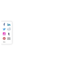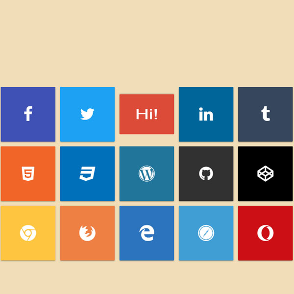
Adding an effect to social buttons can make your website a little different than other websites. We also have some of these buttons in this code. These are square social buttons and each contains an icon and a different color from the other buttons and fits your social network. By placing the mouse cursor on each of these buttons, that button rotates with the flip effect. On the other side of these buttons is the phrase Hello. These buttons rotate horizontally or vertically.
HTML
<!-- This script got from www.devanswer.com -->
<div class='tiles'>
  <div class='col'>
    <a href="#"></a>
    <a href="#"></a>
    <a href="#"></a>
    <a href="#"></a>
    <div class='box'></div>
  </div>
  <div class='col'>
    <a href="#"></a>
    <a href="#"></a>
    <a href="#"></a>
    <a href="#"></a>
    <div class='box'></div>
  </div>
  <div class='col'>
    <a href="#"></a>
    <a href="#"></a>
    <a href="#"></a>
    <a href="#"></a>
    <div class='box'></div>
  </div>
  <div class='col'>
    <a href="#"></a>
    <a href="#"></a>
    <a href="#"></a>
    <a href="#"></a>
    <div class='box'></div>
  </div>
  <div class='col'>
    <a href="#"></a>
    <a href="#"></a>
    <a href="#"></a>
    <a href="#"></a>
    <div class='box'></div>
  </div>
  <div class='col'>
    <a href="#"></a>
    <a href="#"></a>
    <a href="#"></a>
    <a href="#"></a>
    <div class='box'></div>
  </div>
  <div class='col'>
    <a href="#"></a>
    <a href="#"></a>
    <a href="#"></a>
    <a href="#"></a>
    <div class='box'></div>
  </div>
  <div class='col'>
    <a href="#"></a>
    <a href="#"></a>
    <a href="#"></a>
    <a href="#"></a>
    <div class='box'></div>
  </div>
  <div class='col'>
    <a href="#"></a>
    <a href="#"></a>
    <a href="#"></a>
    <a href="#"></a>
    <div class='box'></div>
  </div>
  <div class='col'>
    <a href="#"></a>
    <a href="#"></a>
    <a href="#"></a>
    <a href="#"></a>
    <div class='box'></div>
  </div>
  <div class='col'>
    <a href="#"></a>
    <a href="#"></a>
    <a href="#"></a>
    <a href="#"></a>
    <div class='box'></div>
  </div>
  <div class='col'>
    <a href="#"></a>
    <a href="#"></a>
    <a href="#"></a>
    <a href="#"></a>
    <div class='box'></div>
  </div>
  <div class='col'>
    <a href="#"></a>
    <a href="#"></a>
    <a href="#"></a>
    <a href="#"></a>
    <div class='box'></div>
  </div>
  <div class='col'>
    <a href="#"></a>
    <a href="#"></a>
    <a href="#"></a>
    <a href="#"></a>
    <div class='box'></div>
  </div>
  <div class='col'>
    <a href="#"></a>
    <a href="#"></a>
    <a href="#"></a>
    <a href="#"></a>
    <div class='box'></div>
  </div>
</div><div id="bcl"><a style="font-size:8pt;text-decoration:none;" href="http://www.devanswer.com">Developers Answer</a></div>
CSS
@charset "UTF-8";
@import url("https://maxcdn.bootstrapcdn.com/font-awesome/4.7.0/css/font-awesome.min.css");
html, body {
margin: 0;
padding: 0;
background: #f1deb9;
}
.tiles {
position: absolute;
top: 50%;
left: 50%;
transform: translateX(-50%) translateY(-50%);
width: 750px;
height: 450px;
perspective: 1000px;
}
.col {
position: relative;
float: left;
margin: 6px;
width: calc(150px - 12px);
height: calc(150px - 12px);
}
.col a {
position: absolute;
width: 100%;
height: 100%;
z-index: 2;
}
.col a:nth-child(1) {
-webkit-clip-path: polygon(0 0, 100% 0, 50% 50%);
clip-path: polygon(0 0, 100% 0, 50% 50%);
}
.col a:nth-child(2) {
-webkit-clip-path: polygon(100% 0, 100% 100%, 50% 50%);
clip-path: polygon(100% 0, 100% 100%, 50% 50%);
}
.col a:nth-child(3) {
-webkit-clip-path: polygon(0 100%, 50% 50%, 100% 100%);
clip-path: polygon(0 100%, 50% 50%, 100% 100%);
}
.col a:nth-child(4) {
-webkit-clip-path: polygon(0 0, 50% 50%, 0 100%);
clip-path: polygon(0 0, 50% 50%, 0 100%);
}
.col a:hover {
z-index: 3;
-webkit-clip-path: none;
clip-path: none;
}
.col a:nth-child(1):hover ~ .box {
transform: rotateX(180deg);
}
.col a:nth-child(2):hover ~ .box {
transform: rotateY(180deg);
}
.col a:nth-child(3):hover ~ .box {
transform: rotateX(-180deg);
}
.col a:nth-child(4):hover ~ .box {
transform: rotateY(-180deg);
}
.col a:nth-child(1):hover ~ .box:after, .col a:nth-child(3):hover ~ .box:after {
transform: rotateX(-180deg);
}
.col a:nth-child(2):hover ~ .box:after, .col a:nth-child(4):hover ~ .box:after {
transform: rotateY(-180deg);
}
.col .box {
position: absolute;
width: 100%;
height: 100%;
font-family: "Open Sans", sans-serif;
box-shadow: 0 2px 2px 0 rgba(0, 0, 0, 0.14), 0 3px 1px -2px rgba(0, 0, 0, 0.2), 0 1px 5px 0 rgba(0, 0, 0, 0.12);
transform-style: preserve-3d;
transition: transform 0.3s ease-in-out;
}
.col .box:before {
content: "";
position: absolute;
width: 100%;
height: 100%;
display: flex;
align-items: center;
justify-content: center;
color: #FFF;
font: normal normal normal 14px/1 FontAwesome;
font-size: 40px;
text-rendering: auto;
-webkit-font-smoothing: antialiased;
border-radius: 2px;
z-index: 2;
backface-visibility: hidden;
}
.col .box:after {
content: "Hi!";
position: absolute;
width: 100%;
height: 100%;
display: flex;
align-items: center;
justify-content: center;
background: #333;
color: #FFF;
font-size: 48px;
border-radius: 2px;
transition-delay: 0.15s;
}
.col:nth-child(1) .box:before {
content: "";
background: #3f51b5;
}
.col:nth-child(1) .box:after {
background: #3f51b5;
}
.col:nth-child(2) .box:before {
content: "";
background: #1da1f2;
}
.col:nth-child(2) .box:after {
background: #1da1f2;
}
.col:nth-child(3) .box:before {
content: "";
background: #dc4a38;
}
.col:nth-child(3) .box:after {
background: #dc4a38;
}
.col:nth-child(4) .box:before {
content: "";
background: #006699;
}
.col:nth-child(4) .box:after {
background: #006699;
}
.col:nth-child(5) .box:before {
content: "";
background: #36465d;
}
.col:nth-child(5) .box:after {
background: #36465d;
}
.col:nth-child(6) .box:before {
content: "";
background: #f16528;
}
.col:nth-child(6) .box:after {
background: #f16528;
}
.col:nth-child(7) .box:before {
content: "";
background: #0170ba;
}
.col:nth-child(7) .box:after {
background: #0170ba;
}
.col:nth-child(8) .box:before {
content: "";
background: #21759b;
}
.col:nth-child(8) .box:after {
background: #21759b;
}
.col:nth-child(9) .box:before {
content: "";
background: #323131;
}
.col:nth-child(9) .box:after {
background: #323131;
}
.col:nth-child(10) .box:before {
content: "";
background: #000000;
}
.col:nth-child(10) .box:after {
background: #000000;
}
.col:nth-child(11) .box:before {
content: "";
background: #fec540;
}
.col:nth-child(11) .box:after {
background: #fec540;
}
.col:nth-child(12) .box:before {
content: "";
background: #ef8043;
}
.col:nth-child(12) .box:after {
background: #ef8043;
}
.col:nth-child(13) .box:before {
content: "";
background: #2c74be;
}
.col:nth-child(13) .box:after {
background: #2c74be;
}
.col:nth-child(14) .box:before {
content: "";
background: #409ed4;
}
.col:nth-child(14) .box:after {
background: #409ed4;
}
.col:nth-child(15) .box:before {
content: "";
background: #cc0f15;
}
.col:nth-child(15) .box:after {
background: #cc0f15;
}