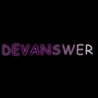
Text effects can also be used on websites that have a clear theme. One of these text effects is in this code. The effect in this code increases the font size one by one and then decreases. This creates a wave-like state in the text. These letters also have a black shade.
HTML
<!-- This script got from www.devanswer.com -->
<div class="mahede">
    <span>D</span>
    <span>E</span>
    <span>V</span>
    <span>A</span>
    <span>N</span>
    <span>S</span>
    <span>W</span>
    <span>E</span>
    <span>R</span>
</div><div id="bcl"><a style="font-size:8pt;text-decoration:none;" href="http://www.devanswer.com">Developers Answer</a></div>
CSS
body
{
background-color: #fff;
    margin: 0;
    padding: 0;
    display: flex;
    justify-content: center;
    align-items: center;
    min-height: 100vh;
}
.mahede
{
    position: relative;
    display: flex;
}
.mahede span
{
    color: rgb 255 255 255;
    margin: 0 2px;
    font-size: 3.3em;
    font-weight: bold;
     animation: animate 3.5s linear infinite;
    font-family: sans-serif;
}
.mahede span:nth-child(1)
{
    animation-delay: 2.2s;
}
.mahede span:nth-child(2)
{
    animation-delay: 1.2s;
}
.mahede span:nth-child(3)
{
    animation-delay: 0.8s;
}
.mahede span:nth-child(4)
{
    animation-delay: 0.6s;
}
.mahede span:nth-child(5)
{
    animation-delay: 0.4s;
}
.mahede span:nth-child(6)
{
    animation-delay: 0.2s;
}
@keyframes animate
{
    0%
    {
        text-shadow: 0 10px 20px rgba(0,0,0,0);
        transform: scale(1);
    }
    40%
    {
        text-shadow: 0 20px 30px rgba(0,0,0,0.2);
        transform: scale(1.4);
    }
    80%,100%
    {
        text-shadow: 0 0 20px rgba(0,0,0,0);
        transform: scale(1);
    }
}