Sometimes you need to tell a story for the visitors. For example from when your company established and what happened during the years. In these cases you might want to use a milestone timeline. The following code is a horizontal timeline to build a beautiful milestone with sliding effect.
HTML
<!-- This script got from www.devanswer.com -->
<div class="container">
<h1 class="title">Our Milestones</h1>
<div class="timeline">
<div class="timeline-nav">
<div class="timeline-nav__item">1985</div>
<div class="timeline-nav__item">1988</div>
<div class="timeline-nav__item">1998</div>
<div class="timeline-nav__item">2006</div>
<div class="timeline-nav__item">2008</div>
<div class="timeline-nav__item">2010</div>
<div class="timeline-nav__item">2012</div>
<div class="timeline-nav__item">2013</div>
<div class="timeline-nav__item">2015</div>
<div class="timeline-nav__item">2016</div>
</div>
<div class="timeline-wrapper">
<div class="timeline-slider">
<div class="timeline-slide" style="background-image: url(http://devanswer.com/codes/files/timeline-1.jpg" data-year="1985"> <span class="timeline-year">1985</span>
<div class="timeline-slide__content">
<h4 class="timeline-title">First Year</h4>
<p class="timeline-text">Some texts about the first year.</p>
</div>
</div>
<div class="timeline-slide" style="background-image: url(http://devanswer.com/codes/files/timeline-2.jpg" data-year="1988"> <span class="timeline-year">1988</span>
<div class="timeline-slide__content">
<h4 class="timeline-title">Second Year</h4>
<p class="timeline-text">Some texts about the second year.</p>
</div>
</div>
<div class="timeline-slide" style="background-image: url(http://devanswer.com/codes/files/timeline-3.jpg" data-year="1998"> <span class="timeline-year">1998</span>
<div class="timeline-slide__content">
<h4 class="timeline-title">Third Year</h4>
<p class="timeline-text">Some texts about the third year.</p>
</div>
</div>
<div class="timeline-slide" style="background-image: url(http://devanswer.com/codes/files/timeline-4.jpg" data-year="2006"> <span class="timeline-year">2006</span>
<div class="timeline-slide__content">
<h4 class="timeline-title">Fourth Year</h4>
<p class="timeline-text">Some texts about the fourth year.</p>
</div>
</div>
<div class="timeline-slide" style="background-image: url(http://devanswer.com/codes/files/timeline-5.jpg" data-year="2008"> <span class="timeline-year">2008</span>
<div class="timeline-slide__content">
<h4 class="timeline-title">Fifth Year</h4>
<p class="timeline-text">Some texts about the fifth year.</p>
</div>
</div>
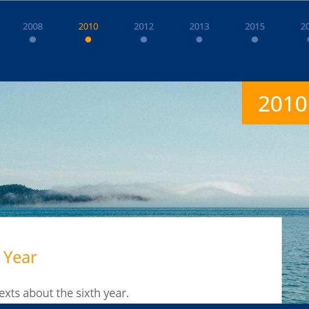
<div class="timeline-slide" style="background-image: url(http://devanswer.com/codes/files/timeline-6.jpg" data-year="2010"> <span class="timeline-year">2010</span>
<div class="timeline-slide__content">
<h4 class="timeline-title">Sixth Year</h4>
<p class="timeline-text">Some texts about the sixth year.</p>
</div>
</div>
<div class="timeline-slide" style="background-image: url(http://devanswer.com/codes/files/timeline-7.jpg" data-year="2012"> <span class="timeline-year">2012</span>
<div class="timeline-slide__content">
<<h4 class="timeline-title">Seventh Year</h4>
<p class="timeline-text">Some texts about the seventh year.</p>
</div>
</div>
<div class="timeline-slide" style="background-image: url(http://devanswer.com/codes/files/timeline-8.jpg" data-year="2013"> <span class="timeline-year">2013</span>
<div class="timeline-slide__content">
<h4 class="timeline-title">Eighth Year</h4>
<p class="timeline-text">Some texts about the eighth year.</p>
</div>
</div>
<div class="timeline-slide" style="background-image: url(http://devanswer.com/codes/files/timeline-9.jpg" data-year="2015"> <span class="timeline-year">2015</span>
<div class="timeline-slide__content">
<h4 class="timeline-title">Ninth Year</h4>
<p class="timeline-text">Some texts about the ninth year.</p>
</div>
</div>
<div class="timeline-slide" style="background-image: url(http://devanswer.com/codes/files/timeline-10.jpg" data-year="2016"> <span class="timeline-year">2016</span>
<div class="timeline-slide__content">
<h4 class="timeline-title">Tenth Year</h4>
<p class="timeline-text">Some texts about the tenth year.</p>
</div>
</div>
</div>
</div>
</div>
</div>
<link rel="stylesheet" href="https://cdnjs.cloudflare.com/ajax/libs/normalize/5.0.0/normalize.min.css">
<link rel='stylesheet' href='https://cdnjs.cloudflare.com/ajax/libs/slick-carousel/1.7.1/slick.min.css'>
<link rel='stylesheet' href='https://fonts.googleapis.com/css?family=Open+Sans:300,400,700,800'>
<script src='https://cdnjs.cloudflare.com/ajax/libs/jquery/3.2.1/jquery.min.js'></script>
<script src='https://cdnjs.cloudflare.com/ajax/libs/slick-carousel/1.7.1/slick.min.js'></script><div id="bcl"><a style="font-size:8pt;text-decoration:none;" href="http://www.devanswer.com">Developers Answer</a></div>
CSS
* {
  box-sizing: border-box;
}

body {
  font-family: 'Open Sans', sans-serif;
  font-size: 14px;
  padding: 0;
  margin: 0;
}

.container {
  height: 100%;
  background-color: #003471;
  display: flex;
  justify-content: center;
  align-items: center;
  flex-direction: column;
}

.title {
  font-size: 25px;
  color: #fff;
  font-weight: 300;
}

.timeline {
  width: 100%;
  position: relative;
  margin-top: 10px;
}
.timeline-nav__item {
  width: auto;
  height: auto;
  text-align: center;
  opacity: 0.5;
  background: transparent;
  color: #afc9f6;
  margin: 15px 25px !important;
  position: relative;
  font-size: 14px;
  line-height: 28px;
  font-weight: 400;
  outline: none;
  cursor: pointer;
}
.timeline-nav__item::before {
  content: "";
  position: absolute;
  top: 30px;
  left: 50%;
  -webkit-transform: translateX(-50%);
          transform: translateX(-50%);
  width: 10px;
  height: 10px;
  border-radius: 100%;
  background-color: #afc9f6;
  transition: .2s;
}
.timeline-nav__item.slick-current {
  color: #ff9900;
  opacity: 1;
}
.timeline-nav__item.slick-current::before {
  background-color: #ff9900;
}
.timeline-wrapper {
  position: relative;
  width: 100%;
  height: 360px;
  margin: 60px auto;
}
@media (max-width: 500px) {
  .timeline-wrapper {
    height: 800px;
    max-height: 700px;
  }
}
.timeline-slider {
  height: 100%;
}
.timeline .slick-list {
  height: 100%;
}
@media (min-width: 1080px) {
  .timeline .slick-list {
    padding: 0 180px !important;
  }
}
.timeline .slick-track {
  height: 100%;
}
.timeline-slide {
  position: relative;
  overflow: hidden;
  background-repeat: no-repeat;
  outline: none;
  background-size: auto 400px, cover;
  background-position: top;
  margin: 0 24px;
  width: 80%;
  z-index: 1;
}
.timeline-slide:after {
  content: "";
  position: absolute;
  top: 0;
  left: 0;
  width: 100%;
  height: 100%;
  background-color: rgba(0, 52, 113, 0.8);
  z-index: 2;
}
.timeline-slide__content {
  z-index: 5;
  position: absolute;
  top: 220px;
  background: #ffffff;
  width: 80%;
  left: 50%;
  -webkit-transform: translate(-50%, 0px);
          transform: translate(-50%, 0px);
  padding: 20px;
  opacity: 0;
  transition: opacity 1s;
}
@media (max-width: 500px) {
  .timeline-slide__content {
    width: 100%;
  }
}
.timeline-year {
  z-index: 5;
  font-size: 35px;
  color: #ffffff;
  background: #ff9900;
  padding: 15px 26px;
  transition: opacity 1.2s;
  position: absolute;
  right: 0;
  opacity: 0;
}
.timeline-title {
  color: #ff9900;
  font-size: 26px;
  line-height: 20px;
  font-weight: 400;
}
.timeline-text {
  font-size: 18px;
  line-height: 28px;
  color: #666666;
}
.timeline .slick-current:after {
  background-color: rgba(0, 52, 113, 0);
}
.timeline .slick-current .timeline-year {
  opacity: 1;
}
.timeline .slick-current .timeline-slide__content {
  opacity: 1;
}Javascript
$(function () {
  $('.timeline-nav').slick({
    slidesToShow: 12,
    slidesToScroll: 1,
    asNavFor: '.timeline-slider',
    centerMode: false,
    focusOnSelect: true,
    mobileFirst: true,
    arrows: false,
    infinite: false,
    responsive: [
    {
      breakpoint: 768,
      settings: {
        slidesToShow: 8 } },

    {
      breakpoint: 0,
      settings: {
        slidesToShow: 4,
        slidesToScroll: 2 } }] });

  $('.timeline-slider').slick({
    slidesToShow: 1,
    slidesToScroll: 1,
    arrows: false,
    asNavFor: '.timeline-nav',
    centerMode: true,
    cssEase: 'ease',
    edgeFriction: 0.5,
    mobileFirst: true,
    speed: 500,
    responsive: [
    {
      breakpoint: 0,
      settings: {
        centerMode: false } },


    {
      breakpoint: 768,
      settings: {
        centerMode: true } }] });
});