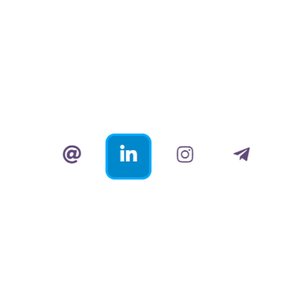
Using hover effects will make your websites more beautiful and more beautiful for your website visitors. In this post, we have prepared the same code. This code shows the four social buttons with their icons. These buttons rotate during the hover and have a background as they rotate. First they find a circular background and then a square background.
HTML
<!-- This script got from www.devanswer.com -->
<link rel="stylesheet" href="https://cdnjs.cloudflare.com/ajax/libs/font-awesome/5.13.0/css/all.min.css">
<section class="social">
			<a href="">
				<i class="fas fa-at"></i>
			</a>
			<a href="">
				<i class="fab fa-linkedin-in"></i>
			</a>
			<a href="">
				<i class="fab fa-instagram"></i>
			</a>
			<a href="">
				<i class="fab fa-telegram-plane"></i>
			</a>
</section><div id="bcl"><a style="font-size:8pt;text-decoration:none;" href="http://www.devanswer.com">Developers Answer</a></div>
CSS
.social{
	width: 100%;
	height: auto;
	text-align: center;
}
.social a{
	display: inline-block;
	padding: 5px;

}
.social a i{
	color: #3b1e59;
    width: 55px;
    height: 55px;
    font-size: 25px;
    line-height: 50px!important;
    border: 3px solid #fff;
    opacity: .8;
    transition-property: transform;
    -moz-transition-property: -moz-transform;
    -webkit-transition-property: -webkit-transform;
    transition: all 0.6s cubic-bezier(0.88, -0.48, 0.38, 1.85);
    border-radius: 50%;
}
.social a i:hover{
	opacity: 1;
	border-radius: 20%;

}
.social a:hover i.fa-linkedin-in,.social a:hover i.fa-telegram-plane{
	transition:  .6s ease-in;
	background: #0088cc;
	color: white;
	border: 3px solid #00aaff;
}
transform: rotate(360deg);
    -webkit-transform: rotate(360deg);
}
.social a:hover i.fa-at{
	transition:  .6s ease-in;
	background: #D44638;
	color:white;
	border: 3px solid #fd8e8e;
	transform: rotate(360deg);
    -webkit-transform: rotate(360deg);
}
.social a:hover i.fa-instagram{
	transition:  .6s ease-in;
	background: linear-gradient(#F58529 20%, #FEDA77 50%, #DD2A7B 75%, #8134AF 90%, #515BD4);
	transform: rotate(360deg);
    -webkit-transform: rotate(360deg);
	border: 3px solid #fd8e8e;
	color:white;
}