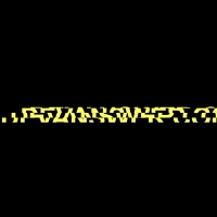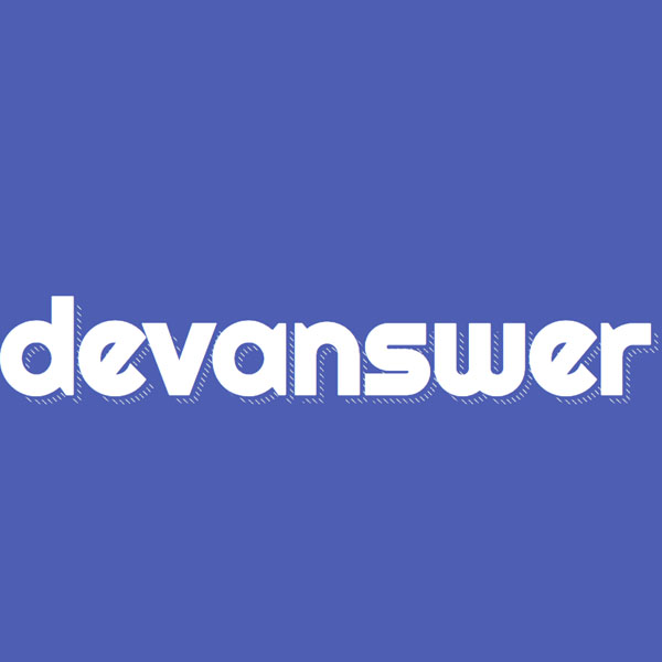
For Batem Abi websites such as airlines, etc., you can use the effect on the title of this website. This code has a blue background, shadow and white text. The font of this code is large. The shadow of this code is moving and is constantly moving in the form of a hash. This beautiful code can attract more attention of your website audience.
HTML
<!-- This script got from www.devanswer.com -->
<h1 data-shadow='Devanswer'>Devanswer</h1> <div id="bcl"><a style="font-size:8pt;text-decoration:none;" href="http://www.devanswer.com">Developers Answer</a></div>
CSS
@import url(https://fonts.googleapis.com/css?family=Righteous);
*, *:before, *:after {
    margin: 0;
    padding: 0;
    box-sizing: border-box;
    position: relative;
}
html, body {
    height: 100%;
}
body {
    text-align: center;
    background-color: hsla(230,40%,50%,1);
}
body:before {
    content: '';
    display: inline-block;
    vertical-align: middle;
    font-size: 0;
    height: 100%;
}
h1 {
    display: inline-block;
    color: white;
    font-family: 'Righteous', serif;
    font-size: 12em;
    text-shadow: .03em .03em 0 hsla(230,40%,50%,1);
}
h1:after {
    content: attr(data-shadow);
    position: absolute;
    top: .06em;
    left: .06em;
    z-index: -1;
    text-shadow: none;
    background-image: linear-gradient( 45deg, transparent 45%, hsla(48,20%,90%,1) 45%, hsla(48,20%,90%,1) 55%, transparent 0 );
    background-size: .05em .05em;
    -webkit-background-clip: text;
    -webkit-text-fill-color: transparent;
    animation: shad-anim 15s linear infinite;
}
@keyframes shad-anim {
    0% {
        background-position: 0 0
    }
    0% {
        background-position: 100% -100%
    }
}