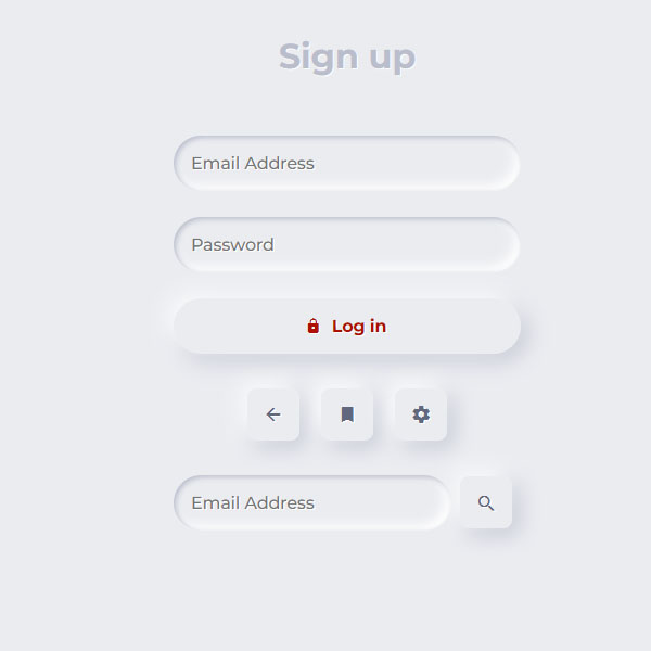
If your website has a gray color theme, this form is very suitable for entering the account section. In this form, the user is faced with a form whose inputs are like a depression on the page and its buttons are like a bulge on the page. The word login is on the red button, but the rest of the titles and icons are all gray.
HTML
<!-- This script got from www.devanswer.com -->
<link rel='stylesheet' href='https://unpkg.com/ionicons@4.5.10-0/dist/css/ionicons.min.css'>
<link rel='stylesheet' href='https://fonts.googleapis.com/css?family=Montserrat:500,700&display=swap'>
<form>
<div class="segment">
<h1>Sign up</h1>
</div>
<label>
<input type="text" placeholder="Email Address" />
</label>
<label>
<input type="password" placeholder="Password" />
</label>
<button class="red" type="button"><i class="icon ion-md-lock"></i> Log in</button>
<div class="segment">
<button class="unit" type="button"><i class="icon ion-md-arrow-back"></i></button>
<button class="unit" type="button"><i class="icon ion-md-bookmark"></i></button>
<button class="unit" type="button"><i class="icon ion-md-settings"></i></button>
</div>
<div class="input-group">
<label>
<input type="text" placeholder="Email Address" />
</label>
<button class="unit" type="button"><i class="icon ion-md-search"></i></button>
</div>
</form><div id="bcl"><a style="font-size:8pt;text-decoration:none;" href="http://www.devanswer.com">Developers Answer</a></div>
CSS
body, html {
	background-color: #EBECF0;
}
body, p, input, select, textarea, button {
	font-family: "Montserrat", sans-serif;
	letter-spacing: -0.2px;
	font-size: 16px;
}
div, p {
	color: #BABECC;
	text-shadow: 1px 1px 1px #FFF;
}
form {
	padding: 16px;
	width: 320px;
	margin: 0 auto;
}
.segment {
	padding: 32px 0;
	text-align: center;
}
button, input {
	border: 0;
	outline: 0;
	font-size: 16px;
	border-radius: 320px;
	padding: 16px;
	background-color: #EBECF0;
	text-shadow: 1px 1px 0 #FFF;
}
label {
	display: block;
	margin-bottom: 24px;
	width: 100%;
}
input {
	margin-right: 8px;
	box-shadow: inset 2px 2px 5px #BABECC, inset -5px -5px 10px #FFF;
	width: 100%;
	box-sizing: border-box;
	transition: all 0.2s ease-in-out;
	appearance: none;
	-webkit-appearance: none;
}
input:focus {
	box-shadow: inset 1px 1px 2px #BABECC, inset -1px -1px 2px #FFF;
}
button {
	color: #61677C;
	font-weight: bold;
	box-shadow: -5px -5px 20px #FFF, 5px 5px 20px #BABECC;
	transition: all 0.2s ease-in-out;
	cursor: pointer;
	font-weight: 600;
}
button:hover {
	box-shadow: -2px -2px 5px #FFF, 2px 2px 5px #BABECC;
}
button:active {
	box-shadow: inset 1px 1px 2px #BABECC, inset -1px -1px 2px #FFF;
}
button .icon {
	margin-right: 8px;
}
button.unit {
	border-radius: 8px;
	line-height: 0;
	width: 48px;
	height: 48px;
	display: inline-flex;
	justify-content: center;
	align-items: center;
	margin: 0 8px;
	font-size: 19.2px;
}
button.unit .icon {
	margin-right: 0;
}
button.red {
	display: block;
	width: 100%;
	color: #AE1100;
}
.input-group {
	display: flex;
	align-items: center;
	justify-content: flex-start;
}
.input-group label {
	margin: 0;
	flex: 1;
}