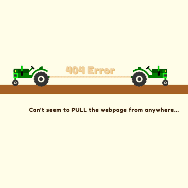
Using the 404 animated and creative page can distract your audience from reaching the page they are looking for. In this code we also have a 404 error page. In a small tractor, they are in the middle of the screen and in opposite directions. Error phrase 404 is attached to these two tractors like a rope. Both of these tractors are trying to pull the phrase to themselves, which results in the phrase 404 going left and right one at a time.
HTML
<!-- This script got from www.devanswer.com -->
<div class="outer-track">
  <div class="inner-track">
    <div class="tractor-container">
      <div class="tractor">
        <div class="body">
          <div class="light"></div>
          <div class="grill"></div>
          <div class="exhaust"></div>
          <div class="steering"></div>
          <div class="seat"></div>
          <div class="wheel-front"></div>
          <div class="fender"></div>
          <div class="wheel-back"></div>
          <div class="hitch"></div>
        </div>
      </div>
    </div>
    <div class="rope"></div>
    <div class="tractor-container">
      <div class="tractor">
        <div class="body">
          <div class="light"></div>
          <div class="grill"></div>
          <div class="exhaust"></div>
          <div class="steering"></div>
          <div class="seat"></div>
          <div class="wheel-front"></div>
          <div class="fender"></div>
          <div class="wheel-back"></div>
          <div class="hitch"></div>
        </div>
      </div>
    </div>
  </div>
</div><div id="bcl"><a style="font-size:8pt;text-decoration:none;" href="http://www.devanswer.com">Developers Answer</a></div>
CSS
@import url("https://fonts.googleapis.com/css?family=Fredoka+One|Open+Sans");
body {
  background: #fffde8;
}
.center, .wheel-back:before, .wheel-back:after {
  position: absolute;
  top: 50%;
  left: 50%;
  transform-origin: center;
  transform: translate(-50%, -50%);
}
.grill-item, .grill:after, .grill:before, .grill {
  position: absolute;
  width: 10px;
  height: 2px;
  background: #333333;
  z-index: 10;
  border-top-right-radius: 3px;
  border-bottom-right-radius: 3px;
}
.spin, .wheel-back {
  animation-name: spin;
  animation-duration: 2000ms;
  animation-iteration-count: infinite;
  animation-timing-function: linear;
}
.putt, .body {
  animation-name: putt;
  animation-duration: 1500ms;
  animation-iteration-count: infinite;
  animation-timing-function: linear;
}
.bob, .wheel-front {
  animation-name: bob;
  animation-duration: 1000ms;
  animation-iteration-count: infinite;
  animation-timing-function: linear;
}
.rattle, .body:after {
  animation-name: rattle;
  animation-duration: 200ms;
  animation-iteration-count: infinite;
  animation-timing-function: linear;
}
.smoke, .exhaust:after {
  animation-name: smoke;
  animation-duration: 1000ms;
  animation-iteration-count: infinite;
  animation-timing-function: linear;
}
.pull, .inner-track {
  animation-name: pull;
  animation-duration: 4000ms;
  animation-iteration-count: infinite;
  animation-timing-function: linear;
}
.title, .rope:before {
  font-family: "Fredoka One";
  font-size: 32px;
  text-shadow: 2px 2px 0px #E8B86A;
  letter-spacing: 1px;
  color: #efd09e;
  text-align: center;
}
.subtext, .outer-track:after {
  font-family: "Fredoka One";
  letter-spacing: 1px;
  font-size: 18px;
  color: #3d230d;
  text-align: center;
}
.outer-track {
  width: 100%;
  height: 125px;
  position: relative;
  margin-top: 200px;
  transform: translateY(-50%);
}
.outer-track:before {
  content: "";
  position: absolute;
  z-index: -9;
  width: 100%;
  height: 30px;
  left: 0px;
  bottom: 0px;
  border-top-left-radius: 10px;
  border-top-right-radius: 10px;
  background: #a65f24;
}
.outer-track:after {
  content: "Can't seem to PULL the webpage from anywhere...";
  min-width: 320px;
  position: absolute;
  left: 50%;
  bottom: -60px;
  transform: translateX(-50%);
}
.inner-track {
  left: 50%;
  transform: translateX(-50%);
  position: relative;
  height: 100%;
  max-width: 540px;
  min-width: 310px;
}
.tractor-container {
  display: inline-block;
  position: relative;
  height: 100%;
  width: 100px;
}
.tractor-container:first-child {
  float: left;
}
.tractor-container:last-child {
  float: right;
}
.rope {
  position: absolute;
  top: 56%;
  left: 50%;
  transform: translate(-50%, -50%);
  width: 48%;
  height: 4px;
  background: url(https://devanswer.com/img/squer.png) repeat;
}
.rope:before {
  content: "404 Error";
  display: inline-block;
  position: absolute;
  white-space: nowrap;
  top: -40px;
  left: 50%;
  transform: translateX(-50%);
}
.tractor {
  position: absolute;
  top: 50%;
  left: 50%;
  transform-origin: center;
}
.tractor-container:first-child .tractor {
  transform: translate(-50%, -50%);
}
.tractor-container:last-child .tractor {
  transform: translate(-50%, -50%) scaleX(-1);
}
.body {
  width: 48px;
  height: 20px;
  background: green;
  border-radius: 2px;
}
.body:after {
  content: "";
  position: absolute;
  width: 105%;
  height: 14px;
  border-radius: 5px;
  background: #004d00;
  left: 50%;
  top: -10px;
  transform: translateX(-50%);
}
.body:before {
  content: "";
  position: absolute;
  width: 30%;
  height: 100%;
  background: #1aff1a;
  bottom: 0px;
  border-radius: 2px;
  left: -1px;
}
.light {
  width: 7px;
  height: 8px;
  position: absolute;
  z-index: 5;
  border-radius: 100%;
  background: #ffee35;
  top: -6px;
  left: 3px;
}
.light:before {
  content: "";
  width: 8px;
  height: 10px;
  z-index: 5;
  position: absolute;
  left: 3px;
  top: 50%;
  transform: translateY(-50%);
  background: green;
  border-top-right-radius: 100%;
  border-bottom-right-radius: 100%;
}
.exhaust {
  position: absolute;
  z-index: 1;
  width: 8px;
  border-radius: 5px;
  height: 17px;
  background: black;
  left: 22px;
  top: -4px;
}
.exhaust:before {
  content: "";
  width: 5px;
  height: 18px;
  border-bottom-left-radius: 3px;
  border-bottom-right-radius: 3px;
  z-index: 5;
  position: absolute;
  background: #00cd00;
  left: 50%;
  top: -15px;
  transform: translateX(-50%);
}
.exhaust:after {
  content: "";
  width: 12px;
  height: 12px;
  top: -15px;
  background: #cccccc;
  position: absolute;
  border-radius: 100%;
  left: 50%;
  transform: translate(-50%, 0px) scale(0);
  opacity: 0.5;
}
.steering {
  position: absolute;
  width: 4px;
  height: 25px;
  background: green;
  right: -7px;
  top: -18px;
  transform: rotate(45deg);
}
.steering:before {
  content: "";
  width: 13px;
  height: 4px;
  background: black;
  position: absolute;
  border-radius: 4px;
  left: 50%;
  transform: translateX(-50%);
}
.seat {
  position: absolute;
  width: 12px;
  height: 12px;
  border-radius: 3px;
  border-top-left-radius: 50px;
  background: #006700;
  right: -44px;
  top: -17px;
  z-index: -1;
}
.grill {
  top: 7px;
}
.grill:before {
  content: "";
  top: 4px;
}
.grill:after {
  content: "";
  top: 8px;
}
.wheel-front {
  z-index: -5;
  position: absolute;
  width: 6px;
  height: 12px;
  background: #009a00;
  left: 2px;
  bottom: -11px;
}
.wheel-front:before {
  content: "";
  position: absolute;
  width: 8px;
  height: 8px;
  border: 6px solid #333333;
  border-radius: 100%;
  top: 6px;
  left: 50%;
  transform: translateX(-50%);
}
.wheel-front:after {
  content: "";
  position: absolute;
  width: 5px;
  height: 5px;
  background: #333333;
  border-radius: 50%;
  top: 13.4px;
  left: 50%;
  transform: translateX(-50%);
}
.fender {
  position: absolute;
  overflow: hidden;
  left: 44px;
  top: -10px;
  width: 65px;
  height: 30px;
  border-bottom-right-radius: 100px;
  background: transparent;
}
.fender:before {
  content: "";
  position: absolute;
  border-radius: 100%;
  border: 5px solid green;
  width: 60px;
  height: 60px;
  left: 67%;
  transform: translateX(-50%);
}
.fender:after {
  content: "";
  position: absolute;
  width: 12px;
  height: 10px;
  bottom: 0px;
  background: green;
  z-index: 100;
}
.wheel-back {
  position: absolute;
  right: -62px;
  bottom: -26px;
  width: 21px;
  height: 21px;
  border: 12px solid #333333;
  border-radius: 50%;
}
.wheel-back:after {
  content: "";
  width: 42px;
  height: 42px;
  border-radius: 50%;
  border: 3px dashed #333333;
  transform: translate(-51%, -51%);
}
.wheel-back:before {
  content: "";
  border-radius: 100%;
  width: 12px;
  height: 12px;
  background: #333333;
  transform: translate(-52%, -52%);
}
.hitch {
  position: absolute;
  width: 17px;
  height: 6px;
  border-radius: 3px;
  background: #006700;
  bottom: 0px;
  right: -68px;
  z-index: -1;
}
.hitch:before {
  content: "";
  position: absolute;
  width: 2px;
  height: 2px;
  border-radius: 50%;
  background: #333333;
  right: 2px;
  top: 50%;
  transform: translateY(-50%);
}
.hitch:after {
  content: "";
  position: absolute;
  width: 4px;
  height: 4px;
  border-radius: 50%;
  background: #efd09e;
  right: -1px;
  top: 50%;
  transform: translateY(-50%);
}
@keyframes spin {
  from {
    transform: rotate(0deg);
  }
  to {
    transform: rotate(-360deg);
  }
}
@keyframes putt {
  0% {
    transform: translateY(0px);
  }
  50% {
    transform: translateY(2px);
  }
  100% {
    transform: translateY(0px);
  }
}
@keyframes bob {
  0% {
    transform: translateY(0px);
  }
  50% {
    transform: translateY(1px);
  }
  100% {
    transform: translateY(0px);
  }
}
@keyframes rattle {
  0% {
    transform: translate(-50%, 0px);
  }
  50% {
    transform: translate(-50%, 1px);
  }
  100% {
    transform: translate(-50%, 0px);
  }
}
@keyframes smoke {
  0% {
    transform: translate(-50%, 0px) scale(0);
  }
  10% {
    transform: translate(-50%, -6px) scale(0.2);
  }
  20% {
    transform: translate(-50%, -8px) scale(0.4);
  }
  30% {
    transform: translate(-50%, -10px) scale(0.6);
  }
  40% {
    transform: translate(-50%, -12px) scale(0.8);
  }
  50% {
    transform: translate(-50%, -14px) scale(1);
  }
  60% {
    transform: translate(-50%, -16px) scale(0.8);
  }
  70% {
    transform: translate(-50%, -18px) scale(0.6);
  }
  80% {
    transform: translate(-50%, -20px) scale(0.4);
  }
  90% {
    transform: translate(-50%, -22px) scale(0.2);
  }
  100% {
    transform: translate(-50%, -24px) scale(0);
  }
}
@keyframes pull {
  0% {
    transform: translateX(-50%);
  }
  25% {
    transform: translateX(-60%);
  }
  50% {
    transform: translateX(-50%);
  }
  75% {
    transform: translateX(-40%);
  }
  100% {
    transform: translateX(-50%);
  }
}