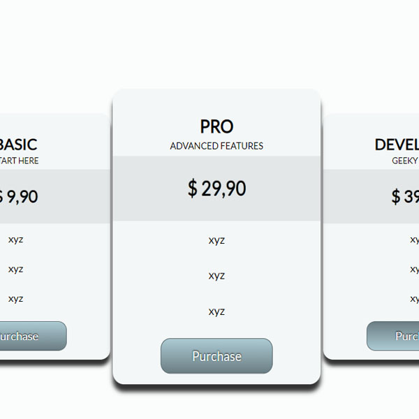
The gray color theme always has its beauty and simplicity. In this post, we have used this beautiful theme. This color theme can enhance the beauty of your website. When the mouse cursor is placed on this panel, the whole panel is displayed larger and even its items become slightly larger. The degree of gradient of the buttons also changes one hundred and eighty degrees during the hover.
HTML
<!-- This script got from www.devanswer.com -->
<div class="container">
	<div class="product">
		<h2>Basic</h2>
		<span>Start here</span>
		<ul>
			<li>$ 9,90</li>
			<li>xyz</li>
			<li>xyz</li>
			<li>xyz</li>
			<li><a href="#" class="btn">Purchase</a></li>
		</ul>
	</div>
	<div class="product featured">
		<h2>Pro</h2>
		<span>Advanced features</span>
		<ul>
			<li>$ 29,90</li>
			<li>xyz</li>
			<li>xyz</li>
			<li>xyz</li>
			<li><a href="#" class="btn">Purchase</a></li>
		</ul>
	</div>
	<div class="product">
		<h2>Developer</h2>
		<span>Geeky stuff</span>
		<ul>
			<li>$ 39,90</li>
			<li>xyz</li>
			<li>xyz</li>
			<li>xyz</li>
			<li><a href="#" class="btn">Purchase</a></li>
		</ul>
	</div>
</div><div id="bcl"><a style="font-size:8pt;text-decoration:none;" href="http://www.devanswer.com">Developers Answer</a></div>
CSS
@import url('https://fonts.googleapis.com/css?family=Lato');
body, html {
	background-color: rgb(251, 252, 252);
}
body {
  font-family: Lato, sans-serif;
}
.container {
	width: 960px;
	margin: 40px auto;
}
.product {
	width: 300px;
	display: inline-block;
	margin: 20px 8px;
	background-color: #F4F7F7;
	color: #000;
	border-radius: 16px;
	box-shadow: 0 10px 6px rgba(0, 0, 0, 0.8);
	-webkit-transition: -webkit-transform 0.4s ease-in-out;
	-moz-transition: -moz-transform 0.4s ease-in-out;
	-o-transition: -o-transform 0.4s ease-in-out;
	transition: transform 0.4s ease-in-out;
}
.product:hover {
	-webkit-transform: scale(1.1, 1.2);
	-moz-transform: scale(1.1, 1.2);
	-o-transform: scale(1.1, 1.2);
	transform: scale(1.1, 1.2);
}
.product h2 {
	text-align: center;
	text-transform: uppercase;
	margin: 1.4em 0 .2em;

}
.product span {
	display: block;
	width: 100%;
	padding-bottom: .4em;
	text-align: center;
	font-size: .8em;
	text-transform: uppercase;
}
.product ul{
	list-style: none;
	margin: 0;
	padding: 0;
}
.product li{
	padding: 14px;
	text-align: center;
}
.product li:first-child{
	padding: 1.1em;
	background-color: #e4e7e7;

	font-size: 1.6em;
	text-shadow: 0px -1px 1px #000;
}
a.btn{
	width: 160px;
	margin: 0 auto;
	padding: 12px 0;
	display: block;

	border-radius: 14px;
	color: #F4F7F7;
	text-decoration: none;
	font-size: 1.1em;

	text-shadow: 0px -1px 2px #000;

	border: 1px solid #607176;

	background: #607176;
	background: -o-linear-gradient(top, #b3d3dc 0%, #abc9d2 2%, #6d8086 97%, #607176 100%);
	background: -moz-linear-gradient(top, #b3d3dc 0%, #abc9d2 2%, #6d8086 97%, #607176 100%);
    background: -webkit-linear-gradient(top, #b3d3dc 0%, #abc9d2 2%, #6d8086 97%, #607176 100%);
	background: linear-gradient(top, #b3d3dc 0%, #abc9d2 2%, #6d8086 97%, #607176 100%);
}
a.btn:hover,
a.btn:focus {
	background: -o-linear-gradient(bottom, #b3d3dc 0%, #abc9d2 2%, #6d8086 97%, #607176 100%);
	background: -moz-linear-gradient(bottom, #b3d3dc 0%, #abc9d2 2%, #6d8086 97%, #607176 100%);
    background: -webkit-linear-gradient(bottom, #b3d3dc 0%, #abc9d2 2%, #6d8086 97%, #607176 100%);
	background: linear-gradient(bottom, #b3d3dc 0%, #abc9d2 2%, #6d8086 97%, #607176 100%);
}