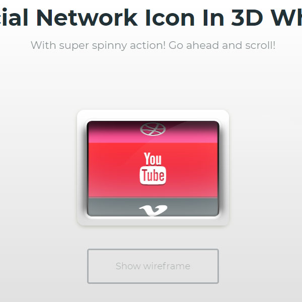
Creating a game display of social icons in the form of games is more attractive for website users. Like this code, instead of simply displaying the social buttons, we simply put them inside a wheel, and by scrolling with the mouse, the wheel rotates and the social icons are displayed.
HTML
<!-- This script got from www.devanswer.com -->
<script src='https://cdnjs.cloudflare.com/ajax/libs/jquery/2.1.3/jquery.min.js'></script>
<link rel='stylesheet' href='https://cdnjs.cloudflare.com/ajax/libs/font-awesome/4.4.0/css/font-awesome.min.css'>
<div id="bcl"><a style="font-size:8pt;text-decoration:none;" href="http://www.devanswer.com">Developers Answer</a></div>
CSS
@import url(https://fonts.googleapis.com/css?family=Montserrat:400,700);
body {
    height: 100vh;
    padding: 0;
    margin: 0;
    font-family: "montserrat";
    text-align: center;
    overflow: hidden;
    font-size: 12px;
    background: white;
    background: linear-gradient(to bottom, white 0%, #dedede 100%);
    filter: progid:DXImageTransform.Microsoft.gradient( startColorstr="#ffffff", endColorstr="#dedede",GradientType=0 );
}
body .clip_r, body .clip_l {
    height: 150px;
    width: 10px;
    background: white;
    background: linear-gradient(to bottom, white 0%, #dedede 100%);
    filter: progid:DXImageTransform.Microsoft.gradient( startColorstr="#ffffff", endColorstr="#dedede",GradientType=0 );
    z-index: 2;
    border-radius: 10px;
    position: absolute;
}
body .clip_b, body .clip_t {
    height: 12px;
    width: 192px;
    z-index: 2;
    border-radius: 10px;
    position: absolute;
    left: -4px;
}
body .roll .elip_r, .roll body .elip_r, body .roll .elip_l, .roll body .elip_l {
    position: absolute;
    height: 122px;
    width: 17px;
    border-radius: 24%;
    z-index: 4;
}
body .clip_l {
    left: -10px;
    box-shadow: 5px 0px 1px -3px black;
}
body .clip_r {
    right: -10px;
    box-shadow: -5px 0px 1px -3px black;
}
body .clip_t {
    background: #FEFEFE;
}
body .clip_b {
    bottom: -10px;
    background: #E0E0E0;
}
body .inner_shadow {
    position: absolute;
    width: 175px;
    pointer-events: none;
    height: 126px;
    box-shadow: 0px -2px 2px 0px rgba(2, 2, 2, 0.17) inset, 0px 0px 0px 1px #F1F1F1, 0px -71px 60px -45px rgba(255, 255, 255, 0.6) inset, 0px 33px 11px -20px rgba(2, 2, 2, 0.82) inset;
    border: 3px solid white;
    border-radius: 10px;
    left: -3px;
    top: 9px;
    z-index: 4;
}
.roll {
    perspective: 1400px;
    width: 175px;
    height: 140px;
    left: 0;
    right: 0;
    margin: 0 auto;
    position: absolute;
    top: 50%;
    transform: translateY(-50%);
}
.roll_outer {
    background: white;
    background: linear-gradient(to bottom, white 0%, #dedede 100%);
    filter: progid:DXImageTransform.Microsoft.gradient( startColorstr="#ffffff", endColorstr="#dedede",GradientType=0 );
    height: 153px;
    border-radius: 10px;
    box-shadow: 0px 2px 5px #c3c3b8;
    width: 201px;
    top: -3px;
    position: absolute;
    left: -13px;
}
.roll .shine {
    width: 400px;
    height: 400px;
    pointer-events: none;
    background: -webkit-linear-gradient(top, white 0%, rgba(255, 255, 255, 0) 20%);
    position: absolute;
    border-radius: 400px;
    z-index: 99;
    opacity: 0.1;
}
.roll .elip_l {
    left: 0px;
    top: 16px;
    box-shadow: -8px 0px 10px -5px black;
}
.roll .elip_r {
    left: 158px;
    top: 16px;
    box-shadow: 8px 0px 10px -5px black;
}
.roll_inner {
    cursor: pointer;
    transform-origin: 50% 50% 60px;
    height: 151px;
    transform-style: preserve-3d;
    transition: all 0.35s cubic-bezier(0.42, 1.84, 0.46, 0.68);
    transform: rotateX(180deg);
}
.roll_inner__button {
    transform-style: preserve-3d;
    width: 175px;
    box-shadow: 0px 1px 0px rgba(255, 255, 255, 0.28) inset, 0px 2px 0px rgba(0, 0, 0, 0.44) inset;
    height: 70px;
    background: -webkit-linear-gradient(top, #1e1e1e 0%, #4f4f4f 100%);
    top: 40px;
    position: absolute;
    transform-origin: 35px 35px 60.1217782649px;
}
.roll_inner__button:nth-of-type(1) {
    transform: rotateX(0deg);
}
.roll_inner__button:nth-of-type(2) {
    transform: rotateX(60deg);
}
.roll_inner__button:nth-of-type(3) {
    transform: rotateX(120deg);
}
.roll_inner__button:nth-of-type(4) {
    transform: rotateX(180deg);
}
.roll_inner__button:nth-of-type(5) {
    transform: rotateX(240deg);
}
.roll_inner__button:nth-of-type(6) {
    transform: rotateX(300deg);
}
.roll_inner__button .fa {
    transform: rotateZ(180deg) rotateY(180deg) translateY(-12px) translatez(7px) scale(0.8);
    text-shadow: 0px 2px rgba(0, 0, 0, 0.43);
}
.men-1 {
    background: #1a3b80;
    background: linear-gradient(to bottom, #1a3b80 0%, #4069bf 100%);
    filter: progid:DXImageTransform.Microsoft.gradient( startColorstr="#1a3b80", endColorstr="#4069bf",GradientType=0 );
}

.men-2 {
    background: #07aeff;
    background: linear-gradient(to bottom, #07aeff 0%, #4069bf 100%);
    filter: progid:DXImageTransform.Microsoft.gradient( startColorstr="#07aeff", endColorstr="#4069bf",GradientType=0 );
}

.men-3 {
    background: #172322;
    background: linear-gradient(to bottom, #172322 0%, #27393f 100%);
    filter: progid:DXImageTransform.Microsoft.gradient( startColorstr="#172322", endColorstr="#27393f",GradientType=0 );
}

.men-4 {
    background: #de163b;
    background: linear-gradient(to bottom, #de163b 0%, #ff343a 100%);
    filter: progid:DXImageTransform.Microsoft.gradient( startColorstr="#de163b", endColorstr="#ff343a",GradientType=0 );
}

.men-5 {
    background: #0059a8;
    background: linear-gradient(to bottom, #0059a8 0%, #2984b2 100%);
    filter: progid:DXImageTransform.Microsoft.gradient( startColorstr="#0059a8", endColorstr="#2984b2",GradientType=0 );
}

.men-6 {
    background: #fd2b7c;
    background: linear-gradient(to bottom, #fd2b7c 0%, #fd5c99 100%);
    filter: progid:DXImageTransform.Microsoft.gradient( startColorstr="#fd2b7c", endColorstr="#fd5c99",GradientType=0 );
}
.wireframe {
    margin-top: 30px;
    color: #1C2A2B;
    border: 2px solid #25363B;
    transition: all 0.3s;
    cursor: pointer;
    border-radius: 3px;
    position: relative;
    z-index: 939223;
    padding: 14px;
    opacity: 0.3;
}
.wireframe:hover {
    color: #EF2F5A;
    border: 2px solid #EF2F5A;
    opacity: 1;
}
.w {
    background: none;
    border: 2px solid rgba(111, 111, 111, 0.61);
}
h1 {
    color: #223135;
    margin: 0;
    font-size: 30px;
    padding-top: 5px;
    font-weight: 900;
}
h2 {
    color: #223135;
    margin-bottom: 30px;
    font-size: 14px;
    margin-top: 10px;
    opacity: 0.6;
    font-weight: 500;
}
a {
    color: white;
}
.love {
    right: 20px;
    bottom: 0px;
    font-size: 11px;
    font-weight: normal;
}
.love p {
    color: #E81E5E;
    font-weight: normal;
}
.love a {
    color: #E81E5E;
    font-weight: 700;
    text-decoration: underline;
}
.love img {
    position: relative;
    top: 3px;
    margin: 0px 4px;
    width: 10px;
}Javascript
rot = 0;
$('.roll_inner').css('transform', 'rotateX(' + rot + 'deg)');
var mousewheelevt = (/Firefox/i.test(navigator.userAgent)) ? "DOMMouseScroll" : "mousewheel"
$('body').bind(mousewheelevt, function (e) {
    var evt = window.event || e
    evt = evt.originalEvent ? evt.originalEvent : evt;
    var delta = evt.detail ? evt.detail * (-40) : evt.wheelDelta
    if (delta > 0) {
        $('.roll_inner').css('transform', 'rotateX(' + (rot + 60) + 'deg)');
        rot = rot + 60
    }
    else {
        $('.roll_inner').css('transform', 'rotateX(' + (rot - 60) + 'deg)');
        rot = rot - 60
    }
});
w = 0;
$('.wireframe').click(function () {
    if (w == 0) {
        $('.roll_outer,.clip_l,.clip_r,.clip_t,.clip_b,.inner_shadow,.elip_l,.elip_r,.shines,.fa').hide();
        $('.roll_inner__button').addClass('w');
        w = 1;
    } else {
        $('.roll_outer,.clip_l,.clip_r,.clip_t,.clip_b,.inner_shadow,.elip_l,.elip_r,.shines,.fa').show();
        $('.roll_inner__button').removeClass('w');
        w = 0
    }
});