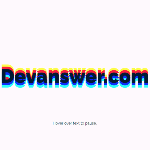
You can announce a news item with a effect to better inform the visitors of the website. Like the effect we provided in this post. This effect is performed with a jump upwards. Every few seconds, a glitch effect is applied to the text and the text jumps up at the same time. This attracts more user attention. In addition, if we hover the mouse cursor over the text. In any case, the text stops until we remove the mouse cursor from it and it continues to move.
HTML
<!-- This script got from www.devanswer.com -->
<div id="wrapper">
    <div id="container">
        <h1>Devanswer.com</h1>
        <p>Hover over text to pause.</p>
    </div>
</div><div id="bcl"><a style="font-size:8pt;text-decoration:none;" href="http://www.devanswer.com">Developers Answer</a></div>
CSS
@import url(https://fonts.googleapis.com/css?family=Raleway:400,700,900,400italic,700italic,900italic);
*,
:before,
:after {
    box-sizing: border-box;
}
body {
    background-color: #fdf9fd;
    color: #011a32;
    font: 16px/1.25 'Raleway', sans-serif;
    text-align: center;
}
#wrapper {
    margin-left: auto;
    margin-right: auto;
    max-width: 80em;
}
#container {
    display: flex;
    flex-direction: column;
    float: left;
    justify-content: center;
    min-height: 100vh;
    padding: 1em;
    width: 100%;
}
h1 {
    animation: text-shadow 1.5s ease-in-out infinite;
    font-size: 5em;
    font-weight: 900;
    line-height: 1;
}
h1:hover {
    animation-play-state: paused;
}
a {
    color: #024794;
}
a:hover {
    text-decoration: none;
}
@keyframes text-shadow {
    0% {
        transform: translateY(0);
        text-shadow:
            0 0 0 #0c2ffb,
            0 0 0 #2cfcfd,
            0 0 0 #fb203b,
            0 0 0 #fefc4b;
    }
    20% {
        transform: translateY(-1em);
        text-shadow:
            0 0.125em 0 #0c2ffb,
            0 0.25em 0 #2cfcfd,
            0 -0.125em 0 #fb203b,
            0 -0.25em 0 #fefc4b;
    }
    40% {
        transform: translateY(0.5em);
        text-shadow:
            0 -0.0625em 0 #0c2ffb,
            0 -0.125em 0 #2cfcfd,
            0 0.0625em 0 #fb203b,
            0 0.125em 0 #fefc4b;
    }
   60% {
        transform: translateY(-0.25em);
        text-shadow:
            0 0.03125em 0 #0c2ffb,
            0 0.0625em 0 #2cfcfd,
            0 -0.03125em 0 #fb203b,
            0 -0.0625em 0 #fefc4b;
    }
    80% {
        transform: translateY(0);
        text-shadow:
            0 0 0 #0c2ffb,
            0 0 0 #2cfcfd,
            0 0 0 #fb203b,
            0 0 0 #fefc4b;
    }
}
@media (prefers-reduced-motion: reduce) {
    * {
      animation: none !important;
      transition: none !important;
    }
}