Are you seeking for a way to show some information when a button is clicked? The following code is for you. It provides three different modals which are shown on a button click. You can use them just for showing texts or inserting images and create a big modal.
HTML
<!-- This script got from www.devanswer.com -->
<div class="demo-btns">
<header>
<h1>Material Design Modals</h1>
</header>
<div class="info">
<div class="buttons">
<p>
<a href="" data-modal="#modal" class="modal__trigger">Modal 1</a>
<a href="" data-modal="#modal2" class="modal__trigger">Modal 2</a>
<a href="" data-modal="#modal3" class="modal__trigger">Modal 3</a>
</p>
</div>
<p>Click a button to activate a modal.</p>
</div>
</div>
<div id="modal" class="modal modal__bg" role="dialog" aria-hidden="true">
<div class="modal__dialog">
<div class="modal__content">
<h1>Modal</h1>
<p>Lorem ipsum dolor sit amet, id est hinc vidit, usu veniam accusam te, usu quod persius ne. Vix te timeam vivendo, modus elitr at mea, has et aeque repudiare. Solum corrumpit has ne, te quo sonet munere praesent, eos no elitr platonem. Eum ex sumo magna fierent. Te vel liber nusquam, delectus efficiendi et nec.</p>
<a href="" class="modal__close demo-close">
<svg class="" viewBox="0 0 24 24"><path d="M19 6.41l-1.41-1.41-5.59 5.59-5.59-5.59-1.41 1.41 5.59 5.59-5.59 5.59 1.41 1.41 5.59-5.59 5.59 5.59 1.41-1.41-5.59-5.59z" /><path d="M0 0h24v24h-24z" fill="none" /></svg>
</a>
</div>
</div>
</div>
<div id="modal2" class="modal modal--align-top modal__bg" role="dialog" aria-hidden="true">
<div class="modal__dialog">
<div class="modal__content">
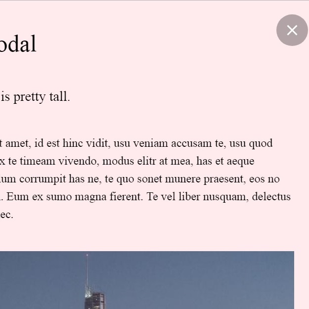
<h1>Big Modal</h1>
<h3>This modal is pretty tall.</h3>
<p>psum dolor sit amet, id est hinc vidit, usu veniam accusam te, usu quod persius ne. Vix te timeam vivendo, modus elitr at mea, has et aeque repudiare. Solum corrumpit has ne, te quo sonet munere praesent, eos no elitr platonem. Eum ex sumo magna fierent. Te vel liber nusquam, delectus efficiendi et nec.</p>
<p><img src="http://devanswer.com/codes/files/tower.jpg" alt="" /></p>
<p>His unum denique salutatus an. Viris similique reprimique ei usu. Sit cu posse adversarium, menandri indoctum scripserit has no. Oblique utroque ut vim, nonumy oblique sed et.</p>
<p>His unum denique salutatus an. Viris similique reprimique ei usu. Sit cu posse adversarium, menandri indoctum scripserit has no. Oblique utroque ut vim, nonumy oblique sed et.</p>
<a href="" class="modal__close demo-close">
<svg class="" viewBox="0 0 24 24"><path d="M19 6.41l-1.41-1.41-5.59 5.59-5.59-5.59-1.41 1.41 5.59 5.59-5.59 5.59 1.41 1.41 5.59-5.59 5.59 5.59 1.41-1.41-5.59-5.59z" /><path d="M0 0h24v24h-24z" fill="none" /></svg>
</a>
</div>
</div>
</div>
<div id="modal3" class="modal modal__bg" role="dialog" aria-hidden="true">
<div class="modal__dialog">
<div class="modal__content">
<h1>Modal 3</h1>
<p>Lorem ipsum dolor sit amet, id est hinc vidit, usu veniam accusam te, usu quod persius ne. Vix te timeam vivendo, modus elitr at mea, has et aeque repudiare. Solum corrumpit has ne, te quo sonet munere praesent, eos no elitr platonem. Eum ex sumo magna fierent. Te vel liber nusquam, delectus efficiendi et nec.</p>
<a href="" class="modal__close demo-close">
<svg class="" viewBox="0 0 24 24"><path d="M19 6.41l-1.41-1.41-5.59 5.59-5.59-5.59-1.41 1.41 5.59 5.59-5.59 5.59 1.41 1.41 5.59-5.59 5.59 5.59 1.41-1.41-5.59-5.59z" /><path d="M0 0h24v24h-24z" fill="none" /></svg>
</a>
</div>
</div>
</div><div id="bcl"><a style="font-size:8pt;text-decoration:none;" href="http://www.devanswer.com">Developers Answer</a></div>
CSS
* {
  box-sizing: border-box;
}
body {
  line-height: 1.5;
  font-family: 'Lato';
  -webkit-font-smoothing: antialiased;
  overflow-x: hidden;
}
h1,
h2,
h3,
p {
  font-weight: 300;
  margin: 0 0 2.4rem 0;
}
h1,
h2,
h3 {
  line-height: 1.3;
}
a {
  text-decoration: none;
  color: inherit;
  font-weight: 400;
}
/**
 * Material Modal CSS
 */
.modal {
  will-change: visibility, opacity;
  display: flex;
  align-items: center;
  justify-content: center;
  position: fixed;
  top: 0;
  left: 0;
  right: 0;
  bottom: 0;
  overflow-y: auto;
  overflow-x: hidden;
  z-index: 1000;
  visibility: hidden;
  opacity: 0;
  transition: all 0.5s cubic-bezier(0.23, 1, 0.32, 1);
  transition-delay: $modal-delay;
}
.modal--active {
  visibility: visible;
  opacity: 1;
}
.modal--align-top {
  align-items: flex-start;
}
.modal__bg {
  background: transparent;
}
.modal__dialog {
  max-width: 600px;
  padding: 1.2rem;
}
.modal__content {
  will-change: transform, opacity;
  position: relative;
  padding: 2.4rem;
  background: #ffebee;
  background-clip: padding-box;
  box-shadow: 0 12px 15px 0 rgba(0,0,0,0.25);
  opacity: 0;
  transition: all 0.25s cubic-bezier(0.23, 1, 0.32, 1);
}
.modal__content--active {
  opacity: 1;
}
.modal__close {
  z-index: 1100;
  cursor: pointer;
}
.modal__trigger {
  position: relative;
  display: inline-block;
  padding: 1.2rem 2.4rem;
  color: rgba(0,0,0,0.7);
  line-height: 1;
  cursor: pointer;
  background: #ffebee;
  box-shadow: 0 2px 5px 0 rgba(0,0,0,0.26);
  -webkit-tap-highlight-color: rgba(0,0,0,0);
  -webkit-user-select: none;
     -moz-user-select: none;
      -ms-user-select: none;
          user-select: none;
  transition: all 0.5s cubic-bezier(0.23, 1, 0.32, 1);
}
.modal__trigger--active {
  z-index: 10;
}
.modal__trigger:hover {
  background: #e5d3d6;
}
#modal__temp {
  will-change: transform, opacity;
  position: absolute;
  top: 0;
  left: 0;
  right: 0;
  bottom: 0;
  background: #ffebee;
  -webkit-transform: none;
          transform: none;
  opacity: 1;
  transition: opacity 0.1s ease-out, -webkit-transform 0.5s cubic-bezier(0.23, 1, 0.32, 1);
  transition: opacity 0.1s ease-out, transform 0.5s cubic-bezier(0.23, 1, 0.32, 1);
  transition: opacity 0.1s ease-out, transform 0.5s cubic-bezier(0.23, 1, 0.32, 1), -webkit-transform 0.5s cubic-bezier(0.23, 1, 0.32, 1);
}
/**
 * Demo specific CSS
 */
body {
  height: 100vh;
  background: #f44336;
}
img {
  max-width: 100%;
}
.demo-btns header {
  padding: 7vh 10vw;
  background: #ffebee;
  display: flex;
  align-items: center;
}
.demo-btns header h1 {
  margin: 0;
  color: rgba(0,0,0,0.54);
  font-weight: 300;
}
.demo-btns .info {
  background: #f44336;
  padding: 3vh 10vw;
  height: 70vh;
  display: flex;
  align-items: center;
  justify-content: center;
  flex-flow: column wrap;
}
.demo-btns p {
  text-align: center;
  color: #fff;
}
.demo-btns .link {
  font-size: 20px;
}
.demo-btns .modal__trigger {
  margin-right: 3px;
}
@media (max-width: 640px) {
  .demo-btns .modal__trigger {
    margin-bottom: 0.8rem;
  }
}
.demo-close {
  position: absolute;
  top: 0;
  right: 0;
  margin: 1.2rem;
  padding: 0.6rem;
  background: rgba(0,0,0,0.3);
  border-radius: 50%;
  transition: all 0.5s cubic-bezier(0.23, 1, 0.32, 1);
}
.demo-close svg {
  width: 24px;
  fill: #fff;
  pointer-events: none;
  vertical-align: top;
}
.demo-close:hover {
  background: rgba(0,0,0,0.6);
}
.logo {
  position: fixed;
  bottom: 3vh;
  right: 3vw;
  z-index: 2;
}
.logo img {
  width: 45px;
  -webkit-transform: rotate(0);
          transform: rotate(0);
  transition: all 0.5s cubic-bezier(0.23, 1, 0.32, 1);
}
.logo img:hover {
  -webkit-transform: rotate(180deg) scale(1.1);
          transform: rotate(180deg) scale(1.1);
}Javascript
  var Modal = function () {

  var trigger = $qsa('.modal__trigger'); // what you click to activate the modal
  var modals = $qsa('.modal'); // the entire modal (takes up entire window)
  var modalsbg = $qsa('.modal__bg'); // the entire modal (takes up entire window)
  var content = $qsa('.modal__content'); // the inner content of the modal
  var closers = $qsa('.modal__close'); // an element used to close the modal
  var w = window;
  var isOpen = false;
  var contentDelay = 400; // duration after you click the button and wait for the content to show
  var len = trigger.length;

  // make it easier for yourself by not having to type as much to select an element
  function $qsa(el) {
    return document.querySelectorAll(el);
  }

  var getId = function (event) {

    event.preventDefault();
    var self = this;
    // get the value of the data-modal attribute from the button
    var modalId = self.dataset.modal;
    var len = modalId.length;
    // remove the '#' from the string
    var modalIdTrimmed = modalId.substring(1, len);
    // select the modal we want to activate
    var modal = document.getElementById(modalIdTrimmed);
    // execute function that creates the temporary expanding div
    makeDiv(self, modal);
  };

  var makeDiv = function (self, modal) {

    var fakediv = document.getElementById('modal__temp');

    /**
                                                           * if there isn't a 'fakediv', create one and append it to the button that was
                                                           * clicked. after that execute the function 'moveTrig' which handles the animations.
                                                           */

    if (fakediv === null) {
      var div = document.createElement('div');
      div.id = 'modal__temp';
      self.appendChild(div);
      moveTrig(self, modal, div);
    }
  };

  var moveTrig = function (trig, modal, div) {
    var trigProps = trig.getBoundingClientRect();
    var m = modal;
    var mProps = m.querySelector('.modal__content').getBoundingClientRect();
    var transX, transY, scaleX, scaleY;
    var xc = w.innerWidth / 2;
    var yc = w.innerHeight / 2;

    // this class increases z-index value so the button goes overtop the other buttons
    trig.classList.add('modal__trigger--active');

    // these values are used for scale the temporary div to the same size as the modal
    scaleX = mProps.width / trigProps.width;
    scaleY = mProps.height / trigProps.height;

    scaleX = scaleX.toFixed(3); // round to 3 decimal places
    scaleY = scaleY.toFixed(3);


    // these values are used to move the button to the center of the window
    transX = Math.round(xc - trigProps.left - trigProps.width / 2);
    transY = Math.round(yc - trigProps.top - trigProps.height / 2);

    // if the modal is aligned to the top then move the button to the center-y of the modal instead of the window
    if (m.classList.contains('modal--align-top')) {
      transY = Math.round(mProps.height / 2 + mProps.top - trigProps.top - trigProps.height / 2);
    }


    // translate button to center of screen
    trig.style.transform = 'translate(' + transX + 'px, ' + transY + 'px)';
    trig.style.webkitTransform = 'translate(' + transX + 'px, ' + transY + 'px)';
    // expand temporary div to the same size as the modal
    div.style.transform = 'scale(' + scaleX + ',' + scaleY + ')';
    div.style.webkitTransform = 'scale(' + scaleX + ',' + scaleY + ')';


    window.setTimeout(function () {
      window.requestAnimationFrame(function () {
        open(m, div);
      });
    }, contentDelay);

  };

  var open = function (m, div) {

    if (!isOpen) {
      // select the content inside the modal
      var content = m.querySelector('.modal__content');
      // reveal the modal
      m.classList.add('modal--active');
      // reveal the modal content
      content.classList.add('modal__content--active');

      /**
                                                        * when the modal content is finished transitioning, fadeout the temporary
                                                        * expanding div so when the window resizes it isn't visible ( it doesn't
                                                        * move with the window).
                                                        */

      content.addEventListener('transitionend', hideDiv, false);

      isOpen = true;
    }

    function hideDiv() {
      // fadeout div so that it can't be seen when the window is resized
      div.style.opacity = '0';
      content.removeEventListener('transitionend', hideDiv, false);
    }
  };

  var close = function (event) {

    event.preventDefault();
    event.stopImmediatePropagation();

    var target = event.target;
    var div = document.getElementById('modal__temp');

    /**
                                                       * make sure the modal__bg or modal__close was clicked, we don't want to be able to click
                                                       * inside the modal and have it close.
                                                       */

    if (isOpen && target.classList.contains('modal__bg') || target.classList.contains('modal__close')) {

      // make the hidden div visible again and remove the transforms so it scales back to its original size
      div.style.opacity = '1';
      div.removeAttribute('style');

      /**
                                    * iterate through the modals and modal contents and triggers to remove their active classes.
                                       * remove the inline css from the trigger to move it back into its original position.
                                    */

      for (var i = 0; i < len; i++) {
        modals[i].classList.remove('modal--active');
        content[i].classList.remove('modal__content--active');
        trigger[i].style.transform = 'none';
        trigger[i].style.webkitTransform = 'none';
        trigger[i].classList.remove('modal__trigger--active');
      }

      // when the temporary div is opacity:1 again, we want to remove it from the dom
      div.addEventListener('transitionend', removeDiv, false);

      isOpen = false;

    }

    function removeDiv() {
      setTimeout(function () {
        window.requestAnimationFrame(function () {
          // remove the temp div from the dom with a slight delay so the animation looks good
          div.remove();
        });
      }, contentDelay - 50);
    }

  };

  var bindActions = function () {
    for (var i = 0; i < len; i++) {
      trigger[i].addEventListener('click', getId, false);
      closers[i].addEventListener('click', close, false);
      modalsbg[i].addEventListener('click', close, false);
    }
  };

  var init = function () {
    bindActions();
  };

  return {
    init: init };


}();

Modal.init();