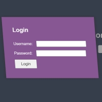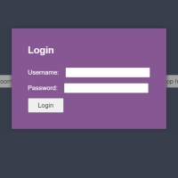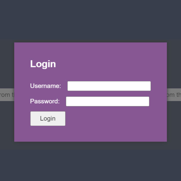
You can use pop-ups to prevent adding different pages to your website. The pop-up we have in this post is displayed by clicking on the button in the middle of the page. This pop-up brings the login form from top and left and at an angle to the center of the page. This login form is purple. And the titles on it are white.
HTML
<!-- This script got from www.devanswer.com -->
<script src='https://cdnjs.cloudflare.com/ajax/libs/jquery/2.1.3/jquery.min.js'></script>
<script src="https://cdnjs.cloudflare.com/ajax/libs/modernizr/2.8.3/modernizr.min.js" type="text/javascript"></script>
<link rel="stylesheet" href="https://cdnjs.cloudflare.com/ajax/libs/normalize/5.0.0/normalize.min.css">
<script src="https://cdnjs.cloudflare.com/ajax/libs/prefixfree/1.0.7/prefixfree.min.js"></script>
<div class="container">
  <h1>Modal Animations</h1>
  <ul class="buttons">
    <li><button data-modal="modal-flip-from-left">Flip from the left</button></li>
    <li><button data-modal="modal-flip-from-top">Flip from the top</button></li>
  </ul>
</div>
<div class="modal-background"></div>
<div id="modal-flip-from-left" class="modal">
  <div class="face-3d back-3d"></div>
  <div class="face-3d front-3d">
    <h2>Login</h2>
    <form action="#">
      <label>
        Username:
        <input type="text" name="username" value="">
      </label>
      <label>
        Password:
        <input type="password" name="password" value="">
      </label>
      <input type="submit" value="Login">
    </form>
  </div>
</div>
<div id="modal-flip-from-top" class="modal">
  <div class="face-3d back-3d"></div>
  <div class="face-3d front-3d">
    <h2>Login</h2>
    <form action="#">
      <label>
        Username:
        <input type="text" name="username" value="">
      </label>
      <label>
        Password:
        <input type="password" name="password" value="">
      </label>
      <input type="submit" value="Login">
    </form>
  </div>
</div>
<div id="bcl"><a style="font-size:8pt;text-decoration:none;" href="http://www.devanswer.com">Developers Answer</a></div>
CSS
#modal-flip-from-left {
  top: 50%;
  left: -200%;
  transform: translate(-50%, -50%);
}
#modal-flip-from-left.show {
  left: 50%;
  animation: modal-flip-from-left-show 1s;
}
#modal-flip-from-left.hide {
  left: -200%;
  transition: all 1s cubic-bezier(0.68, -0.55, 0.265, 1.55);
}
@keyframes modal-flip-from-left-show {
  0% {
    left: -200%;
    transform: translate(-50%, -50%) rotateY(-180deg);
  }
  80% {
    transform: translate(-50%, -50%) rotateY(-180deg);
  }
  90% {
    left: 50%;
    transform: translate(-50%, -50%) rotateY(-90deg);
  }
  100% {
    transform: translate(-50%, -50%) rotateY(0deg);
  }
}
#modal-flip-from-top {
  top: -200%;
  left: 50%;
  transform: translate(-50%, -50%);
}
#modal-flip-from-top.show {
  top: 50%;
  animation: modal-flip-from-top-show 1s;
}
#modal-flip-from-top.hide {
  top: -200%;
  transition: all 1s cubic-bezier(0.68, -0.55, 0.265, 1.55);
}
@keyframes modal-flip-from-top-show {
  0% {
    top: -200%;
    transform: translate(-50%, -50%) rotateX(-180deg);
  }
  80% {
    transform: translate(-50%, -50%) rotateX(-180deg);
  }
  90% {
    top: 50%;
    transform: translate(-50%, -50%) rotateX(-90deg);
  }
  100% {
    transform: translate(-50%, -50%) rotateX(0deg);
  }
}
@keyframes bounce-out {
  0% {
    top: -200%;
  }
  25% {
    top: 50%;
  }
  40% {
    top: 35%;
  }
  55% {
    top: 50%;
  }
  70% {
    top: 42%;
  }
  85% {
    top: 50%;
  }
  95% {
    top: 48%;
  }
  100% {
    top: 50%;
  }
}
/* Extra stuff just to make the demo pretty. */
body {
  padding: 50px 0;
  color: #fff;
  font-family: "Helvetica", serif;
  font-size: 14px;
  text-align: center;
  line-height: 24px;
  background: #273552;
  perspective: 2500px;
  transform-style: preserve-3d;
}
h1 {
  margin-bottom: 75px;
  font-size: 55px;
  line-height: 1.2;
}
h2 {
  margin: 0 0 25px;
}
footer {
  margin: 75px 0 35px;
}
a {
  color: #13A865;
  text-decoration: none;
}
a:hover {
  color: #22e68e;
}
form label {
  display: block;
  margin-bottom: 10px;
}
form input {
  margin-left: 10px;
}
form input[type=submit] {
  margin: 0;
  padding: 6px 20px;
  color: #333;
}
.buttons {
  width: 80%;
  margin: 0 auto;
  padding: 0;
  list-style: none;
  overflow: hidden;
}
.buttons li {
  width: 50%;
  float:left;
  margin: 0 auto 30px;
  padding-bottom: 30px;
}
.buttons button {
  padding: 6px 20px;
  background: #fff;
  border: none;
  border-radius: 4px;
  color: #333;
}
.modal-background {
  position: absolute;
  top: 0;
  right: 0;
  bottom: 0;
  left: 0;
  min-height: 100vh;
  background: rgba(69, 69, 69, 0.7);
  opacity: 0;
  pointer-events: none;
}
.modal-background.show {
  display: block;
  opacity: 1;
  pointer-events: auto;
  animation: fadein 0.8s;
}
.modal-background.hide {
  animation: fadeout 0.8s;
}
@keyframes fadein {
  from {
    opacity: 0;
  }
  to {
    opacity: 1;
  }
}
@keyframes fadeout {
  from {
    opacity: 1;
  }
  to {
    opacity: 0;
  }
}
.modal {
  position: absolute;
  padding: 35px;
  box-shadow: 0px 0px 8px 0px #333;
  background: #875794;
  color: #fff;
  text-align: left;
  transform-style: preserve-3d;
}
.modal .face-3d {
  backface-visibility: hidden;
}
.modal .back-3d {
  position: absolute;
  top: 0;
  right: 0;
  bottom: 0;
  left: 0;
  content: "";
  background: #875794;
  transform: rotateY(180deg);
}Javascript
(function($) {
  $('.buttons button').on('click', function() {
    $('.modal-background').addClass('show').removeClass('hide');
    $('#'+$(this).data('modal')).addClass('show').removeClass('hide');
  });
  $('.modal-background').on('click', function(e) {
    e.preventDefault();
    $(this).removeClass('show').addClass('hide');
    $('.modal.show').removeClass('show').addClass('hide');
  });
  $('.modal').on('click', function(e) {
    e.preventDefault();
  });
})(jQuery);