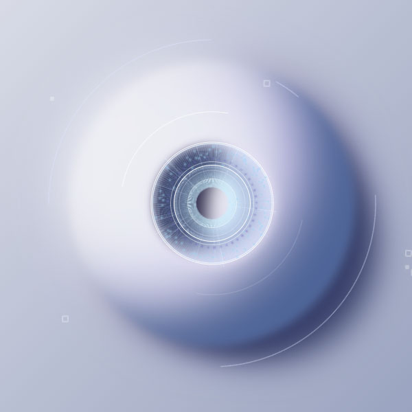
You can use this animated background for parts of your website that need user authentication, such as user login and registration. In this background, an animation such as an electronic eye is displayed to identify the user's eye. And after a few moments, this eye closes. This animation is constantly repeated. The background of this electronic eye is in this white code.
HTML
<!-- This script got from www.devanswer.com -->
<div class="eye"></div>
<div class="circle-1"></div>
<div class="circle-2"></div>
<div class="circle-3"></div>
<div class="circle-4"></div>
<div class="circle-5"></div>
<div class="circle-6"></div>
<div class="circle-7"></div>
<div class="circle-8"></div>
<div class="circle-9"></div>
<div class="circle-10"></div>
<div class="circle-11"></div>
<div class="circle-12"></div>
<div class="circle-13"></div>
<div class="circle-14"></div>
<div class="glitch"></div>
<div class="fragment-1"></div>
<div class="fragment-2"></div>
<div class="fragment-3"></div>
<svg width="190" height="190" viewBox="0 0 190 190" fill="none" xmlns="http://www.w3.org/2000/svg">
	<defs>
		<clipPath id='bagel1'>
			<path fill-rule="evenodd" clip-rule="evenodd" d="M95 190C147.467 190 190 147.467 190 95C190 42.533 147.467 0 95 0C42.533 0 0 42.533 0 95C0 147.467 42.533 190 95 190ZM95 120C108.807 120 120 108.807 120 95C120 81.1929 108.807 70 95 70C81.1929 70 70 81.1929 70 95C70 108.807 81.1929 120 95 120Z" />
		</clipPath>
		<clipPath id='bagel2'>
			<path fill-rule="evenodd" clip-rule="evenodd" d="M71 142C110.212 142 142 110.212 142 71C142 31.7878 110.212 0 71 0C31.7878 0 0 31.7878 0 71C0 110.212 31.7878 142 71 142ZM71 139C108.555 139 139 108.555 139 71C139 33.4446 108.555 3 71 3C33.4446 3 3 33.4446 3 71C3 108.555 33.4446 139 71 139Z" />
		</clipPath>
		<clipPath id='bagel3'>
			<path fill-rule="evenodd" clip-rule="evenodd" d="M60 120C93.1372 120 120 93.1372 120 60C120 26.8628 93.1372 0 60 0C26.8628 0 0 26.8628 0 60C0 93.1372 26.8628 120 60 120ZM60 115C90.3757 115 115 90.3757 115 60C115 29.6243 90.3757 5 60 5C29.6243 5 5 29.6243 5 60C5 90.3757 29.6243 115 60 115Z" />
		</clipPath>
		<clipPath id='bagel4'>
			<path fill-rule="evenodd" clip-rule="evenodd" d="M38 76C58.9868 76 76 58.9868 76 38C76 17.0132 58.9868 0 38 0C17.0132 0 0 17.0132 0 38C0 58.9868 17.0132 76 38 76ZM38 72C56.7777 72 72 56.7776 72 38C72 19.2224 56.7777 4 38 4C19.2223 4 4 19.2224 4 38C4 56.7776 19.2223 72 38 72Z" />
		</clipPath>
	</defs>
</svg><div id="bcl"><a style="font-size:8pt;text-decoration:none;" href="http://www.devanswer.com">Developers Answer</a></div>
CSS
html, body {
	padding: 0;
	margin: 0;
}
body {
	position: relative;
	width: 100vw;
	min-width: 800px;
	height: 100vh;
	min-height: 600px;
	background: linear-gradient(-45deg, #8691b3, #edeef3);
}
body *, body *:before, body *:after {
	content: '';
	position: absolute;
	top: 50%;
	left: 50%;
}
.eye {
	width: 332px;
	height: 332px;
	transform: translate(-50%, -50%);
	border-radius: 50%;
	background: #EBEDF3;
	filter: blur(5px);
	animation: eyeAnimation 4s cubic-bezier(1, 0, 1, 1) infinite;
}
@keyframes eyeAnimation {
	0%, 33%, 100% {
		box-shadow: inset -8px -13px 20px -10px rgba(230, 230, 236, 0.04), 64px 55px 40px -40px #38406A, 20px 18px 30px -10px #38406A, inset -70px -50px 60px -30px #4b6398, inset -90px -90px 70px -90px #697398, inset -70px -50px 100px -40px #697398, inset 80px 50px 80px -50px #eeeef3, -25px -15px 50px -10px #F6F6FB, 14px -1px 50px -10px #7e7ea9, 1px 9px 50px -10px #7e7ea9, inset -90px 40px 60px -20px rgba(116, 66, 255, 0.1), inset -90px -120px 60px -20px rgba(116, 66, 255, 0.1);
		transform: translate(-50%, -50%) scale(1.25);
	}
	65% {
		box-shadow: inset -8px -13px 60px -10px rgba(230, 230, 236, 0.2), 44px 35px 20px -20px #687294, 11px 9px 9px -4px #6e799d, inset -100px -70px 40px -110px #6A789C, inset -90px -90px 70px -90px #697398, inset -70px -50px 100px -40px #697398, inset 80px 50px 80px -50px #eeeef3, -25px -15px 30px -10px #F6F6FB;
		transform: translate(-50%, -50%) scale(1);
	}
}
.eye::after {
	width: 160px;
	height: 160px;
	border-radius: 50%;
	box-shadow: inset -50px -20px 30px 0px #e7e2f5, inset 100px 10px 20px -27px #2f2c4c, 0px 0px 10px 7px rgba(231, 226, 245, 1);
	animation: pupilAnimationSize 4s cubic-bezier(1, 0, 1, 1) infinite, pupilAnimationView 4s ease infinite;
}
@keyframes pupilAnimationSize {
	0%, 30%, 100% {
		transform: translate(-50%, -50%) scale(0.85);
	}
	40%, 90% {
		transform: translate(-50%, -50%) scale(0.5);
	}
}
@keyframes pupilAnimationView {
	0%, 30%, 100% {
		box-shadow: inset -50px -20px 30px 0px #e7e2f5, inset 100px 10px 20px -27px #2f2c4c, 0px 0px 10px 7px rgba(231, 226, 245, 1);
	}
	60%, 66% {
		box-shadow: inset -50px -20px 30px 0px rgba(231, 226, 245, 0), inset 10px 10px 70px -27px rgba(47, 44, 76, 0), 0px 0px 10px 7px hsla(256, 49%, 92%, 0);
	}
	90% {
		box-shadow: inset -50px -20px 30px 0px #e7e2f5, inset 100px 10px 20px -27px #2f2c4c, 0px 0px 10px 7px rgba(231, 226, 245, 1);
	}
}
.circle-1 {
	width: 475px;
	height: 475px;
	border-radius: 50%;
	border: 1px solid transparent;
	border-right-color: rgba(223, 228, 255, 0.6);
	animation: circle1AnimationOpacity 4s ease infinite, circle1AnimationMove 4s ease infinite;
}
@keyframes circle1AnimationMove {
	00%, 100% {
		transform: translate(-50%, -50%) rotate(49deg);
	}
	07% {
		transform: translate(-50%, -50%) rotate(38deg);
	}
	12%, 19%, 68% {
		transform: translate(-50%, -50%) rotate(42deg);
	}
	26%, 30% {
		transform: translate(-50%, -50%) rotate(82deg);
	}
	73% {
		transform: translate(-50%, -50%) rotate(34deg);
	}
	87%, 92% {
		transform: translate(-50%, -50%) rotate(69deg);
	}
	94% {
		transform: translate(-50%, -50%) rotate(65deg);
	}
}
@keyframes circle1AnimationOpacity {
	00%, 27%, 73%, 100% {
		opacity: 1;
	}
	30%, 70% {
		opacity: 0;
	}
}
.circle-2 {
	width: 475px;
	height: 475px;
	border-radius: 50%;
	border: 1px solid transparent;
	border-right-color: rgba(223, 228, 255, 0.6);
	animation: circle2AnimationOpacity 4s ease infinite, circle2AnimationMove 4s ease infinite;
}
@keyframes circle2AnimationMove {
	0%, 100% {
		transform: translate(-50%, -50%) rotate(229deg);
	}
	9% {
		transform: translate(-50%, -50%) rotate(220deg);
	}
	14%, 21% {
		transform: translate(-50%, -50%) rotate(225deg);
	}
	29%, 67% {
		transform: translate(-50%, -50%) rotate(262deg);
	}
	82% {
		transform: translate(-50%, -50%) rotate(241deg);
	}
	90%, 94% {
		transform: translate(-50%, -50%) rotate(249deg);
	}
	99% {
		transform: translate(-50%, -50%) rotate(245deg);
	}
}
@keyframes circle2AnimationOpacity {
	0%, 27%, 79%, 100% {
		opacity: 1;
	}
	30%, 76% {
		opacity: 0;
	}
}
.circle-3 {
	left: calc(50% + 93px);
	top: calc(50% - 189px);
	width: 106px;
	height: 280px;
	overflow: hidden;
}
.circle-3::before {
	left: -275%;
	top: -4%;
	width: 393px;
	height: 393px;
	border-radius: 50%;
	border: 1px solid transparent;
	border-right-color: rgba(223, 228, 255, 0.6);
	animation: circle3Animation 4s ease infinite;
}
@keyframes circle3Animation {
	0% {
		transform: rotate(-3deg);
	}
	20% {
		transform: rotate(-107deg);
	}
	79% {
		transform: rotate(-286deg);
	}
	100% {
		transform: rotate(-364deg);
	}
}
.circle-4 {
	width: 295px;
	height: 295px;
	border-radius: 50%;
	border: 1px solid transparent;
	border-right-color: rgb(251, 251, 251);
	border-left-color: rgba(251, 251, 251, 0.2);
	animation: circle4AnimationMove 4s cubic-bezier(1, 0, 1, 1) infinite, circle4AnimationOpacity 4s ease infinite;
}
@keyframes circle4AnimationMove {
	0%, 100% {
		transform: translate(-50%, -50%) rotate(219deg) scale(1);
	}
	6% {
		transform: translate(-50%, -50%) rotate(221deg) scale(0.9);
	}
	16% {
		transform: translate(-50%, -50%) rotate(302deg) scale(0.9);
	}
	22% {
		transform: translate(-50%, -50%) rotate(307deg) scale(0.9);
	}
	29% {
		transform: translate(-50%, -50%) rotate(312deg) scale(0.93);
	}
	33% {
		transform: translate(-50%, -50%) rotate(310deg) scale(0.93);
	}
	36% {
		transform: translate(-50%, -50%) rotate(300deg) scale(0.7);
	}
	39% {
		transform: translate(-50%, -50%) rotate(220deg) scale(0.92);
	}
	50%, 57% {
		transform: translate(-50%, -50%) rotate(248deg) scale(0.92);
	}
	66% {
		transform: translate(-50%, -50%) rotate(225deg) scale(0.92);
	}
	73%, 81% {
		transform: translate(-50%, -50%) rotate(243deg) scale(0.92);
	}
	93% {
		transform: translate(-50%, -50%) rotate(215deg) scale(1);
	}
}
@keyframes circle4AnimationOpacity {
	00%, 33%, 50%, 100% {
		opacity: 1;
	}
	36%, 39% {
		opacity: 0;
	}
}
.circle-5 {
	width: 100px;
	height: 100px;
	transform: translate(-50%, -50%);
	animation: circle5AnimationSize 4s cubic-bezier(1, 0, 1, 1) infinite, circle5AnimationView 4s ease infinite;
}
.circle-5::before {
	width: 173px;
	height: 173px;
	border-radius: 50%;
	border: 1px solid rgb(251, 251, 251);
	transform: translate(-50%, -50%);
}
.circle-5::after {
	width: 177px;
	height: 177px;
	border-radius: 50%;
	border: 1px solid rgb(251, 251, 251);
	transform: translate(-50%, -50%);
}
@keyframes circle5AnimationSize {
	0%, 38%, 82.82%, 100% {
		transform: translate(-50%, -50%) scale(1);
	}
	45%, 75.44% {
		transform: translate(-50%, -50%) scale(0.7);
	}
}
@keyframes circle5AnimationView {
	0%, 5.7%, 7.4%, 9.8%, 11.5%, 14%, 15.6%, 18.9%, 21.3%, 23.8%, 25.4%, 28.7%, 35.3%, 42%, 77.9%, 82.7%, 83.6%, 85.2%, 86.1%, 91.8%, 93.5%, 97.6%, 100% {
		opacity: 1;
	}
	2.5%, 6.6%, 8.2%, 10.7%, 14.8%, 18%, 20.5%, 22.1%, 24.6%, 27.9%, 36%, 88.6% {
		opacity: 0.5;
	}
	47%, 77.8%, 82.8%, 83.5%, 85.3%, 86%, 90.2%, 92.7%, 96.8%, 99.2% {
		opacity: 0;
	}
}
.circle-6 {
	top: 50%;
	left: 50%;
	width: 190px;
	height: 190px;
	background: repeating-conic-gradient(from 0deg, rgba(179, 221, 255, 0.4) 0deg 1deg, transparent 1deg 2deg);
	clip-path: url(#bagel1);
	border-radius: 50%;
	animation: circle6Animation 4s cubic-bezier(1, 0, 1, 1) infinite;
}
@keyframes circle6Animation {
	0% {
		transform: translate(-50%, -50%) scale(1);
	}
	8%, 35% {
		transform: translate(-50%, -50%) scale(0.93);
		opacity: 1;
	}
	40%, 90% {
		transform: translate(-50%, -50%) scale(0.2);
		opacity: 0;
	}
	95%, 100% {
		transform: translate(-50%, -50%) scale(1);
		opacity: 1;
	}
}
.circle-7 {
	top: 50%;
	left: 50%;
	width: 142px;
	height: 142px;
	filter: blur(1px);
	animation: circle6Animation 4s -0.1s cubic-bezier(1, 0, 1, 1) infinite;
}
.circle-7::before {
	top: 0;
	left: 0;
	width: 100%;
	height: 100%;
	background: repeating-conic-gradient(from 0deg, rgba(114, 87, 187, 0.6) 0deg 2deg, transparent 2deg 8deg);
	clip-path: url(#bagel2);
	border-radius: 50%;
}
.circle-8 {
	top: 50%;
	left: 50%;
	width: 120px;
	height: 120px;
	background: repeating-conic-gradient(from 0deg, rgba(236, 247, 255, 0.68) 0deg 1deg, transparent 1deg 2deg);
	clip-path: url(#bagel3);
	border-radius: 50%;
	animation: circle6Animation 4s -0.13s cubic-bezier(1, 0, 1, 1) infinite;
}
.circle-9 {
	top: 50%;
	left: 50%;
	width: 76px;
	height: 76px;
	background: repeating-conic-gradient(from 0deg, rgba(236, 247, 255, 0.68) 0deg 1deg, transparent 1deg 2deg);
	clip-path: url(#bagel4);
	border-radius: 50%;
	animation: circle6Animation 4s -0.16s cubic-bezier(1, 0, 1, 1) infinite;
}
.circle-10 {
	top: 50%;
	left: 50%;
	width: 190px;
	height: 190px;
	background: radial-gradient(rgba(230, 245, 255, 0.6), rgba(201, 243, 255, 0.5), rgba(74, 105, 160, 0.3), transparent 70%);
	clip-path: url(#bagel1);
	border-radius: 50%;
	animation: circle10Animation 4s cubic-bezier(1, 0, 1, 1) infinite;
}
@keyframes circle10Animation {
	0% {
		transform: translate(-50%, -50%) scale(1);
	}
	4%, 30% {
		transform: translate(-50%, -50%) scale(0.93);
		opacity: 1;
	}
	35%, 93% {
		transform: translate(-50%, -50%) scale(0);
		opacity: 0;
	}
	98%, 100% {
		transform: translate(-50%, -50%) scale(1);
		opacity: 1;
	}
}
.circle-11 {
	top: 50%;
	left: 50%;
	width: 190px;
	height: 190px;
	background: repeating-conic-gradient(from 0deg, rgba(229, 243, 255, 0.1) 0deg 1deg, transparent 1deg 8deg, rgba(229, 243, 255, 0.3) 8deg 9deg, transparent 9deg 10deg, rgba(229, 243, 255, 0.1) 10deg 11deg, transparent 11deg 72deg);
	clip-path: url(#bagel1);
	border-radius: 50%;
	animation: circle11Animation 4s cubic-bezier(1, 0, 1, 1) infinite;
}
@keyframes circle11Animation {
	0%, 98%, 100% {
		transform: translate(-50%, -50%) rotate(0deg);
		opacity: 1;
	}
	15% {
		transform: translate(-50%, -50%) rotate(45deg);
	}
	25% {
		transform: translate(-50%, -50%) rotate(-10deg);
	}
	30% {
		opacity: 1;
	}
	35% {
		transform: translate(-50%, -50%) rotate(-20deg);
		opacity: 0;
	}
	93% {
		transform: translate(-50%, -50%) rotate(80deg);
		opacity: 0;
	}
}
.circle-12 {
	top: 50%;
	left: 50%;
	width: 190px;
	height: 190px;
	background: repeating-conic-gradient(from 0deg, rgba(208, 233, 255, 0.2) 20deg 21deg, transparent 21deg 40deg, rgba(192, 223, 249, 0.25) 40deg 41deg, transparent 41deg 43deg, rgba(179, 220, 255, 0.15) 43deg 44deg, transparent 44deg 76deg);
	clip-path: url(#bagel1);
	border-radius: 50%;
	animation: circle12Animation 4s cubic-bezier(1, 0, 1, 1) infinite;
}
@keyframes circle12Animation {
	0%, 96%, 100% {
		transform: translate(-50%, -50%) rotate(0deg);
		opacity: 1;
	}
	10% {
		transform: translate(-50%, -50%) rotate(45deg);
	}
	25% {
		transform: translate(-50%, -50%) rotate(-45deg);
	}
	30% {
		opacity: 1;
	}
	35% {
		transform: translate(-50%, -50%) rotate(50deg);
		opacity: 0;
	}
	93% {
		transform: translate(-50%, -50%) rotate(-90deg);
		opacity: 0;
	}
}
.circle-13 {
	width: 100px;
	height: 100px;
	transform: translate(-50%, -50%);
	animation: circle13AnimationSize 4s cubic-bezier(1, 0, 1, 1) infinite, circle13AnimationView 4s ease infinite;
}
.circle-13::before {
	width: 110px;
	height: 110px;
	border-radius: 50%;
	border: 1px solid rgb(251, 251, 251);
	transform: translate(-50%, -50%);
}
.circle-13::after {
	width: 120px;
	height: 120px;
	border-radius: 50%;
	border: 1px solid rgba(251, 251, 251, 0.5);
	transform: translate(-50%, -50%);
}
@keyframes circle13AnimationSize {
	0%, 32%, 86%, 100% {
		transform: translate(-50%, -50%) scale(1);
	}
	38%, 82% {
		transform: translate(-50%, -50%) scale(0.2);
	}
}
@keyframes circle13AnimationView {
	/* подвигать */
	0% {
		opacity: 1;
	}
	2.5% {
		opacity: 0.5;
	}
	5.7% {
		opacity: 1;
	}
	6.6% {
		opacity: 0.5;
	}
	7.4% {
		opacity: 1;
	}
	8.2% {
		opacity: 0.5;
	}
	9.8% {
		opacity: 1;
	}
	10.7% {
		opacity: 0.5;
	}
	11.5%, 14% {
		opacity: 1;
	}
	14.8% {
		opacity: 0.5;
	}
	15.6% {
		opacity: 1;
	}
	18% {
		opacity: 0.5;
	}
	18.9% {
		opacity: 1;
	}
	20.5% {
		opacity: 0.5;
	}
	21.3% {
		opacity: 1;
	}
	22.1% {
		opacity: 0.5;
	}
	23.8% {
		opacity: 1;
	}
	24.6% {
		opacity: 0.5;
	}
	25.4% {
		opacity: 1;
	}
	27.9% {
		opacity: 0.5;
	}
	28.7%, 32% {
		opacity: 1;
	}
	38% {
		opacity: 0;
	}
	82% {
		opacity: 0;
	}
	86% {
		opacity: 1;
	}
	88.6% {
		opacity: 0.5;
	}
	90.2% {
		opacity: 0;
	}
	91.8% {
		opacity: 1;
	}
	92.7% {
		opacity: 0;
	}
	93.5% {
		opacity: 1;
	}
	96.8% {
		opacity: 0;
	}
	97.6% {
		opacity: 1;
	}
	99.2% {
		opacity: 0;
	}
	100% {
		opacity: 1;
	}
}
.circle-14 {
	width: 100px;
	height: 100px;
	transform: translate(-50%, -50%);
	animation: circle13AnimationSize 4s -0.15s cubic-bezier(1, 0, 1, 1) infinite, circle14AnimationView 4s ease infinite;
}
.circle-14::before {
	width: 70px;
	height: 70px;
	border-radius: 50%;
	border: 1px solid rgba(251, 251, 251, 0.5);
	transform: translate(-50%, -50%);
}
.circle-14::after {
	width: 95px;
	height: 95px;
	border-radius: 50%;
	border: 1px solid rgba(251, 251, 251, 0.3);
	transform: translate(-50%, -50%);
}
@keyframes circle14AnimationView {
	/* подвигать */
	0% {
		opacity: 1;
	}
	2.5% {
		opacity: 0.5;
	}
	5.7% {
		opacity: 1;
	}
	6.6% {
		opacity: 0.5;
	}
	7.4% {
		opacity: 1;
	}
	8.2% {
		opacity: 0.5;
	}
	9.8% {
		opacity: 1;
	}
	10.7% {
		opacity: 0.5;
	}
	11.5%, 14% {
		opacity: 1;
	}
	14.8% {
		opacity: 0.5;
	}
	15.6% {
		opacity: 1;
	}
	18% {
		opacity: 0.5;
	}
	18.9% {
		opacity: 1;
	}
	20.5% {
		opacity: 0.5;
	}
	21.3% {
		opacity: 1;
	}
	22.1% {
		opacity: 0.5;
	}
	23.8% {
		opacity: 1;
	}
	24.6% {
		opacity: 0.5;
	}
	25.4% {
		opacity: 1;
	}
	27.9% {
		opacity: 0.5;
	}
	28.7%, 32% {
		opacity: 1;
	}
	38% {
		opacity: 0;
	}
	82% {
		opacity: 0;
	}
	86% {
		opacity: 1;
	}
	88.6% {
		opacity: 0.5;
	}
	90.2% {
		opacity: 0;
	}
	91.8% {
		opacity: 1;
	}
	92.7% {
		opacity: 0;
	}
	93.5% {
		opacity: 1;
	}
	96.8% {
		opacity: 0;
	}
	97.6% {
		opacity: 1;
	}
	99.2% {
		opacity: 0;
	}
	100% {
		opacity: 1;
	}
}
.glitch {
	width: 2px;
	height: 2px;
	box-shadow: -21px -75px #8AC7ED, -16px -78px #8AC7ED, -8px -78px #8AC7ED, -5px -77px #8AC7ED, -2px -79px #8AC7ED, 10px -79px #8AC7ED, 25px -73px #8AC7ED, 41px -71px #8AC7ED, 44px -68px #8AC7ED, -26px -72px #8AC7ED, -45px -62px #8AC7ED, -65px -57px #8AC7ED, 59px -49px #8AC7ED, 67px -52px #8AC7ED, 37px -69px #8AC7ED, 43px -62px #8AC7ED, 39px -62px #8AC7ED, 17px -71px #8AC7ED, 28px -67px #8AC7ED, 65px -32px #8AC7ED, 73px -24px #8AC7ED, 67px -25px #8AC7ED, 76px -14px #8AC7ED, 70px -18px #8AC7ED, 82px 21px #8AC7ED, 79px 20px #8AC7ED, 72px 15px #8AC7ED, 55px 45px #8AC7ED, 48px 51px #8AC7ED, 43px 58px #8AC7ED, 37px 57px #8AC7ED, 36px 63px #8AC7ED, 32px 76px #8AC7ED, 35px 70px #8AC7ED, 25px 71px #8AC7ED, 20px 75px #8AC7ED, 5px 70px #8AC7ED, 7px 75px #8AC7ED, -5px 79px #8AC7ED, 3px 78px #8AC7ED, -1px 77px #8AC7ED, -13px 78px #8AC7ED, -15px 82px #8AC7ED, -20px 76px #8AC7ED, -18px 78px #8AC7ED, -17px 75px #8AC7ED, -22px 72px #8AC7ED, -34px 72px #8AC7ED, -36px 69px #8AC7ED, -43px 74px #8AC7ED, -41px 72px #8AC7ED, -42px 69px #8AC7ED, -38px 66px #8AC7ED, -43px 63px #8AC7ED, -37px 61px #8AC7ED, -56px 66px #8AC7ED, -54px 61px #8AC7ED, -58px 54px #8AC7ED, -60px 41px #8AC7ED, -50px 56px #8AC7ED, -54px 57px #8AC7ED, -60px 52px #8AC7ED, -74px 35px #8AC7ED, -76px 18px #8AC7ED, -74px 25px #8AC7ED, -69px 23px #8AC7ED, -84px 13px #8AC7ED, -73px 3px #8AC7ED, -80px -1px #8AC7ED, -79px -4px #8AC7ED, -79px -7px #8AC7ED, -70px -11px #8AC7ED, -67px -23px #8AC7ED, -84px -13px #8AC7ED, -71px -42px #8AC7ED, -61px -49px #8AC7ED, -58px -43px #8AC7ED, -55px -50px #8AC7ED, -32px -72px #8AC7ED, -80px -30px #8AC7ED, -59px -20px #8AC7ED, -79px 12px #8AC7ED, -76px 1px #8AC7ED, 8px 57px #8AC7ED, 59px 36px #8AC7ED, 60px 46px #8AC7ED, 54px 59px #8AC7ED, 44px 52px #8AC7ED, -31px 20px #8AC7ED, -56px 2px #8AC7ED, 47px 35px #8AC7ED, 70px 6px #8AC7ED, 60px -2px #8AC7ED, -21px -75px 0 1px rgba(255, 255, 255, 0.1), -16px -78px 0 1px rgba(255, 255, 255, 0.1), -8px -78px 0 1px rgba(255, 255, 255, 0.1), -5px -77px 0 1px rgba(255, 255, 255, 0.1), -2px -79px 0 1px rgba(255, 255, 255, 0.1), 10px -79px 0 1px rgba(255, 255, 255, 0.1), 25px -73px 0 1px rgba(255, 255, 255, 0.1), 41px -71px 0 1px rgba(255, 255, 255, 0.1), 44px -68px 0 1px rgba(255, 255, 255, 0.1), -26px -72px 0 1px rgba(255, 255, 255, 0.1), -45px -62px 0 1px rgba(255, 255, 255, 0.1), -65px -57px 0 1px rgba(255, 255, 255, 0.1), 59px -49px 0 1px rgba(255, 255, 255, 0.1), 67px -52px 0 1px rgba(255, 255, 255, 0.1), 37px -69px 0 1px rgba(255, 255, 255, 0.1), 43px -62px 0 1px rgba(255, 255, 255, 0.1), 39px -62px 0 1px rgba(255, 255, 255, 0.1), 17px -71px 0 1px rgba(255, 255, 255, 0.1), 28px -67px 0 1px rgba(255, 255, 255, 0.1), 65px -32px 0 1px rgba(255, 255, 255, 0.1), 73px -24px 0 1px rgba(255, 255, 255, 0.1), 67px -25px 0 1px rgba(255, 255, 255, 0.1), 76px -14px 0 1px rgba(255, 255, 255, 0.1), 70px -18px 0 1px rgba(255, 255, 255, 0.1), 82px 21px 0 1px rgba(255, 255, 255, 0.1), 79px 20px 0 1px rgba(255, 255, 255, 0.1), 72px 15px 0 1px rgba(255, 255, 255, 0.1), 55px 45px 0 1px rgba(255, 255, 255, 0.1), 48px 51px 0 1px rgba(255, 255, 255, 0.1), 43px 58px 0 1px rgba(255, 255, 255, 0.1), 37px 57px 0 1px rgba(255, 255, 255, 0.1), 36px 63px 0 1px rgba(255, 255, 255, 0.1), 32px 76px 0 1px rgba(255, 255, 255, 0.1), 35px 70px 0 1px rgba(255, 255, 255, 0.1), 25px 71px 0 1px rgba(255, 255, 255, 0.1), 20px 75px 0 1px rgba(255, 255, 255, 0.1), 5px 70px 0 1px rgba(255, 255, 255, 0.1), 7px 75px 0 1px rgba(255, 255, 255, 0.1), -5px 79px 0 1px rgba(255, 255, 255, 0.1), 3px 78px 0 1px rgba(255, 255, 255, 0.1), -1px 77px 0 1px rgba(255, 255, 255, 0.1), -13px 78px 0 1px rgba(255, 255, 255, 0.1), -15px 82px 0 1px rgba(255, 255, 255, 0.1), -20px 76px 0 1px rgba(255, 255, 255, 0.1), -18px 78px 0 1px rgba(255, 255, 255, 0.1), -17px 75px 0 1px rgba(255, 255, 255, 0.1), -22px 72px 0 1px rgba(255, 255, 255, 0.1), -34px 72px 0 1px rgba(255, 255, 255, 0.1), -36px 69px 0 1px rgba(255, 255, 255, 0.1), -43px 74px 0 1px rgba(255, 255, 255, 0.1), -41px 72px 0 1px rgba(255, 255, 255, 0.1), -42px 69px 0 1px rgba(255, 255, 255, 0.1), -38px 66px 0 1px rgba(255, 255, 255, 0.1), -43px 63px 0 1px rgba(255, 255, 255, 0.1), -37px 61px 0 1px rgba(255, 255, 255, 0.1), -56px 66px 0 1px rgba(255, 255, 255, 0.1), -54px 61px 0 1px rgba(255, 255, 255, 0.1), -58px 54px 0 1px rgba(255, 255, 255, 0.1), -60px 41px 0 1px rgba(255, 255, 255, 0.1), -50px 56px 0 1px rgba(255, 255, 255, 0.1), -54px 57px 0 1px rgba(255, 255, 255, 0.1), -60px 52px 0 1px rgba(255, 255, 255, 0.1), -74px 35px 0 1px rgba(255, 255, 255, 0.1), -76px 18px 0 1px rgba(255, 255, 255, 0.1), -74px 25px 0 1px rgba(255, 255, 255, 0.1), -69px 23px 0 1px rgba(255, 255, 255, 0.1), -84px 13px 0 1px rgba(255, 255, 255, 0.1), -73px 3px 0 1px rgba(255, 255, 255, 0.1), -80px -1px 0 1px rgba(255, 255, 255, 0.1), -79px -4px 0 1px rgba(255, 255, 255, 0.1), -79px -7px 0 1px rgba(255, 255, 255, 0.1), -70px -11px 0 1px rgba(255, 255, 255, 0.1), -67px -23px 0 1px rgba(255, 255, 255, 0.1), -84px -13px 0 1px rgba(255, 255, 255, 0.1), -71px -42px 0 1px rgba(255, 255, 255, 0.1), -61px -49px 0 1px rgba(255, 255, 255, 0.1), -58px -43px 0 1px rgba(255, 255, 255, 0.1), -55px -50px 0 1px rgba(255, 255, 255, 0.1), -32px -72px 0 1px rgba(255, 255, 255, 0.1), -80px -30px 0 1px rgba(255, 255, 255, 0.1), -59px -20px 0 1px rgba(255, 255, 255, 0.1), -79px 12px 0 1px rgba(255, 255, 255, 0.1), -76px 1px 0 1px rgba(255, 255, 255, 0.1), 8px 57px 0 1px rgba(255, 255, 255, 0.1), 59px 36px 0 1px rgba(255, 255, 255, 0.1), 60px 46px 0 1px rgba(255, 255, 255, 0.1), 54px 59px 0 1px rgba(255, 255, 255, 0.1), 44px 52px 0 1px rgba(255, 255, 255, 0.1), -31px 20px 0 1px rgba(255, 255, 255, 0.1), -56px 2px 0 1px rgba(255, 255, 255, 0.1), 47px 35px 0 1px rgba(255, 255, 255, 0.1), 70px 6px 0 1px rgba(255, 255, 255, 0.1), 60px -2px 0 1px rgba(255, 255, 255, 0.1);
	filter: blur(1px);
	animation: glitchAnimationOpacity 4s cubic-bezier(1, 0, 1, 1) infinite, glitchAnimationMove 4s cubic-bezier(1, 0, 1, 1) infinite, glitchAnimationBright 4s cubic-bezier(1, 0, 1, 1) infinite;
}
@keyframes glitchAnimationOpacity {
	0%, 30%, 96%, 100% {
		opacity: 1;
	}
	35%, 93% {
		opacity: 0;
	}
}
@keyframes glitchAnimationMove {
	0%, 100% {
		transform: translate(-50%, -50%) rotate(0deg);
	}
	35%, 65% {
		transform: translate(-50%, -50%) rotate(4320deg);
	}
}
@keyframes glitchAnimationBright {
	0%, 100% {
		filter: blur(1px);
	}
	35%, 65% {
		filter: blur(1px) brightness(1.8);
	}
}
.fragment-1::before {
	width: 6px;
	height: 6px;
	border: 2px solid rgba(255, 255, 255, 0.3);
	border-radius: 2px;
	animation: fragment1BeforeAnimationMove 4s -0.15s cubic-bezier(1, 0, 1, 1) infinite;
}
@keyframes fragment1BeforeAnimationMove {
	0%, 100% {
		transform: rotate(0deg) translate(71px, -181px);
		opacity: 1;
	}
	37% {
		transform: rotate(15deg) translate(71px, -181px);
		opacity: 1;
	}
	37.1%, 76.9% {
		opacity: 0;
	}
	77% {
		transform: rotate(-2deg) translate(71px, -181px);
		opacity: 1;
	}
	90% {
		transform: rotate(-9deg) translate(71px, -181px);
	}
}
.fragment-1::after {
	width: 6px;
	height: 6px;
	border: 2px solid rgba(255, 255, 255, 0.3);
	border-radius: 2px;
	animation: fragment1AfterAnimationMove 4s -0.15s cubic-bezier(1, 0, 1, 1) infinite;
}
@keyframes fragment1AfterAnimationMove {
	0%, 100% {
		transform: rotate(0deg) translate(285px, 48px);
		opacity: 1;
	}
	7% {
		transform: rotate(5deg) translate(285px, 48px);
	}
	22% {
		transform: rotate(-1deg) translate(285px, 48px);
	}
	40% {
		transform: rotate(-3deg) translate(285px, 48px);
		opacity: 1;
	}
	40.1%, 81.9% {
		opacity: 0;
	}
	82% {
		transform: rotate(-15deg) translate(285px, 48px);
		opacity: 1;
	}
}
.fragment-2::after {
	width: 6px;
	height: 6px;
	border: 2px solid rgba(255, 255, 255, 0.3);
	border-radius: 2px;
	animation: fragment2AfterAnimationMove 4s -0.15s cubic-bezier(1, 0, 1, 1) infinite;
}
@keyframes fragment2AfterAnimationMove {
	0%, 100% {
		transform: rotate(0deg) translate(-220px, 162px);
		opacity: 1;
	}
	46% {
		transform: rotate(-8deg) translate(-220px, 162px);
		opacity: 1;
	}
	46.1%, 97.9% {
		opacity: 0;
	}
	98% {
		transform: rotate(2deg) translate(-220px, 162px);
		opacity: 1;
	}
}
.fragment-2::before {
	width: 6px;
	height: 6px;
	border: 2px solid rgba(255, 255, 255, 0.3);
	border-radius: 2px;
	animation: fragment2BeforeAnimationMove 4s -0.15s cubic-bezier(1, 0, 1, 1) infinite;
}
@keyframes fragment2BeforeAnimationMove {
	0%, 100% {
		transform: rotate(0deg) translate(284px, 111px);
		opacity: 1;
	}
	2% {
		transform: rotate(2deg) translate(284px, 111px);
	}
	9% {
		transform: rotate(-5deg) translate(284px, 111px);
	}
	15%, 22% {
		transform: rotate(-3deg) translate(284px, 111px);
	}
	27% {
		transform: rotate(-2deg) translate(284px, 111px);
		opacity: 1;
	}
	38.9% {
		transform: rotate(-9deg) translate(284px, 111px);
	}
	39%, 76.9% {
		opacity: 0;
	}
	77% {
		transform: rotate(-9deg) translate(284px, 111px);
		opacity: 1;
	}
}
.fragment-3::after {
	width: 6px;
	height: 6px;
	background: rgba(255, 255, 255, 0.3);
	border-radius: 2px;
	animation: fragment3AfterAnimationMove 4s -0.15s cubic-bezier(1, 0, 1, 1) infinite;
}
@keyframes fragment3AfterAnimationMove {
	0%, 4.9%, 65.1%, 100% {
		opacity: 0;
	}
	5% {
		transform: rotate(0deg) translate(183px, 198px);
		opacity: 1;
	}
	16% {
		transform: rotate(-9deg) translate(284px, 111px);
		opacity: 1;
	}
	16.1%, 60.9% {
		opacity: 0;
	}
	61% {
		transform: rotate(5deg) translate(284px, 111px);
		opacity: 1;
	}
	65% {
		transform: rotate(10deg) translate(284px, 111px);
		opacity: 1;
	}
}
.fragment-3::before {
	width: 6px;
	height: 6px;
	background: rgba(255, 255, 255, 0.3);
	border-radius: 2px;
	animation: fragment3BeforeAnimationMove 4s -0.15s cubic-bezier(1, 0, 1, 1) infinite;
}
@keyframes fragment3BeforeAnimationMove {
	0%, 100% {
		transform: rotate(0deg) translate(-253px, -126px);
		opacity: 1;
	}
	22% {
		transform: rotate(25deg) translate(-253px, -126px);
		opacity: 1;
	}
	22.1%, 95.9% {
		opacity: 0;
	}
	96% {
		transform: rotate(-5deg) translate(-253px, -126px);
		opacity: 1;
	}
}