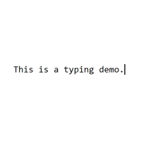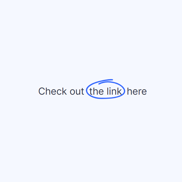
Using animation for text makes the texts more beautiful and relieves fatigue from the user's eyes. In this code, we have included one of these effects that can be used for links. This effect draws a handwriting-like line around the link during the hover and when the mouse cursor hits the link. This is a blue line.
HTML
<!-- This script got from www.devanswer.com -->
<link rel="stylesheet" href="https://cdnjs.cloudflare.com/ajax/libs/meyer-reset/2.0/reset.min.css">
<link rel='stylesheet' href='https://fonts.googleapis.com/css?family=Inter:400,500,600,700&display=swap'>
<p>
Check out
<a href="#">
the link
<svg viewBox="0 0 70 36">
<path d="M6.9739 30.8153H63.0244C65.5269 30.8152 75.5358 -3.68471 35.4998 2.81531C-16.1598 11.2025 0.894099 33.9766 26.9922 34.3153C104.062 35.3153 54.5169 -6.68469 23.489 9.31527" />
</svg>
</a>
here
</p>
<!-- dribbble - twitter -->
<a class="twitter" target="_top" href="http://www.devanswer.com/"><svg xmlns="http://www.w3.org/2000/svg" width="72" height="72" viewBox="0 0 72 72"><path d="M67.812 16.141a26.246 26.246 0 0 1-7.519 2.06 13.134 13.134 0 0 0 5.756-7.244 26.127 26.127 0 0 1-8.313 3.176A13.075 13.075 0 0 0 48.182 10c-7.229 0-13.092 5.861-13.092 13.093 0 1.026.118 2.021.338 2.981-10.885-.548-20.528-5.757-26.987-13.679a13.048 13.048 0 0 0-1.771 6.581c0 4.542 2.312 8.551 5.824 10.898a13.048 13.048 0 0 1-5.93-1.638c-.002.055-.002.11-.002.162 0 6.345 4.513 11.638 10.504 12.84a13.177 13.177 0 0 1-3.449.457c-.846 0-1.667-.078-2.465-.231 1.667 5.2 6.499 8.986 12.23 9.09a26.276 26.276 0 0 1-16.26 5.606A26.21 26.21 0 0 1 4 55.976a37.036 37.036 0 0 0 20.067 5.882c24.083 0 37.251-19.949 37.251-37.249 0-.566-.014-1.134-.039-1.694a26.597 26.597 0 0 0 6.533-6.774z"></path></svg></a><div id="bcl"><a style="font-size:8pt;text-decoration:none;" href="http://www.devanswer.com">Developers Answer</a></div>
CSS
:root {
	--text: #2B3044;
	--line: #BBC1E1;
	--line-active: #275EFE;
}
p {
	font-size: 18px;
	margin: 0;
	color: var(--text);
}
p a {
	display: inline-block;
	position: relative;
	text-decoration: none;
	color: inherit;
	margin: 0 var(--spacing, 0px);
	transition: margin 0.25s;
}
p a svg {
	width: 76px;
	height: 40px;
	position: absolute;
	left: 50%;
	bottom: 0;
	transform: translate(-50%, 7px) translateZ(0);
	fill: none;
	stroke: var(--stroke, var(--line));
	stroke-linecap: round;
	stroke-width: 2px;
	stroke-dasharray: var(--offset, 69px) 278px;
	stroke-dashoffset: 361px;
	transition: stroke 0.25s ease var(--stroke-delay, 0s), stroke-dasharray 0.35s;
}
p a:hover {
	--spacing: 4px;
	--stroke: var(--line-active);
	--stroke-delay: .1s;
	--offset: 180px;
}
html {
	box-sizing: border-box;
	-webkit-font-smoothing: antialiased;
}
* {
	box-sizing: inherit;
}
*:before, *:after {
	box-sizing: inherit;
}
body {
	min-height: 100vh;
	display: flex;
	font-family: "Inter", Arial;
	justify-content: center;
	align-items: center;
	background: #F6F8FF;
}
body .dribbble {
	position: fixed;
	display: block;
	right: 20px;
	bottom: 20px;
}
body .dribbble img {
	display: block;
	height: 28px;
}
body .twitter {
	position: fixed;
	display: block;
	right: 64px;
	bottom: 14px;
}
body .twitter svg {
	width: 32px;
	height: 32px;
	fill: #1da1f2;
}