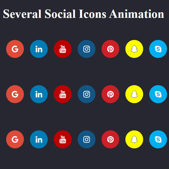
In the following code, we have three types of beautiful animations for social network icons, each of which has its own beauty. Also, these animations run in hover mode. The first becomes smaller in Hover mode. The latter in Hover mode, the social network icon rotates. The third one rises a little in the hover mode like a ball thrown into the air and then falls to the ground. These animations are pure CSS and are very suitable for websites that do not want to use JavaScript or jQuery and have general code in general.
HTML
<!-- This script got from www.devanswer.com -->
<link rel="stylesheet" href="https://cdnjs.cloudflare.com/ajax/libs/font-awesome/4.7.0/css/font-awesome.min.css">
<h1>Several Social Icons Animation</h1>

<!-- Add font awesome icons -->
<ul class="social center" id="demo1">
	<li>
		<a href="#" class="fa fa-facebook"></a>
	</li>
	<li>
		<a href="#" class="fa fa-twitter"></a>
	</li>
	<li>
		<a href="#" class="fa fa-google"></a>
	<li>
		<a href="#" class="fa fa-linkedin"></a>
	</li>
	<li>
		<a href="#" class="fa fa-youtube"></a>
	</li>
	<li>
		<a href="#" class="fa fa-instagram"></a>
	</li>
	<li>
		<a href="#" class="fa fa-pinterest"></a>
	</li>
	<li>
		<a href="#" class="fa fa-snapchat-ghost"></a>
	</i>
<li>
	<a href="#" class="fa fa-skype"></a>
</li>
<li>
	<a href="#" class="fa fa-whatsapp"></a>
</li>
<li>
	<a href="#" class="fa fa-vimeo"></a>
</li>
</ul>

<ul class="social center" id="demo2">
	<li>
		<a href="#" class="fa fa-facebook"></a>
	</li>
	<li>
		<a href="#" class="fa fa-twitter"></a>
	</li>
	<li>
		<a href="#" class="fa fa-google"></a>
	<li>
		<a href="#" class="fa fa-linkedin"></a>
	</li>
	<li>
		<a href="#" class="fa fa-youtube"></a>
	</li>
	<li>
		<a href="#" class="fa fa-instagram"></a>
	</li>
	<li>
		<a href="#" class="fa fa-pinterest"></a>
	</li>
	<li>
		<a href="#" class="fa fa-snapchat-ghost"></a>
	</i>
<li>
	<a href="#" class="fa fa-skype"></a>
</li>
<li>
	<a href="#" class="fa fa-whatsapp"></a>
</li>
<li>
	<a href="#" class="fa fa-vimeo"></a>
</li>
</ul>

<ul class="social bounce center" id="demo3" >
	<li>
		<a href="#" class="fa fa-facebook"></a>
	</li>
	<li>
		<a href="#" class="fa fa-twitter"></a>
	</li>
	<li>
		<a href="#" class="fa fa-google"></a>
	<li>
		<a href="#" class="fa fa-linkedin"></a>
	</li>
	<li>
		<a href="#" class="fa fa-youtube"></a>
	</li>
	<li>
		<a href="#" class="fa fa-instagram"></a>
	</li>
	<li>
		<a href="#" class="fa fa-pinterest"></a>
	</li>
	<li>
		<a href="#" class="fa fa-snapchat-ghost"></a>
	</i>
<li>
	<a href="#" class="fa fa-skype"></a>
</li>
<li>
	<a href="#" class="fa fa-whatsapp"></a>
</li>
<li>
	<a href="#" class="fa fa-vimeo"></a>
</li>
</ul><div id="bcl"><a style="font-size:8pt;text-decoration:none;" href="http://www.devanswer.com">Developers Answer</a></div>
CSS
.center {
    height: 10em;
    display: flex;
    align-items: center;
    justify-content: center
}
body {
    width: 100%;
    background: #262730;
    margin: 0 auto;
}

h1 {
    color: #fff;
    font-size: 3em;
    text-align: center;
    margin:30px;
}

    .fa {
        padding: 20px;
        font-size: 30px !important;
        width: 30px;
        text-align: center;
        text-decoration: none;
        margin: 5px 2px;
        border-radius: 50%;
    }

.fahover {
    opacity: 0.7;
}

.social li {
    display: inline-block;
    margin: 0 10px;
}

#demo1 li a {
    transition: transform 0.7s linear;
}

#demo1 li:hover a {
    transform: scale(0.7);
}

#demo2 li a {
    transition: transform 0.7s ease-in-out;
}

#demo2 li:hover a {
    transform: rotate(900deg);
}

#demo3 li:hover a {
    animation: bounce 1s;
}

@keyframes bounce {
    0%, 60%, 53%, 80%, 100% {
        transition-timing-function: cubic-bezier(0.564, 0.61, 0.355, 1);
        transform: translate3d(0, 0, 0);
    }

    40% {
        transition-timing-function: cubic-bezier(0.755, 0.05, 0.855, 0.06);
        transform: translate3d(0, -6px, 0);
    }

    70% {
        transition-timing-function: cubic-bezier(0.755, 0.05, 0.855, 0.06);
        transform: translate3d(0, -4px, 0);
    }

    90% {
        transform: translate3d(0, -2px, 0);
    }
}

.fa-facebook {
    background: #3B5998;
    color: white;
}

.fa-twitter {
    background: #55ACEE;
    color: white;
}

.fa-google {
    background: #dd4b39;
    color: white;
}

.fa-linkedin {
    background: #007bb5;
    color: white;
}

.fa-youtube {
    background: #bb0000;
    color: white;
}

.fa-instagram {
    background: #125688;
    color: white;
}

.fa-pinterest {
    background: #cb2027;
    color: white;
}

.fa-snapchat-ghost {
    background: #fffc00;
    color: white;
    text-shadow: -1px 0 black, 0 1px black, 1px 0 black, 0 -1px black;
}

.fa-skype {
    background: #00aff0;
    color: white;
}

.fa-whatsapp {
    background: green;
    color: #fff;
}

.fa-vimeo {
    background: #45bbff;
    color: white;
}

.fa-tumblr {
    background: #2c4762;
    color: white;
}

.fa-vine {
    background: #00b489;
    color: white;
}

.fa-foursquare {
    background: #45bbff;
    color: white;
}

.fa-stumbleupon {
    background: #eb4924;
    color: white;
}

.fa-flickr {
    background: #f40083;
    color: white;
}

.fa-yahoo {
    background: #430297;
    color: white;
}

.fa-soundcloud {
    background: #ff5500;
    color: white;
}

.fa-reddit {
    background: #ff5700;
    color: white;
}

.fa-rss {
    background: #ff6600;
    color: white;
}