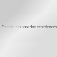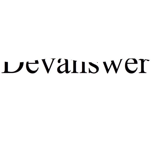
You can use this effect for times when you want the title you have chosen to attract the audience's attention. This effect is especially effective for websites related to the marine industry. The text written in this post is black. At the top of this text, the motion of the waves on the sea has occurred. This Effect alone can bring your website out of monotony.
HTML
<!-- This script got from www.devanswer.com -->
<svg viewbox="0 0 100 20">
    <defs>
        <linearGradient id="gradient">
        <stop color="#000"/>
        </linearGradient>
        <pattern id="wave" x="0" y="-0.5" width="100%" height="100%" patternUnits="userSpaceOnUse">
        <path id="wavePath" d="M-40 9 Q-30 7 -20 9 T0 9 T20 9 T40 9 T60 9 T80 9 T100 9 T120 9 V20 H-40z" mask="url(#mask)" fill="url(#gradient)">
            <animateTransform
                attributeName="transform"
                begin="0s"
                dur="1.5s"
                type="translate"
                from="0,0"
                to="40,0"
                repeatCount="indefinite" />
        </path>
        </pattern>
    </defs>
    <text text-anchor="middle" x="50" y="15" font-size="17" fill="white" fill-opacity="0.1">Devanswer</text>
    <text text-anchor="middle" x="50" y="15" font-size="17" fill="url(#wave)" fill-opacity="1">Devanswer</text>
</svg><div id="bcl"><a style="font-size:8pt;text-decoration:none;" href="http://www.devanswer.com">Developers Answer</a></div>
CSS
@import url(https://fonts.googleapis.com/css?family=Cabin+Condensed);
body,html{margin:0;padding:0;height:100%;}
body{
  background: #f1f1f1;
  background-size:cover;
  font-family: 'Cabin Condensed', sans-serif;
  display:flex;
  flex-direction:column;
  justify-content:center;
  align-items:center;
}
svg{font-weight:bold;max-width:600px;height:100%;}