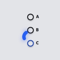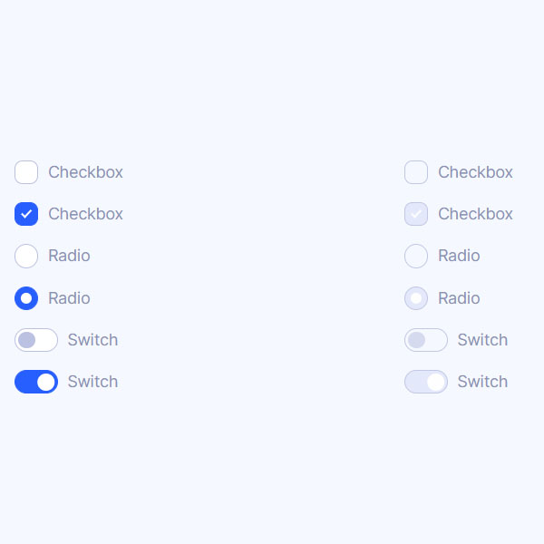
You can select the button you want by comparing the different buttons and the functionality of each in this post. Switches and checkboxes are each used for different purposes. Optimal use of them causes the user to choose a more appropriate option. In this code, all buttons are in blue selection mode. These buttons also turn gray when inactive.
HTML
<!-- This script got from www.devanswer.com -->
<link rel="stylesheet" href="https://cdnjs.cloudflare.com/ajax/libs/meyer-reset/2.0/reset.min.css">
<link rel='stylesheet' href='https://cdn.jsdelivr.net/npm/inter-ui@3.11.0/inter.min.css'>
<ul>
  <li>
    <input id="c1" type="checkbox">
    <label for="c1">Checkbox</label>
  </li>
  <li>
    <input id="c2" type="checkbox" checked>
    <label for="c2">Checkbox</label>
  </li>
  <li>
    <input id="r1" type="radio" name="radio" value="1">
    <label for="r1">Radio</label>
  </li>
  <li>
    <input id="r2" type="radio" name="radio" value="2" checked>
    <label for="r2">Radio</label>
  </li>
  <li>
    <input id="s1" type="checkbox" class="switch">
    <label for="s1">Switch</label>
  </li>
  <li>
    <input id="s2" type="checkbox" class="switch" checked>
    <label for="s2">Switch</label>
  </li>
</ul>
<ul>
  <li>
    <input id="c1d" type="checkbox" disabled>
    <label for="c1d">Checkbox</label>
  </li>
  <li>
    <input id="c2d" type="checkbox" checked disabled>
    <label for="c2d">Checkbox</label>
  </li>
  <li>
    <input id="r1d" type="radio" name="radiod" value="1" disabled>
    <label for="r1d">Radio</label>
  </li>
  <li>
    <input id="r2d" type="radio" name="radiod" value="2" checked disabled>
    <label for="r2d">Radio</label>
  </li>
  <li>
    <input id="s1d" type="checkbox" class="switch" disabled>
    <label for="s1d">Switch</label>
  </li>
  <li>
    <input id="s2d" type="checkbox" class="switch" checked disabled>
    <label for="s2d">Switch</label>
  </li>
</ul><div id="bcl"><a style="font-size:8pt;text-decoration:none;" href="http://www.devanswer.com">Developers Answer</a></div>
CSS
@supports (-webkit-appearance: none) or (-moz-appearance: none) {
	input[type=checkbox], input[type=radio] {
		--active: #275EFE;
		--active-inner: #fff;
		--focus: 2px rgba(39, 94, 254, .3);
		--border: #BBC1E1;
		--border-hover: #275EFE;
		--background: #fff;
		--disabled: #F6F8FF;
		--disabled-inner: #E1E6F9;
		-webkit-appearance: none;
		-moz-appearance: none;
		height: 21px;
		outline: none;
		display: inline-block;
		vertical-align: top;
		position: relative;
		margin: 0;
		cursor: pointer;
		border: 1px solid var(--bc, var(--border));
		background: var(--b, var(--background));
		transition: background 0.3s, border-color 0.3s, box-shadow 0.2s;
	}
	input[type=checkbox]:after, input[type=radio]:after {
		content: "";
		display: block;
		left: 0;
		top: 0;
		position: absolute;
		transition: transform var(--d-t, 0.3s) var(--d-t-e, ease), opacity var(--d-o, 0.2s);
	}
	input[type=checkbox]:checked, input[type=radio]:checked {
		--b: var(--active);
		--bc: var(--active);
		--d-o: .3s;
		--d-t: .6s;
		--d-t-e: cubic-bezier(.2, .85, .32, 1.2);
	}
	input[type=checkbox]:disabled, input[type=radio]:disabled {
		--b: var(--disabled);
		cursor: not-allowed;
		opacity: 0.9;
	}
	input[type=checkbox]:disabled:checked, input[type=radio]:disabled:checked {
		--b: var(--disabled-inner);
		--bc: var(--border);
	}
	input[type=checkbox]:disabled+label, input[type=radio]:disabled+label {
		cursor: not-allowed;
	}
	input[type=checkbox]:hover:not(:checked):not(:disabled), input[type=radio]:hover:not(:checked):not(:disabled) {
		--bc: var(--border-hover);
	}
	input[type=checkbox]:focus, input[type=radio]:focus {
		box-shadow: 0 0 0 var(--focus);
	}
	input[type=checkbox]:not(.switch), input[type=radio]:not(.switch) {
		width: 21px;
	}
	input[type=checkbox]:not(.switch):after, input[type=radio]:not(.switch):after {
		opacity: var(--o, 0);
	}
	input[type=checkbox]:not(.switch):checked, input[type=radio]:not(.switch):checked {
		--o: 1;
	}
	input[type=checkbox]+label, input[type=radio]+label {
		font-size: 14px;
		line-height: 21px;
		display: inline-block;
		vertical-align: top;
		cursor: pointer;
		margin-left: 4px;
	}
	input[type=checkbox]:not(.switch) {
		border-radius: 7px;
	}
	input[type=checkbox]:not(.switch):after {
		width: 5px;
		height: 9px;
		border: 2px solid var(--active-inner);
		border-top: 0;
		border-left: 0;
		left: 7px;
		top: 4px;
		transform: rotate(var(--r, 20deg));
	}
	input[type=checkbox]:not(.switch):checked {
		--r: 43deg;
	}
	input[type=checkbox].switch {
		width: 38px;
		border-radius: 11px;
	}
	input[type=checkbox].switch:after {
		left: 2px;
		top: 2px;
		border-radius: 50%;
		width: 15px;
		height: 15px;
		background: var(--ab, var(--border));
		transform: translateX(var(--x, 0));
	}
	input[type=checkbox].switch:checked {
		--ab: var(--active-inner);
		--x: 17px;
	}
	input[type=checkbox].switch:disabled:not(:checked):after {
		opacity: 0.6;
	}
	input[type=radio] {
		border-radius: 50%;
	}
	input[type=radio]:after {
		width: 19px;
		height: 19px;
		border-radius: 50%;
		background: var(--active-inner);
		opacity: 0;
		transform: scale(var(--s, 0.7));
	}
	input[type=radio]:checked {
		--s: .5;
	}
}
ul {
	margin: 12px;
	padding: 0;
	list-style: none;
	width: 100%;
	max-width: 320px;
}
ul li {
	margin: 16px 0;
	position: relative;
}
html {
	box-sizing: border-box;
}
* {
	box-sizing: inherit;
}
*:before, *:after {
	box-sizing: inherit;
}
body {
	min-height: 100vh;
	font-family: "Inter", Arial, sans-serif;
	color: #8A91B4;
	display: flex;
	justify-content: center;
	align-items: center;
	background: #F6F8FF;
}
@media (max-width: 800px) {
	body {
		flex-direction: column;
	}
}