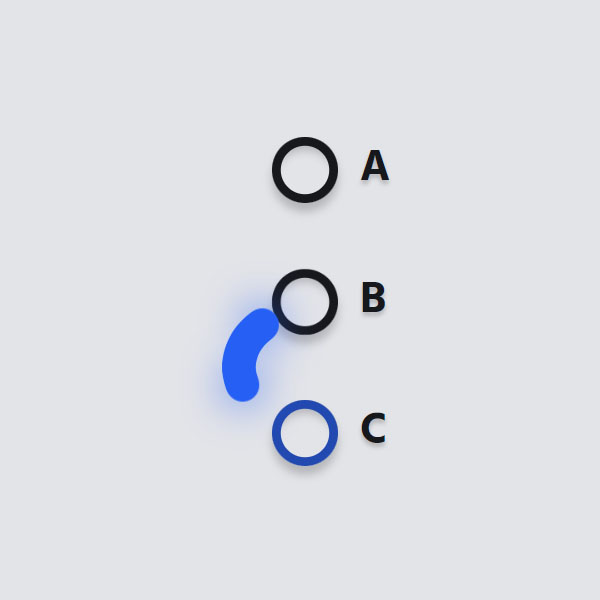
Instead of using simple radio buttons, use the radio buttons with the animation. These animations are attractive to the user, so he enjoys the time he spends on your website. The animation used in this code for the radio buttons. It is a circle that is placed inside each of the buttons at the time of selection. If a button is selected, the worm-like circle moves from that button to the current button.
HTML
<!-- This script got from www.devanswer.com -->
<link rel='stylesheet' href='https://fonts.googleapis.com/css?family=Hind:400,700&display=swap'>
<form>
<input id="a" type="radio" name="hopping" value="a" checked>
<label for="a"><span></span>A</label>
<input id="b" type="radio" name="hopping" value="b">
<label for="b"><span></span>B</label>
<input id="c" type="radio" name="hopping" value="c">
<label for="c"><span></span>C</label>
<div class="worm">
<div class="worm__segment"></div>
<div class="worm__segment"></div>
<div class="worm__segment"></div>
<div class="worm__segment"></div>
<div class="worm__segment"></div>
<div class="worm__segment"></div>
<div class="worm__segment"></div>
<div class="worm__segment"></div>
<div class="worm__segment"></div>
<div class="worm__segment"></div>
<div class="worm__segment"></div>
<div class="worm__segment"></div>
<div class="worm__segment"></div>
<div class="worm__segment"></div>
<div class="worm__segment"></div>
<div class="worm__segment"></div>
<div class="worm__segment"></div>
<div class="worm__segment"></div>
<div class="worm__segment"></div>
<div class="worm__segment"></div>
<div class="worm__segment"></div>
<div class="worm__segment"></div>
<div class="worm__segment"></div>
<div class="worm__segment"></div>
<div class="worm__segment"></div>
<div class="worm__segment"></div>
<div class="worm__segment"></div>
<div class="worm__segment"></div>
<div class="worm__segment"></div>
<div class="worm__segment"></div>
</div>
</form><div id="bcl"><a style="font-size:8pt;text-decoration:none;" href="http://www.devanswer.com">Developers Answer</a></div>
CSS
* {
	border: 0;
	box-sizing: border-box;
	margin: 0;
	padding: 0;
}
:root {
	font-size: calc(32px + (40 - 32)*(100vw - 320px)/ (1024 - 320));
}
body {
	background: #e3e4e8;
	color: #17181c;
	display: flex;
	font: 1em Hind, sans-serif;
	height: 100vh;
	line-height: 1.5;
	padding: 1.5em 0;
}
form {
	display: block;
	margin: auto;
	max-width: 10em;
	position: relative;
}
input {
	position: fixed;
	top: -1.5em;
	left: -1.5em;
}
label {
	cursor: pointer;
	display: block;
	font-weight: bold;
	text-shadow: 0 0.1em 0.1em rgba(0, 0, 0, 0.2);
	transition: color 0.2s cubic-bezier(0.45, 0.05, 0.55, 0.95);
}
label:not(:last-of-type) {
	margin-bottom: 1.5em;
}
label span {
	box-shadow: 0 0 0 0.2em currentColor inset, 0 0.2em 0.2em rgba(0, 0, 0, 0.2), 0 0.3em 0.2em rgba(0, 0, 0, 0.2) inset;
	display: inline-block;
	margin-right: 0.5em;
	vertical-align: bottom;
	width: 1.5em;
	height: 1.5em;
	transition: transform 0.2s cubic-bezier(0.5, 0, 0.5, 2), box-shadow 0.2s cubic-bezier(0.45, 0.05, 0.55, 0.95), color 0.2s cubic-bezier(0.45, 0.05, 0.55, 0.95);
}
label span, .worm__segment:before {
	border-radius: 50%;
}
input:checked+label, input:checked+label span, .worm__segment:before {
	color: #255ff4;
}
input:checked+label, input:checked+label span {
	transition-delay: 0.4s;
}
input:checked+label span {
	transform: scale(1.2);
}
.worm {
	top: 0.375em;
	left: 0.375em;
}
.worm, .worm__segment {
	position: absolute;
}
.worm__segment {
	top: 0;
	left: 0;
	width: 0.75em;
	height: 0.75em;
	transition: transform 0.4s cubic-bezier(0.45, 0.05, 0.55, 0.95);
}
.worm__segment:before {
	animation-duration: 0.4s;
	animation-timing-function: cubic-bezier(0.45, 0.05, 0.55, 0.95);
	background: currentColor;
	content: "";
	display: block;
	width: 100%;
	height: 100%;
}
.worm__segment:first-child:before, .worm__segment:last-child:before {
	box-shadow: 0 0 1em 0 currentColor;
}
.worm__segment:nth-child(2) {
	transition-delay: 0.004s;
}
.worm__segment:nth-child(2):before {
	animation-delay: 0.004s;
}
.worm__segment:nth-child(3) {
	transition-delay: 0.008s;
}
.worm__segment:nth-child(3):before {
	animation-delay: 0.008s;
}
.worm__segment:nth-child(4) {
	transition-delay: 0.012s;
}
.worm__segment:nth-child(4):before {
	animation-delay: 0.012s;
}
.worm__segment:nth-child(5) {
	transition-delay: 0.016s;
}
.worm__segment:nth-child(5):before {
	animation-delay: 0.016s;
}
.worm__segment:nth-child(6) {
	transition-delay: 0.02s;
}
.worm__segment:nth-child(6):before {
	animation-delay: 0.02s;
}
.worm__segment:nth-child(7) {
	transition-delay: 0.024s;
}
.worm__segment:nth-child(7):before {
	animation-delay: 0.024s;
}
.worm__segment:nth-child(8) {
	transition-delay: 0.028s;
}
.worm__segment:nth-child(8):before {
	animation-delay: 0.028s;
}
.worm__segment:nth-child(9) {
	transition-delay: 0.032s;
}
.worm__segment:nth-child(9):before {
	animation-delay: 0.032s;
}
.worm__segment:nth-child(10) {
	transition-delay: 0.036s;
}
.worm__segment:nth-child(10):before {
	animation-delay: 0.036s;
}
.worm__segment:nth-child(11) {
	transition-delay: 0.04s;
}
.worm__segment:nth-child(11):before {
	animation-delay: 0.04s;
}
.worm__segment:nth-child(12) {
	transition-delay: 0.044s;
}
.worm__segment:nth-child(12):before {
	animation-delay: 0.044s;
}
.worm__segment:nth-child(13) {
	transition-delay: 0.048s;
}
.worm__segment:nth-child(13):before {
	animation-delay: 0.048s;
}
.worm__segment:nth-child(14) {
	transition-delay: 0.052s;
}
.worm__segment:nth-child(14):before {
	animation-delay: 0.052s;
}
.worm__segment:nth-child(15) {
	transition-delay: 0.056s;
}
.worm__segment:nth-child(15):before {
	animation-delay: 0.056s;
}
.worm__segment:nth-child(16) {
	transition-delay: 0.06s;
}
.worm__segment:nth-child(16):before {
	animation-delay: 0.06s;
}
.worm__segment:nth-child(17) {
	transition-delay: 0.064s;
}
.worm__segment:nth-child(17):before {
	animation-delay: 0.064s;
}
.worm__segment:nth-child(18) {
	transition-delay: 0.068s;
}
.worm__segment:nth-child(18):before {
	animation-delay: 0.068s;
}
.worm__segment:nth-child(19) {
	transition-delay: 0.072s;
}
.worm__segment:nth-child(19):before {
	animation-delay: 0.072s;
}
.worm__segment:nth-child(20) {
	transition-delay: 0.076s;
}
.worm__segment:nth-child(20):before {
	animation-delay: 0.076s;
}
.worm__segment:nth-child(21) {
	transition-delay: 0.08s;
}
.worm__segment:nth-child(21):before {
	animation-delay: 0.08s;
}
.worm__segment:nth-child(22) {
	transition-delay: 0.084s;
}
.worm__segment:nth-child(22):before {
	animation-delay: 0.084s;
}
.worm__segment:nth-child(23) {
	transition-delay: 0.088s;
}
.worm__segment:nth-child(23):before {
	animation-delay: 0.088s;
}
.worm__segment:nth-child(24) {
	transition-delay: 0.092s;
}
.worm__segment:nth-child(24):before {
	animation-delay: 0.092s;
}
.worm__segment:nth-child(25) {
	transition-delay: 0.096s;
}
.worm__segment:nth-child(25):before {
	animation-delay: 0.096s;
}
.worm__segment:nth-child(26) {
	transition-delay: 0.1s;
}
.worm__segment:nth-child(26):before {
	animation-delay: 0.1s;
}
.worm__segment:nth-child(27) {
	transition-delay: 0.104s;
}
.worm__segment:nth-child(27):before {
	animation-delay: 0.104s;
}
.worm__segment:nth-child(28) {
	transition-delay: 0.108s;
}
.worm__segment:nth-child(28):before {
	animation-delay: 0.108s;
}
.worm__segment:nth-child(29) {
	transition-delay: 0.112s;
}
.worm__segment:nth-child(29):before {
	animation-delay: 0.112s;
}
.worm__segment:nth-child(30) {
	transition-delay: 0.116s;
}
.worm__segment:nth-child(30):before {
	animation-delay: 0.116s;
}
/* States */

input:nth-of-type(1):checked~.worm .worm__segment:before {
	animation-name: hop1;
}
@keyframes hop1 {
	from, to {
		transform: translateX(0);
	}
	50% {
		transform: translateX(-1.5em);
	}
}
input:nth-of-type(2):checked~.worm .worm__segment {
	transform: translateY(3em);
}
input:nth-of-type(2):checked~.worm .worm__segment:before {
	animation-name: hop2;
}
@keyframes hop2 {
	from, to {
		transform: translateX(0);
	}
	50% {
		transform: translateX(-1.5em);
	}
}
input:nth-of-type(3):checked~.worm .worm__segment {
	transform: translateY(6em);
}
input:nth-of-type(3):checked~.worm .worm__segment:before {
	animation-name: hop3;
}
@keyframes hop3 {
	from, to {
		transform: translateX(0);
	}
	50% {
		transform: translateX(-1.5em);
	}
}
/* Dark mode */

@media screen and (prefers-color-scheme: dark) {
	body {
		background: #17181c;
		color: #e3e4e8;
	}
	input:checked+label, input:checked+label span, .worm__segment:before {
		color: #5583f6;
	}
}