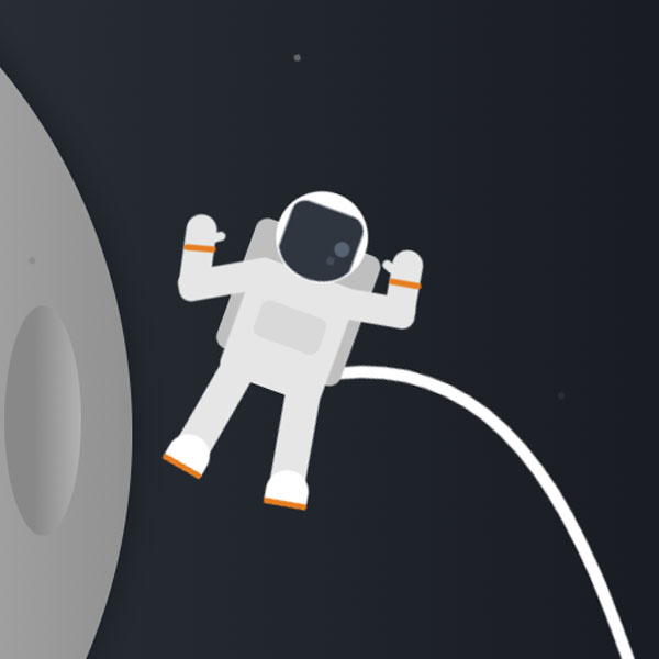
To make your website more beautiful and attractive, you can make the 404 error page for your website animated and beautiful. In this post, we have a month in which a spacecraft is located next to it. The oxygen supply tube to the astronaut or the rope connecting the astronaut to the spacecraft is moving. The phrase 404 is written on the moon and there are two buttons below it, which can be clicked on to go to a more relevant page.
HTML
<!-- This script got from www.devanswer.com -->
<link href="https://fonts.googleapis.com/css?family=Righteous&display=swap" rel="stylesheet">
<div class="moon"></div>
<div class="moon__crater moon__crater1"></div>
<div class="moon__crater moon__crater2"></div>
<div class="moon__crater moon__crater3"></div>
<div class="star star1"></div>
<div class="star star2"></div>
<div class="star star3"></div>
<div class="star star4"></div>
<div class="star star5"></div>
<div class="error">
  <div class="error__title">404</div>
  <div class="error__subtitle">Hmmm...</div>
  <div class="error__description">It looks like one of the  developers fell asleep</div>
  <button class="error__button error__button--active">LOGIN</button>
  <button class="error__button">CONTACT</button>
</div>
<div class="astronaut">
  <div class="astronaut__backpack"></div>
  <div class="astronaut__body"></div>
  <div class="astronaut__body__chest"></div>
  <div class="astronaut__arm-left1"></div>
  <div class="astronaut__arm-left2"></div>
  <div class="astronaut__arm-right1"></div>
  <div class="astronaut__arm-right2"></div>
  <div class="astronaut__arm-thumb-left"></div>
  <div class="astronaut__arm-thumb-right"></div>
  <div class="astronaut__leg-left"></div>
  <div class="astronaut__leg-right"></div>
  <div class="astronaut__foot-left"></div>
  <div class="astronaut__foot-right"></div>
  <div class="astronaut__wrist-left"></div>
  <div class="astronaut__wrist-right"></div>
  <div class="astronaut__cord">
    <canvas id="cord" height="500px" width="500px"></canvas>
  </div>
  <div class="astronaut__head">
    <canvas id="visor" width="60px" height="60px"></canvas>
    <div class="astronaut__head-visor-flare1"></div>
    <div class="astronaut__head-visor-flare2"></div>
  </div>
</div><div id="bcl"><a style="font-size:8pt;text-decoration:none;" href="http://www.devanswer.com">Developers Answer</a></div>
CSS
html,
body {
  height: 100%;
  width: 100%;
  margin: 0px;
  background: linear-gradient(90deg, #2f3640 23%, #181b20 100%);
}
.moon {
  background: linear-gradient(90deg, #d0d0d0 48%, #919191 100%);
  position: absolute;
  top: -100px;
  left: -300px;
  width: 900px;
  height: 900px;
  content: "";
  border-radius: 100%;
  box-shadow: 0px 0px 30px -4px rgba(0, 0, 0, 0.5);
}
.moon__crater {
  position: absolute;
  content: "";
  border-radius: 100%;
  background: linear-gradient(90deg, #7a7a7a 38%, #c3c3c3 100%);
  opacity: 0.6;
}
.moon__crater1 {
  top: 250px;
  left: 500px;
  width: 60px;
  height: 180px;
}
.moon__crater2 {
  top: 650px;
  left: 340px;
  width: 40px;
  height: 80px;
  transform: rotate(55deg);
}
.moon__crater3 {
  top: -20px;
  left: 40px;
  width: 65px;
  height: 120px;
  transform: rotate(250deg);
}
.star {
  background: grey;
  position: absolute;
  width: 5px;
  height: 5px;
  content: "";
  border-radius: 100%;
  transform: rotate(250deg);
  opacity: 0.4;
  animation-name: shimmer;
  animation-duration: 1.5s;
  animation-iteration-count: infinite;
  animation-direction: alternate;
}
@keyframes shimmer {
  from {
    opacity: 0;
  }
  to {
    opacity: 0.7;
  }
}
.star1 {
  top: 40%;
  left: 50%;
  animation-delay: 1s;
}
.star2 {
  top: 60%;
  left: 90%;
  animation-delay: 3s;
}
.star3 {
  top: 10%;
  left: 70%;
  animation-delay: 2s;
}
.star4 {
  top: 90%;
  left: 40%;
}
.star5 {
  top: 20%;
  left: 30%;
  animation-delay: 0.5s;
}
.error {
  position: absolute;
  left: 100px;
  top: 400px;
  transform: translateY(-60%);
  font-family: "Righteous", cursive;
  color: #363e49;
}
.error__title {
  font-size: 10em;
}
.error__subtitle {
  font-size: 2em;
}
.error__description {
  opacity: 0.5;
}
.error__button {
  min-width: 7em;
  margin-top: 3em;
  margin-right: 0.5em;
  padding: 0.5em 2em;
  outline: none;
  border: 2px solid #2f3640;
  background-color: transparent;
  border-radius: 8em;
  color: #576375;
  cursor: pointer;
  transition-duration: 0.2s;
  font-size: 0.75em;
  font-family: "Righteous", cursive;
}
.error__button:hover {
  color: #21252c;
}
.error__button--active {
  background-color: #e67e22;
  border: 2px solid #e67e22;
  color: white;
}
.error__button--active:hover {
  box-shadow: 0px 0px 8px 0px rgba(0, 0, 0, 0.5);
  color: white;
}
.astronaut {
  position: absolute;
  width: 185px;
  height: 300px;
  left: 70%;
  top: 50%;
  transform: translate(-50%, -50%) rotate(20deg) scale(1.2);
}
.astronaut__head {
  background-color: white;
  position: absolute;
  top: 60px;
  left: 60px;
  width: 60px;
  height: 60px;
  content: "";
  border-radius: 2em;
}
.astronaut__head-visor-flare1 {
  background-color: #7f8fa6;
  position: absolute;
  top: 28px;
  left: 40px;
  width: 10px;
  height: 10px;
  content: "";
  border-radius: 2em;
  opacity: 0.5;
}
.astronaut__head-visor-flare2 {
  background-color: #718093;
  position: absolute;
  top: 40px;
  left: 38px;
  width: 5px;
  height: 5px;
  content: "";
  border-radius: 2em;
  opacity: 0.3;
}
.astronaut__backpack {
  background-color: #bfbfbf;
  position: absolute;
  top: 90px;
  left: 47px;
  width: 86px;
  height: 90px;
  content: "";
  border-radius: 8px;
}
.astronaut__body {
  background-color: #e6e6e6;
  position: absolute;
  top: 115px;
  left: 55px;
  width: 70px;
  height: 80px;
  content: "";
  border-radius: 8px;
}
.astronaut__body__chest {
  background-color: #d9d9d9;
  position: absolute;
  top: 140px;
  left: 68px;
  width: 45px;
  height: 25px;
  content: "";
  border-radius: 6px;
}
.astronaut__arm-left1 {
  background-color: #e6e6e6;
  position: absolute;
  top: 127px;
  left: 9px;
  width: 65px;
  height: 20px;
  content: "";
  border-radius: 8px;
  transform: rotate(-30deg);
}
.astronaut__arm-left2 {
  background-color: #e6e6e6;
  position: absolute;
  top: 102px;
  left: 7px;
  width: 20px;
  height: 45px;
  content: "";
  border-radius: 8px;
  transform: rotate(-12deg);
  border-top-left-radius: 8em;
  border-top-right-radius: 8em;
}
.astronaut__arm-right1 {
  background-color: #e6e6e6;
  position: absolute;
  top: 113px;
  left: 100px;
  width: 65px;
  height: 20px;
  content: "";
  border-radius: 8px;
  transform: rotate(-10deg);
}
.astronaut__arm-right2 {
  background-color: #e6e6e6;
  position: absolute;
  top: 78px;
  left: 141px;
  width: 20px;
  height: 45px;
  content: "";
  border-radius: 8px;
  transform: rotate(-10deg);
  border-top-left-radius: 8em;
  border-top-right-radius: 8em;
}
.astronaut__arm-thumb-left {
  background-color: #e6e6e6;
  position: absolute;
  top: 110px;
  left: 21px;
  width: 10px;
  height: 6px;
  content: "";
  border-radius: 8em;
  transform: rotate(-35deg);
}
.astronaut__arm-thumb-right {
  background-color: #e6e6e6;
  position: absolute;
  top: 90px;
  left: 133px;
  width: 10px;
  height: 6px;
  content: "";
  border-radius: 8em;
  transform: rotate(20deg);
}
.astronaut__wrist-left {
  background-color: #e67e22;
  position: absolute;
  top: 122px;
  left: 6.5px;
  width: 21px;
  height: 4px;
  content: "";
  border-radius: 8em;
  transform: rotate(-15deg);
}
.astronaut__wrist-right {
  background-color: #e67e22;
  position: absolute;
  top: 98px;
  left: 141px;
  width: 21px;
  height: 4px;
  content: "";
  border-radius: 8em;
  transform: rotate(-10deg);
}
.astronaut__leg-left {
  background-color: #e6e6e6;
  position: absolute;
  top: 188px;
  left: 50px;
  width: 23px;
  height: 75px;
  content: "";
  transform: rotate(10deg);
}
.astronaut__leg-right {
  background-color: #e6e6e6;
  position: absolute;
  top: 188px;
  left: 108px;
  width: 23px;
  height: 75px;
  content: "";
  transform: rotate(-10deg);
}
.astronaut__foot-left {
  background-color: white;
  position: absolute;
  top: 240px;
  left: 43px;
  width: 28px;
  height: 20px;
  content: "";
  transform: rotate(10deg);
  border-radius: 3px;
  border-top-left-radius: 8em;
  border-top-right-radius: 8em;
  border-bottom: 4px solid #e67e22;
}
.astronaut__foot-right {
  background-color: white;
  position: absolute;
  top: 240px;
  left: 111px;
  width: 28px;
  height: 20px;
  content: "";
  transform: rotate(-10deg);
  border-radius: 3px;
  border-top-left-radius: 8em;
  border-top-right-radius: 8em;
  border-bottom: 4px solid #e67e22;
}Javascript
function drawVisor() {
  const canvas = document.getElementById('visor');
  const ctx = canvas.getContext('2d');
  ctx.beginPath();
  ctx.moveTo(5, 45);
  ctx.bezierCurveTo(15, 64, 45, 64, 55, 45);
  ctx.lineTo(55, 20);
  ctx.bezierCurveTo(55, 15, 50, 10, 45, 10);
  ctx.lineTo(15, 10);
  ctx.bezierCurveTo(15, 10, 5, 10, 5, 20);
  ctx.lineTo(5, 45);
  ctx.fillStyle = '#2f3640';
  ctx.strokeStyle = '#f5f6fa';
  ctx.fill();
  ctx.stroke();
}
const cordCanvas = document.getElementById('cord');
const ctx = cordCanvas.getContext('2d');
let y1 = 160;
let y2 = 100;
let y3 = 100;
let y1Forward = true;
let y2Forward = false;
let y3Forward = true;
function animate() {
  requestAnimationFrame(animate);
  ctx.clearRect(0, 0, innerWidth, innerHeight);
  ctx.beginPath();
  ctx.moveTo(130, 170);
  ctx.bezierCurveTo(250, y1, 345, y2, 400, y3);
  ctx.strokeStyle = 'white';
  ctx.lineWidth = 8;
  ctx.stroke();
  if (y1 === 100) {
    y1Forward = true;
  }
  if (y1 === 300) {
    y1Forward = false;
  }
  if (y2 === 100) {
    y2Forward = true;
  }
  if (y2 === 310) {
    y2Forward = false;
  }
  if (y3 === 100) {
    y3Forward = true;
  }
  if (y3 === 317) {
    y3Forward = false;
  }
  y1Forward ? y1 += 1 : y1 -= 1;
  y2Forward ? y2 += 1 : y2 -= 1;
  y3Forward ? y3 += 1 : y3 -= 1;
}
drawVisor();
animate();