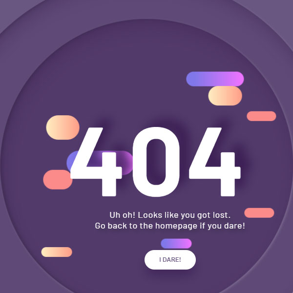
To make your website more beautiful, you can put a different 404 page for it. If the color theme of your website is purple, this code is suitable for your website. In this code, the phrase 404 and your page could not be returned is written in white in the middle of the page. There are two nested circles around it. These two circles are floating and move slightly with the movement of the mouse. There are also shapes in the background of phrase 404 that move within the circle themselves. The entire phrase is also displayed when loading with the zoom out effect.
HTML
<!-- This script got from www.devanswer.com -->
<script src='https://cdnjs.cloudflare.com/ajax/libs/parallax/3.1.0/parallax.min.js'></script>
<script src='https://cdnjs.cloudflare.com/ajax/libs/jquery/2.1.3/jquery.min.js'></script>
<div class="about">
   <a class="bg_links social portfolio" href="#" target="_blank">
      <span class="icon"></span>
   </a>
   <a class="bg_links social dribbble" href="#" target="_blank">
      <span class="icon"></span>
   </a>
   <a class="bg_links social linkedin" href="#" target="_blank">
      <span class="icon"></span>
   </a>
   <a class="bg_links logo"></a>
</div>
<nav>
    <div class="menu">
        <p class="website_name">LOGO</p>
        <div class="menu_links">
            <a href="" class="link">about</a>
            <a href="" class="link">projects</a>
            <a href="" class="link">contacts</a>
        </div>
        <div class="menu_icon">
            <span class="icon"></span>
        </div>
    </div>
</nav>
<section class="wrapper">
    <div class="container">
        <div id="scene" class="scene" data-hover-only="false">
            <div class="circle" data-depth="1.2"></div>
            <div class="one" data-depth="0.9">
                <div class="content">
                    <span class="piece"></span>
                    <span class="piece"></span>
                    <span class="piece"></span>
                </div>
            </div>
            <div class="two" data-depth="0.60">
                <div class="content">
                    <span class="piece"></span>
                    <span class="piece"></span>
                    <span class="piece"></span>
                </div>
            </div>
            <div class="three" data-depth="0.40">
                <div class="content">
                    <span class="piece"></span>
                    <span class="piece"></span>
                    <span class="piece"></span>
                </div>
            </div>
            <p class="p404" data-depth="0.50">404</p>
            <p class="p404" data-depth="0.10">404</p>
        </div>
        <div class="text">
            <article>
                <p>Uh oh! Looks like you got lost. <br>Go back to the homepage if you dare!</p>
                <button>i dare!</button>
            </article>
        </div>
    </div>
</section><div id="bcl"><a style="font-size:8pt;text-decoration:none;" href="http://www.devanswer.com">Developers Answer</a></div>
CSS
@import url("https://fonts.googleapis.com/css?family=Barlow+Condensed:300,400,500,600,700,800,900|Barlow:300,400,500,600,700,800,900&display=swap");
.about {
  position: fixed;
  z-index: 10;
  bottom: 10px;
  right: 10px;
  width: 40px;
  height: 40px;
  display: flex;
  justify-content: flex-end;
  align-items: flex-end;
  transition: all 0.2s ease;
}
.about .bg_links {
  width: 40px;
  height: 40px;
  border-radius: 100%;
  display: flex;
  justify-content: center;
  align-items: center;
  background-color: rgba(0, 0, 0, 0.2);
  border-radius: 100%;
  backdrop-filter: blur(5px);
  position: absolute;
}
.about .logo {
  width: 40px;
  height: 40px;
  z-index: 9;
  background-image: url(http://www.devanswer.com/img/logo_white.svg);
  background-size: 50%;
  background-repeat: no-repeat;
  background-position: 10px 7px;
  opacity: 0.9;
  transition: all 1s 0.2s ease;
  bottom: 0;
  right: 0;
}
.about .social {
  opacity: 0;
  right: 0;
  bottom: 0;
}
.about .social .icon {
  width: 100%;
  height: 100%;
  background-size: 20px;
  background-repeat: no-repeat;
  background-position: center;
  background-color: transparent;
  display: flex;
  transition: all 0.2s ease, background-color 0.4s ease;
  opacity: 0;
  border-radius: 100%;
}
.about .social.portfolio {
  transition: all 0.8s ease;
}
.about .social.portfolio .icon {
  background-image: url(http://www.devanswer.com/img/link.svg);
}
.about .social.dribbble {
  transition: all 0.3s ease;
}
.about .social.dribbble .icon {
  background-image: url(http://www.devanswer.com/img/dribbble.svg);
}
.about .social.linkedin {
  transition: all 0.8s ease;
}
.about .social.linkedin .icon {
  background-image: url(http://www.devanswer.com/img/linkedin.svg);
}
.about:hover {
  width: 105px;
  height: 105px;
  transition: all 0.6s cubic-bezier(0.64, 0.01, 0.07, 1.65);
}
.about:hover .logo {
  opacity: 1;
  transition: all 0.6s ease;
}
.about:hover .social {
  opacity: 1;
}
.about:hover .social .icon {
  opacity: 0.9;
}
.about:hover .social:hover {
  background-size: 28px;
}
.about:hover .social:hover .icon {
  background-size: 65%;
  opacity: 1;
}
.about:hover .social.portfolio {
  right: 0;
  bottom: calc(100% - 40px);
  transition: all 0.3s 0s cubic-bezier(0.64, 0.01, 0.07, 1.65);
}
.about:hover .social.portfolio .icon:hover {
  background-color: #698fb7;
}
.about:hover .social.dribbble {
  bottom: 45%;
  right: 45%;
  transition: all 0.3s 0.15s cubic-bezier(0.64, 0.01, 0.07, 1.65);
}
.about:hover .social.dribbble .icon:hover {
  background-color: #ea4c89;
}
.about:hover .social.linkedin {
  bottom: 0;
  right: calc(100% - 40px);
  transition: all 0.3s 0.25s cubic-bezier(0.64, 0.01, 0.07, 1.65);
}
.about:hover .social.linkedin .icon:hover {
  background-color: #0077b5;
}
h1,
h2,
h3,
h4,
h5,
h6,
p,
ul,
li,
button,
a,
i,
input,
body {
  margin: 0;
  padding: 0;
  list-style: none;
  border: 0;
  -webkit-tap-highlight-color: transparent;
  text-decoration: none;
  color: inherit;
}
h1:focus,
h2:focus,
h3:focus,
h4:focus,
h5:focus,
h6:focus,
p:focus,
ul:focus,
li:focus,
button:focus,
a:focus,
i:focus,
input:focus,
body:focus {
  outline: 0;
}
body {
  margin: 0;
  padding: 0;
  height: auto;
  font-family: "Barlow", sans-serif;
  background: #695681;
}
.logo {
  position: fixed;
  z-index: 5;
  bottom: 10px;
  right: 10px;
  width: 40px;
  height: 40px;
  border-radius: 100%;
  display: flex;
  justify-content: center;
  align-items: center;
  background: rgba(0, 0, 0, 0.1);
  border-radius: 100%;
  backdrop-filter: blur(5px);
}
.logo img {
  width: 55%;
  height: 55%;
  transform: translateY(-1px);
  opacity: 0.8;
}
nav .menu {
  width: 100%;
  height: 80px;
  position: absolute;
  display: flex;
  align-items: center;
  justify-content: space-between;
  padding: 0 5%;
  box-sizing: border-box;
  z-index: 3;
}
nav .menu .website_name {
  color: #695681;
  font-weight: 600;
  font-size: 20px;
  letter-spacing: 1px;
  background: white;
  padding: 4px 8px;
  border-radius: 2px;
  opacity: 0.5;
  transition: all 0.4s ease;
  cursor: pointer;
}
nav .menu .website_name:hover {
  opacity: 1;
}
nav .menu .menu_links {
  transition: all 0.4s ease;
  opacity: 0.5;
}
nav .menu .menu_links:hover {
  opacity: 1;
}
@media screen and (max-width: 799px) {
  nav .menu .menu_links {
    display: none;
  }
}
nav .menu .menu_links .link {
  color: white;
  text-transform: uppercase;
  font-weight: 500;
  margin-right: 50px;
  letter-spacing: 2px;
  position: relative;
  transition: all 0.3s 0.2s ease;
}
nav .menu .menu_links .link:last-child {
  margin-right: 0;
}
nav .menu .menu_links .link:before {
  content: "";
  position: absolute;
  width: 0px;
  height: 4px;
  background: linear-gradient(90deg, #FFEDC0 0%, #FF9D87 100%);
  bottom: -10px;
  border-radius: 4px;
  transition: all 0.4s cubic-bezier(0.82, 0.02, 0.13, 1.26);
  left: 100%;
}
nav .menu .menu_links .link:hover {
  opacity: 1;
  color: #FB8A8A;
}
nav .menu .menu_links .link:hover:before {
  width: 40px;
  left: 0;
}
nav .menu .menu_icon {
  width: 40px;
  height: 40px;
  position: relative;
  display: none;
  justify-content: center;
  align-items: center;
  cursor: pointer;
}
@media screen and (max-width: 799px) {
  nav .menu .menu_icon {
    display: flex;
  }
}
nav .menu .menu_icon .icon {
  width: 24px;
  height: 2px;
  background: white;
  position: absolute;
}
nav .menu .menu_icon .icon:before, nav .menu .menu_icon .icon:after {
  content: "";
  width: 100%;
  height: 100%;
  background: inherit;
  position: absolute;
  transition: all 0.3s cubic-bezier(0.49, 0.04, 0, 1.55);
}
nav .menu .menu_icon .icon:before {
  transform: translateY(-8px);
}
nav .menu .menu_icon .icon:after {
  transform: translateY(8px);
}
nav .menu .menu_icon:hover .icon {
  background: #FFEDC0;
}
nav .menu .menu_icon:hover .icon:before {
  transform: translateY(-10px);
}
nav .menu .menu_icon:hover .icon:after {
  transform: translateY(10px);
}
.wrapper {
  display: grid;
  grid-template-columns: 1fr;
  justify-content: center;
  align-items: center;
  height: 100vh;
  overflow-x: hidden;
}
.wrapper .container {
  margin: 0 auto;
  transition: all 0.4s ease;
  display: flex;
  justify-content: center;
  align-items: center;
  position: relative;
}
.wrapper .container .scene {
  position: absolute;
  width: 100vw;
  height: 100vh;
  vertical-align: middle;
}
.wrapper .container .one,
.wrapper .container .two,
.wrapper .container .three,
.wrapper .container .circle,
.wrapper .container .p404 {
  width: 60%;
  height: 60%;
  top: 20% !important;
  left: 20% !important;
  min-width: 400px;
  min-height: 400px;
}
.wrapper .container .one .content,
.wrapper .container .two .content,
.wrapper .container .three .content,
.wrapper .container .circle .content,
.wrapper .container .p404 .content {
  width: 600px;
  height: 600px;
  display: flex;
  justify-content: center;
  align-items: center;
  position: absolute;
  top: 50%;
  left: 50%;
  transform: translate(-50%, -50%);
  animation: content 0.8s cubic-bezier(1, 0.06, 0.25, 1) backwards;
}
@keyframes content {
  0% {
    width: 0;
  }
}
.wrapper .container .one .content .piece,
.wrapper .container .two .content .piece,
.wrapper .container .three .content .piece,
.wrapper .container .circle .content .piece,
.wrapper .container .p404 .content .piece {
  width: 200px;
  height: 80px;
  display: flex;
  position: absolute;
  border-radius: 80px;
  z-index: 1;
  animation: pieceLeft 8s cubic-bezier(1, 0.06, 0.25, 1) infinite both;
}
@keyframes pieceLeft {
  50% {
    left: 80%;
    width: 10%;
  }
}
@keyframes pieceRight {
  50% {
    right: 80%;
    width: 10%;
  }
}
@media screen and (max-width: 799px) {
  .wrapper .container .one,
.wrapper .container .two,
.wrapper .container .three,
.wrapper .container .circle,
.wrapper .container .p404 {
    width: 90%;
    height: 90%;
    top: 5% !important;
    left: 5% !important;
    min-width: 280px;
    min-height: 280px;
  }
}
@media screen and (max-height: 660px) {
  .wrapper .container .one,
.wrapper .container .two,
.wrapper .container .three,
.wrapper .container .circle,
.wrapper .container .p404 {
    min-width: 280px;
    min-height: 280px;
    width: 60%;
    height: 60%;
    top: 20% !important;
    left: 20% !important;
  }
}
.wrapper .container .text {
  width: 60%;
  height: 40%;
  min-width: 400px;
  min-height: 500px;
  position: absolute;
  margin: 40px 0;
  animation: text 0.6s 1.8s ease backwards;
}
@keyframes text {
  0% {
    opacity: 0;
    transform: translateY(40px);
  }
}
@media screen and (max-width: 799px) {
  .wrapper .container .text {
    min-height: 400px;
    height: 80%;
  }
}
.wrapper .container .text article {
  width: 400px;
  position: absolute;
  bottom: 0;
  z-index: 4;
  display: flex;
  flex-direction: column;
  justify-content: center;
  align-items: center;
  text-align: center;
  bottom: 0;
  left: 50%;
  transform: translateX(-50%);
}
@media screen and (max-width: 799px) {
  .wrapper .container .text article {
    width: 100%;
  }
}
.wrapper .container .text article p {
  color: white;
  font-size: 18px;
  letter-spacing: 0.6px;
  margin-bottom: 40px;
  text-shadow: 6px 6px 10px #32243E;
}
.wrapper .container .text article button {
  height: 40px;
  padding: 0 30px;
  border-radius: 50px;
  cursor: pointer;
  box-shadow: 0px 15px 20px rgba(54, 24, 79, 0.5);
  z-index: 3;
  color: #695681;
  background-color: white;
  text-transform: uppercase;
  font-weight: 600;
  font-size: 12px;
  transition: all 0.3s ease;
}
.wrapper .container .text article button:hover {
  box-shadow: 0px 10px 10px -10px rgba(54, 24, 79, 0.5);
  transform: translateY(5px);
  background: #FB8A8A;
  color: white;
}
.wrapper .container .p404 {
  font-size: 200px;
  font-weight: 700;
  letter-spacing: 4px;
  color: white;
  display: flex !important;
  justify-content: center;
  align-items: center;
  position: absolute;
  z-index: 2;
  animation: anime404 0.6s cubic-bezier(0.3, 0.8, 1, 1.05) both;
  animation-delay: 1.2s;
}
@media screen and (max-width: 799px) {
  .wrapper .container .p404 {
    font-size: 100px;
  }
}
@keyframes anime404 {
  0% {
    opacity: 0;
    transform: scale(10) skew(20deg, 20deg);
  }
}
.wrapper .container .p404:nth-of-type(2) {
  color: #36184F;
  z-index: 1;
  animation-delay: 1s;
  filter: blur(10px);
  opacity: 0.8;
}
.wrapper .container .circle {
  position: absolute;
}
.wrapper .container .circle:before {
  content: "";
  position: absolute;
  width: 800px;
  height: 800px;
  background-color: rgba(54, 24, 79, 0.2);
  border-radius: 100%;
  top: 50%;
  left: 50%;
  transform: translate(-50%, -50%);
  box-shadow: inset 5px 20px 40px rgba(54, 24, 79, 0.25), inset 5px 0px 5px rgba(50, 36, 62, 0.3), inset 5px 5px 20px rgba(50, 36, 62, 0.25), 2px 2px 5px rgba(255, 255, 255, 0.2);
  animation: circle 0.8s cubic-bezier(1, 0.06, 0.25, 1) backwards;
}
@keyframes circle {
  0% {
    width: 0;
    height: 0;
  }
}
@media screen and (max-width: 799px) {
  .wrapper .container .circle:before {
    width: 400px;
    height: 400px;
  }
}
.wrapper .container .one .content:before {
  content: "";
  position: absolute;
  width: 600px;
  height: 600px;
  background-color: rgba(54, 24, 79, 0.3);
  border-radius: 100%;
  box-shadow: inset 5px 20px 40px rgba(54, 24, 79, 0.25), inset 5px 0px 5px rgba(50, 36, 62, 0.3), inset 5px 5px 20px rgba(50, 36, 62, 0.25), 2px 2px 5px rgba(255, 255, 255, 0.2);
  animation: circle 0.8s 0.4s cubic-bezier(1, 0.06, 0.25, 1) backwards;
}
@media screen and (max-width: 799px) {
  .wrapper .container .one .content:before {
    width: 300px;
    height: 300px;
  }
}
.wrapper .container .one .content .piece {
  background: linear-gradient(90deg, #8077EA 13.7%, #EB73FF 94.65%);
}
.wrapper .container .one .content .piece:nth-child(1) {
  right: 15%;
  top: 18%;
  height: 30px;
  width: 120px;
  animation-delay: 0.5s;
  animation-name: pieceRight;
}
.wrapper .container .one .content .piece:nth-child(2) {
  left: 15%;
  top: 45%;
  width: 150px;
  height: 50px;
  animation-delay: 1s;
  animation-name: pieceLeft;
}
.wrapper .container .one .content .piece:nth-child(3) {
  left: 10%;
  top: 75%;
  height: 20px;
  width: 70px;
  animation-delay: 1.5s;
  animation-name: pieceLeft;
}
.wrapper .container .two .content .piece {
  background: linear-gradient(90deg, #FFEDC0 0%, #FF9D87 100%);
}
.wrapper .container .two .content .piece:nth-child(1) {
  left: 0%;
  top: 25%;
  height: 40px;
  width: 120px;
  animation-delay: 2s;
  animation-name: pieceLeft;
}
.wrapper .container .two .content .piece:nth-child(2) {
  right: 15%;
  top: 35%;
  width: 180px;
  height: 50px;
  animation-delay: 2.5s;
  animation-name: pieceRight;
}
.wrapper .container .two .content .piece:nth-child(3) {
  right: 10%;
  top: 80%;
  height: 20px;
  width: 160px;
  animation-delay: 3s;
  animation-name: pieceRight;
}
.wrapper .container .three .content .piece {
  background: #FB8A8A;
}
.wrapper .container .three .content .piece:nth-child(1) {
  left: 25%;
  top: 35%;
  height: 20px;
  width: 80px;
  animation-name: pieceLeft;
  animation-delay: 3.5s;
}
.wrapper .container .three .content .piece:nth-child(2) {
  right: 10%;
  top: 55%;
  width: 140px;
  height: 40px;
  animation-name: pieceRight;
  animation-delay: 4s;
}
.wrapper .container .three .content .piece:nth-child(3) {
  left: 40%;
  top: 68%;
  height: 20px;
  width: 80px;
  animation-name: pieceLeft;
  animation-delay: 4.5s;
}Javascript
var scene = document.getElementById('scene');
var parallax = new Parallax(scene);