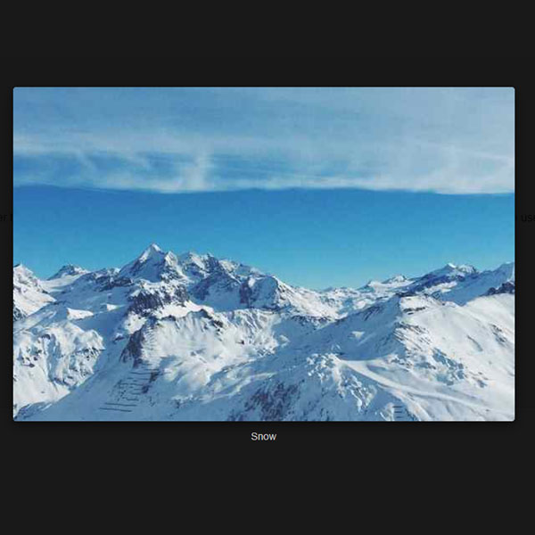
We can use different models to display pop-ups. Normally, there must be a button to open the pop-up, but other elements can also be used to open the pop-up. One of these elements is a photo. In this code, click on the photo of this pop-up. it opens. This pop-up displays the same photo in a larger format and writes the name of the photo below it.
HTML
<!-- This script got from www.devanswer.com -->
<link rel="stylesheet" href="https://netdna.bootstrapcdn.com/bootstrap/3.2.0/css/bootstrap.min.css">
<div class="container">
<h2>Image Popup</h2>
<p>In this example, we use CSS to create a Popup (dialog box) that is hidden by default.</p>
<p>We use JavaScript to trigger the Popup and to display the current image inside the Popup when it is clicked on. Also note that we use the value from the image's "alt" attribute as an image caption text inside the Popup.</p>
<img id="myImg" src="https://devanswer.com/img/img_snow.jpg" alt="Snow" style="width:100%;max-width:300px">
<!-- The Modal -->
<div id="myModal" class="modal">
<span class="close">×</span>
<img class="modal-content" id="img01">
<div id="caption"></div>
</div>
</div><div id="bcl"><a style="font-size:8pt;text-decoration:none;" href="http://www.devanswer.com">Developers Answer</a></div>
CSS
body {font-family: Arial, Helvetica, sans-serif;}
#myImg {
  border-radius: 5px;
  cursor: pointer;
  transition: 0.3s;
}
#myImg:hover {opacity: 0.7;}
.container {
  max-width: 100%;
  text-align: center;
  border: 1px solid gainsboro;
  border-top: 0;
  padding-bottom: 15px;
  margin-top: 60px;
  background-color: whitesmoke;
}
h2 {
  font-family: system-ui;
  padding: 56px 0;
}
p {
  font-size: 16px;
  margin-bottom: 15px;
}
.modal {
  display: none;
  position: fixed;
  z-index: 1;
  padding-top: 100px;
  left: 0;
  top: 0;
  width: 100%;
  height: 100%;
  overflow: auto;
  background-color: rgb(0,0,0);
  background-color: rgba(0,0,0,0.9);
}
.modal-content {
  margin: auto;
  display: block;
  width: 80%;
  max-width: 700px;
}
#caption {
  margin: auto;
  display: block;
  width: 80%;
  max-width: 700px;
  text-align: center;
  color: #ccc;
  padding: 10px 0;
  height: 150px;
}
.modal-content, #caption {
  -webkit-animation-name: zoom;
  -webkit-animation-duration: 0.6s;
  animation-name: zoom;
  animation-duration: 0.6s;
}
@-webkit-keyframes zoom {
  from {-webkit-transform:scale(0)}
  to {-webkit-transform:scale(1)}
}
@keyframes zoom {
  from {transform:scale(0)}
  to {transform:scale(1)}
}
.close {
  position: absolute;
  top: 15px;
  right: 35px;
  color: #f1f1f1;
  font-size: 40px;
  font-weight: bold;
  transition: 0.3s;
}
.close:hover,
.close:focus {
  color: #bbb;
  text-decoration: none;
  cursor: pointer;
}
@media only screen and (max-width: 700px){
  .modal-content {
    width: 100%;
  }
}Javascript
var modal = document.getElementById("myModal");caption
var img = document.getElementById("myImg");
var modalImg = document.getElementById("img01");
var captionText = document.getElementById("caption");
img.onclick = function(){
  modal.style.display = "block";
  modalImg.src = this.src;
  captionText.innerHTML = this.alt;
}
var span = document.getElementsByClassName("close")[0];
span.onclick = function() {
  modal.style.display = "none";
}