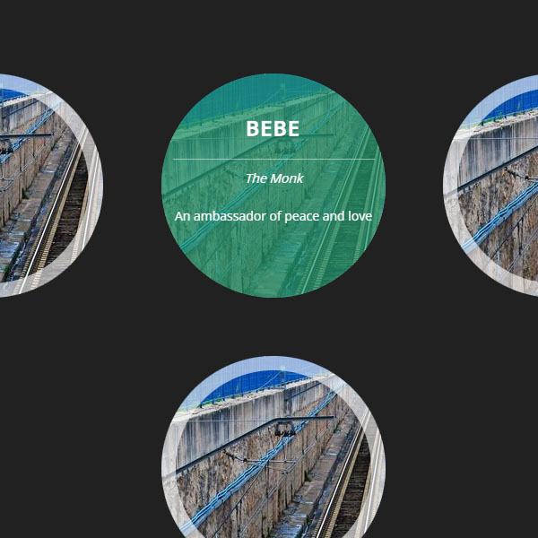
Fingerprint images can have beautiful effects. These effects make the images appear more beautiful and the user will feel better about the user with the images on your website. In this post, we also have thumbnails that have been circled. These images are in white border. Also, when the mouse cursor hovers over any of the images, a short title is displayed on a green background. This background also has a bit of transparency.
HTML
<!-- This script got from www.devanswer.com -->
<div class="container">
  <section>
	<div class="thumb">
		<div class="info">
			<h3>Nego</h3>
			<p><span>The Lord</span><br />The personification of elegance</p>
		</div>
	</div>
	<div class="thumb">
		<div class="info">
			<h3>Bebe</h3>
			<p><span>The Monk</span><br />An ambassador of peace and love</p>
		</div>
	</div>
	<div class="thumb">
		<div class="info">
			<h3>Lua</h3>
			<p><span>Rebel Princess</span><br />A lady with a indomitable spirit</p>
		</div>
	</div>
	<div class="thumb">
		<div class="info">
			<h3>Nino</h3>
			<p><span>The Caos</span><br />The prankish kitten you'll see</p>
		</div>
	</div>
</section>
</div><div id="bcl"><a style="font-size:8pt;text-decoration:none;" href="http://www.devanswer.com">Developers Answer</a></div>
CSS
/* Google Fonts */
@import url(https://fonts.googleapis.com/css?family=Open+Sans);
body {
  	text-align: center;
  	background-color: #212121;
  	font-family: 'Open Sans', Arial, sans-serif;
  	color: #737f82;
}
.container {
  	max-width: 90%;
  	margin: 0 auto;
}
h1 a,
p a {
  color: #219a6e;
}
section {
  	width: 100%;
  	padding: 30px 0;
  	margin: 40px 0;
}
.thumb {
	width: 250px;
	height: 250px;
	border-radius: 50%;
	display: inline-block;
	margin: 30px;
	box-shadow: inset 0 0 0 16px rgba(255,255,255,0.6), 0 1px 2px rgba(0,0,0,0.1);
	position: relative;
	-webkit-transition: all 0.4s ease-in-out;
	transition: all 0.4s ease-in-out;
}
.thumb:nth-child(1) {
	background-image: url(https://picsum.photos/id/233/500/500);
	background-repeat: no-repeat;
}
.thumb:nth-child(2) {
	background-image: url(https://picsum.photos/id/233/500/500);
	background-repeat: no-repeat;
}
.thumb:nth-child(3) {
	background-image: url(https://picsum.photos/id/233/500/500);
	background-repeat: no-repeat;
}
.thumb:nth-child(4) {
	background-image: url(https://picsum.photos/id/233/500/500);
	background-repeat: no-repeat;
}
.thumb:hover {
	box-shadow:
		inset 0 0 0 1px rgba(255,255,255,0.1),
		0 1px 2px rgba(0,0,0,0.1);
}
.thumb:hover .info {
	-webkit-transform: scale(1);
	transform: scale(1);
	opacity: 1;
}
.info {
	position: absolute;
	background: rgba(33, 154, 110, 0.71);
	width: inherit;
	height: inherit;
	border-radius: 50%;
	opacity: 0;
	-webkit-transition: all 0.4s ease-in-out;
	transition: all 0.4s ease-in-out;
	-webkit-transform: scale(0);
	transform: scale(0);
	-webkit-backface-visibility: hidden;
}
.info h3 {
	color: #fff;
	text-transform: uppercase;
	letter-spacing: 2px;
	font-size: 22px;
	margin: 0 30px;
	padding: 45px 0 0 0;
	height: 40px;
	text-shadow:
		0 0 1px #fff,
		0 1px 2px rgba(0,0,0,0.3);
}
.info p:hover {
	opacity: 1;
}
.info p span {
	font-style: italic;
}
.info p {
	color: #fff;
	font-family: 'Open Sans', Arial, sans-serif;
	text-align: center;
	line-height: 42px;
	margin: 10px auto;
	font-size: 14px;
	max-width: 90%;
	border-top: 1px solid rgba(255,255,255,0.5);
	-webkit-transition: all 1s ease-in-out 0.4s;
	transition: all 1s ease-in-out 0.4s;
}