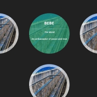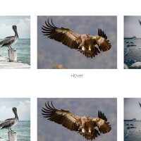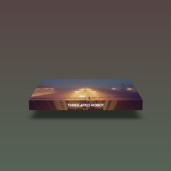
We can use this code whenever there is a need to attract the user's attention on your website. In this post, the images are displayed in two dimensions with a light shadow. Whenever the mouse cursor is placed on any of the images, the image becomes three-dimensional and rotates backwards, and on the other side, the title is written in white. The shadow of the image has also become more colorful and wide in this case.
HTML
<!-- This script got from www.devanswer.com -->
<div class="thumb">
	<!-- Image -->
	<a href="#">
		<!-- Label -->
		<span>Three-dimension View</span>
	</a>
</div><div id="bcl"><a style="font-size:8pt;text-decoration:none;" href="http://www.devanswer.com">Developers Answer</a></div>
CSS
/*custom font - Montserrat*/
@import url(https://fonts.googleapis.com/css?family=Montserrat);
/*basic reset*/
* {margin: 0; padding: 0;}
/*forcing the body to take 100% height*/
html, body {min-height: 100%;}
/*a nice BG*/
body {
	background: #544; /*fallback*/
	background: linear-gradient(#544, #565);
}
/*Thumbnail Background*/
.thumb {
	width: 400px; height: 300px; margin: 70px auto;
	perspective: 1000px;
}
.thumb a {
	display: block; width: 100%; height: 100%;
	/*double layered BG for lighting effect*/
	background:
		linear-gradient(rgba(0, 0, 0, 0.4), rgba(0, 0, 0, 0.4)),
		url("https://picsum.photos/id/220/500/500");
	/*disabling the translucent black bg on the main image*/
	background-size: 0, cover;
	/*3d space for children*/
	transform-style: preserve-3d;
	transition: all 0.5s;
}
.thumb:hover a {transform: rotateX(80deg); transform-origin: bottom;}
/*bottom surface */
.thumb a:after {
	/*36px high element positioned at the bottom of the image*/
	content: ''; position: absolute; left: 0; bottom: 0;
	width: 100%; height: 36px;
	/*inherit the main BG*/
	background: inherit; background-size: cover, cover;
	/*draw the BG bottom up*/
	background-position: bottom;
	/*rotate the surface 90deg on the bottom axis*/
	transform: rotateX(90deg); transform-origin: bottom;
}
/*label style*/
.thumb a span {
	color: white; text-transform: uppercase;
	position: absolute; top: 100%; left: 0; width: 100%;
	font: bold 12px/36px Montserrat; text-align: center;
	/*the rotation is a bit less than the bottom surface to avoid flickering*/
	transform: rotateX(-89.99deg); transform-origin: top;
	z-index: 1;
}
/*shadow*/
.thumb a:before {
	content: ''; position: absolute; top: 0; left: 0;
	width: 100%; height: 100%;
	background: rgba(0, 0, 0, 0.5);
	box-shadow: 0 0 100px 50px rgba(0, 0, 0, 0.5);
	transition: all 0.5s;
	/*by default the shadow will be almost flat, very transparent, scaled down with a large blur*/
	opacity: 0.15;
	transform: rotateX(95deg) translateZ(-80px) scale(0.75);
	transform-origin: bottom;
}
.thumb:hover a:before {
	opacity: 1;
	/*blurred effect using box shadow as filter: blur is not supported in all browsers*/
	box-shadow: 0 0 25px 25px rgba(0, 0, 0, 0.5);
	/*pushing the shadow down and scaling it down to size*/
	transform: rotateX(0) translateZ(-60px) scale(0.85);
}