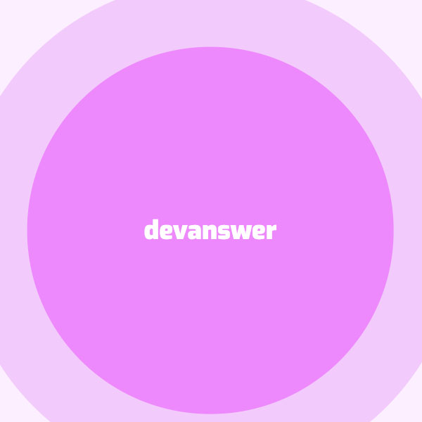
To make your website more beautiful, you can use codes that make your website unique. One of these codes can be used for the background of your website. In this code, we also have a circular background for the website background. There are three purple but transparent circles that are constantly getting bigger and smaller. These three trees are inside each other. In the center of these circles is a title written in white.
HTML
<!-- This script got from www.devanswer.com -->
<link rel="stylesheet" href="https://cdnjs.cloudflare.com/ajax/libs/normalize/5.0.0/normalize.min.css">
<link rel='stylesheet' href='https://fonts.googleapis.com/css?family=Exo:900'>
<div class='cristalBall'>
  <div class='cristal'>
    <div class='ball'>
      <div class='name'>devanswer</div>
    </div>
  </div>
</div>
<div class='background'>
  <div class='circle'>
  <div class='circle1'>
    <div class='circle2'>
      <div class='circle3'>
<!--         <div class='star'>Hire</div> -->
      </div>
    </div>
  </div>
  </div>
</div>
<div id="bcl"><a style="font-size:8pt;text-decoration:none;" href="http://www.devanswer.com">Developers Answer</a></div>
CSS
body{
  overflow: hidden;
}
.name{
  text-align:center;
/*   margin-top:140px; */
  font-size:37px;
  position:relative;
  font-family: 'Exo', sans-serif;
  color:#fff;
}
.cristalBall{
  width: 100%;
  margin: auto;
  position: absolute;
  top: 50%; left: 50%;
  transform: translate(-50%,-50%);
  z-index:99999;
}
.background{
  background-color:white;
  width:100%;
  height:100%;
  position:absolute;
  top:0;
  left:0;
}
.circle{
  background-color:#fffdff;
  height:1300px;
  border-radius:50%;
  width: 1300px;
  margin: auto;
  position: absolute;
  top: 50%; left: 50%;
  transform: translate(-50%,-50%);
}
.circle1{
  background-color:#fcefff;
  height:1000px;
  border-radius:50%;
  width: 1000px;
  margin: auto;
  position: absolute;
  top: 50%; left: 50%;
  transform: translate(-50%,-50%);
  -webkit-animation: pulse3 10s linear infinite;
          animation: pulse3 10s linear infinite;
}
.circle2{
  background-color:#f3cafc;
  height:700px;
  border-radius:50%;
  width: 700px;
  margin: auto;
  position: absolute;
  top: 50%; left: 50%;
  color:white;
  font-size:40px;
  transform: translate(-50%,-50%);
  -webkit-animation: pulse 4s linear infinite;
          animation: pulse 4s linear infinite;
}
.circle3{
  background-color:#ee88fd;
  height:500px;
  border-radius:50%;
  width: 500px;
  margin: auto;
  position: absolute;
  top: 50%; left: 50%;
  transform: translate(-50%,-50%);
  font-size:50px;
  -webkit-animation: pulse2 3s linear infinite;
          animation: pulse2 3s linear infinite;
}
.star{
  transform: translate(350px,50px);
  opacity:.6;
}
@-webkit-keyframes pulse{
  0%{width:700px;height:700px;}
  50%{width:750px;height:750px;}
  100%{width:700px;height:700px;}
}
@keyframes pulse{
  0%{width:700px;height:700px;}
  50%{width:750px;height:750px;}
  100%{width:700px;height:700px;}
}
@-webkit-keyframes pulse2{
  0%{width:500px;height:500px;}
  50%{width:550px;height:550px;}
  100%{width:500px;height:500px;}
}
@keyframes pulse2{
  0%{width:500px;height:500px;}
  50%{width:550px;height:550px;}
  100%{width:500px;height:500px;}
}
@-webkit-keyframes pulse3{
  0%{width:1000px;height:1000px;}
  50%{width:1050px;height:1050px;}
  100%{width:1000px;height:1000px;}
}
@keyframes pulse3{
  0%{width:1000px;height:1000px;}
  50%{width:1050px;height:1050px;}
  100%{width:1000px;height:1000px;}
}