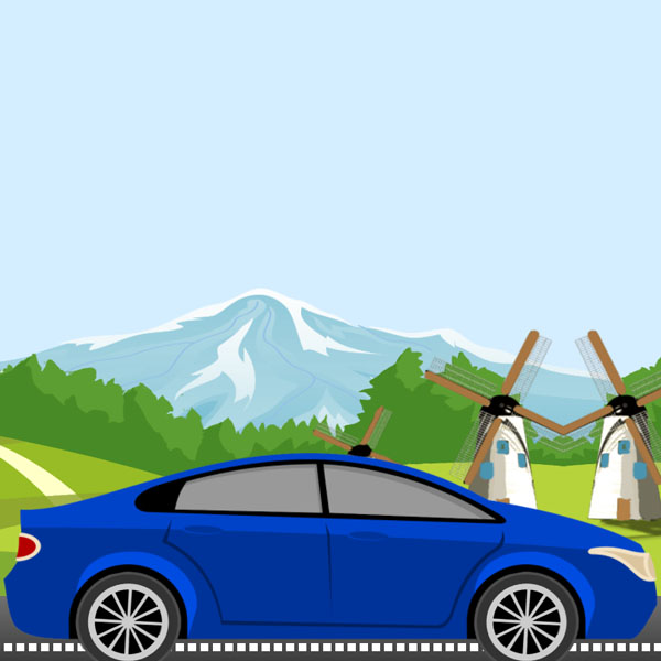
Car shows and car sales companies can use this background to beautify their website. In this code we have a car that is moving on the road. The wheels of the car and the view behind the car are moving, which evokes the real feeling of the car moving on the road. This is pure CSS code.
HTML
<!-- This script got from www.devanswer.com -->
<div class="main-container">
        <div class="forest-img-wrapper"></div>
        <div class="car-wrapper">
            <img class="car-img" src="http://www.devanswer.com/img/blue-car.png" />
                 <div class="tire-wrapper back-tire-wrapper">
                <img class="tire back-tire" src="http://www.devanswer.com/img/tire.png" />
                 </div>
            <div class="tire-wrapper front-tire-wrapper">
                <img class="tire front-tire" src="http://www.devanswer.com/img/tire.png" />
            </div>
      </div>
      <div class="road">
         <div class="road-line"></div>
      </div>
 </div><div id="bcl"><a style="font-size:8pt;text-decoration:none;" href="http://www.devanswer.com">Developers Answer</a></div>
CSS
body {
    padding: 0;
    margin: 0;
    background-color: #d5eeff;
}
.car-wrapper {
    width: 800px;
    position: absolute;
    bottom:0;
    left: 15%;
}
.car-wrapper .car-img{
    width: 100%;
}
.tire-wrapper {
    width: 130px;
    position: absolute;
    bottom: -4px;
    border-radius: 50%;
}
.back-tire-wrapper {
    left: 88px;
}
.front-tire-wrapper {
    right: 95px;
}
.tire-wrapper .tire {
    width: 100%;
    transform-origin: 50%;
    animation-name: circle;
    animation-duration: 0.7s;
    animation-timing-function: linear;
    animation-iteration-count: infinite;
}
@keyframes circle {
    0% {transform: rotate(0deg);}
    100% {transform: rotate(365deg);}
}
@keyframes forest {
    0% {left: 0}
    100% {left: -3840px;}
}
.road {
    width: 1920px;
    height: 200px;
    background-color: #484545;
    position: absolute;
    bottom: -32px;
    z-index: -1;
    background: linear-gradient(0deg, rgb(31, 31, 31) 0%, rgb(156, 156, 156) 100%);
}
.road-line {
    position: absolute;
    width: 6000px;
    border: 5px dashed #fff;
    bottom: 30%;
    animation-name: forest;
    animation-duration: 5s;
    animation-timing-function: linear;
    animation-iteration-count: infinite;
    animation-fill-mode: both;
}
.main-container {
    height: 100vh;
    min-height: 650px;
    background-position: center left;
    background-size: 1920px;
    background-repeat: repeat-x;
    position: relative;
    overflow-X: hidden;
    background-image: url('http://www.devanswer.com/img/mountain.png');
  }
  .forest-img-wrapper {
    width: 8000px;
    height: 549px;
    background-repeat: repeat-x;
    bottom:0;
    background-position: center;
    position: absolute;
    animation-name: forest;
    animation-duration: 5s;
    animation-timing-function: linear;
    animation-iteration-count: infinite;
    animation-fill-mode: both;
    background-image: url('http://www.devanswer.com/img/car-grass.png');
}
@media (max-width: 640px){
    .car-wrapper {
        width: 264px;
    }
    .tire-wrapper {
        width: 42px;
        bottom: -1px;
    }
    .front-tire-wrapper {
        right: 32px;
    }
    .back-tire-wrapper {
        left: 30px;
    }
    .road {
        height: 80px;
    }
    .forest-img-wrapper {
        height: 232px;
        background-size: 1597px;
        background-repeat: repeat-x;
        bottom: 0;
    }
    .road-line {
        border: 2px dashed #fff;
    }
    .main-container {
        min-height: 483px;
        background-size: 620px;
        min-height: 483px;
        background-size: 620px;
        background-position: 0 74%;
    }
}