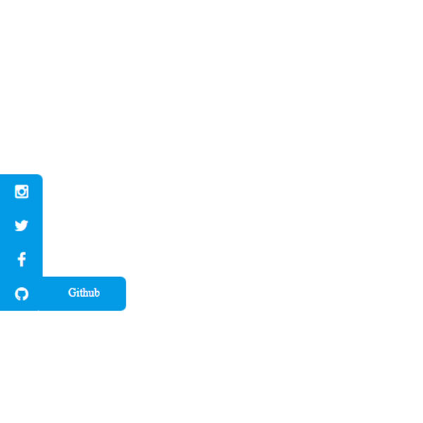
Use social buttons when you want. But if you want these buttons to be constantly in front of the user, you can use buttons in the sidebar. In this post, the color theme of these buttons is blue. An arrow is on the left side of the screen. By placing the mouse cursor on this arrow, social buttons are displayed. These buttons also have a separate hover effect. By placing the mouse cursor on each of these buttons, the name of that button is displayed.
HTML
<!-- This script got from www.devanswer.com -->
<link rel="stylesheet" href="https://maxcdn.bootstrapcdn.com/font-awesome/4.4.0/css/font-awesome.min.css">
<div class="menu-container">
  <div class="collapse-icon">
    <span class="fa fa-chevron-right"></span>
  </div>
  <div class="menu-item">
    <span class="fa fa-instagram"></span>
    <div class="menu-item-text">Instagram</div>
  </div>
  <div class="menu-item">
    <span class="fa fa-twitter"></span>
    <div class="menu-item-text">Twitter</div>
  </div>
  <div class="menu-item">
    <span class="fa fa-facebook"></span>
    <div class="menu-item-text">Facebook</div>
  </div>
   <div class="menu-item">
    <span class="fa fa-github"></span>
    <div class="menu-item-text">Github</div>
  </div>
</div><div id="bcl"><a style="font-size:8pt;text-decoration:none;" href="http://www.devanswer.com">Developers Answer</a></div>
CSS
body {
  display: flex;
  justify-content: center;
  align-items: center;
  width: 100vw;
  height: 100vh;
  margin: 0;
}
.menu-container {
  background: #039be5;
  position: fixed;
  left: -30px;
  z-index: 99;
  width: 35px;
  border-radius: 0 6px 6px 0;
  display: flex;
  flex-direction: column;
  align-items: center;
  justify-content: center;
  padding: 0 5px;
  transition: all 0.5s ease;
}
.menu-container:hover {
  transform: translateX(30px);
}
.menu-container:hover .collapse-icon {
  opacity: 0;
  display: none;
}
.menu-container:hover .menu-item {
  opacity: 1;
}
.menu-container:hover .menu-item:hover {
  cursor: pointer;
}
.menu-container:hover .menu-item:hover .menu-item-text {
  transform: translateX(129px);
}
.menu-container .collapse-icon {
  position: absolute;
  right: 0px;
  display: flex;
  align-items: center;
  justify-content: center;
  width: 16px;
  height: 100%;
  opacity: 1;
  color: #fff;
}
.menu-container .menu-item {
  color: #fff;
  opacity: 0;
  transition: all 0.2s ease;
  display: flex;
  flex-direction: row-reverse;
  position: relative;
  padding: 10px 5px;
}
.menu-container .menu-item .menu-item-text {
  display: flex;
  position: absolute;
  top: 0;
  background: #039be5;
  height: 100%;
  width: 80px;
  right: 30px;
  border-radius: 0 6px 6px 0;
  z-index: 0;
  padding: 0 5px;
  transition: all 0.5s ease;
  align-items: center;
  justify-content: center;
  border-left: 2px solid #039be5;
  text-align: center;
  font-size: 0.75rem;
}