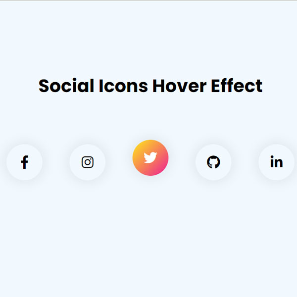
Using elements with a hover effect can attract more attention from your website audience. In this code, social buttons also have a beautiful effect in hover mode. Normally the icon color of the buttons is black and the background of the buttons is light. In hover mode, the icon color of the buttons turns white and the background of the icons is a gradient of orange and pink.
HTML
<!-- This script got from www.devanswer.com -->
<link rel="stylesheet"href="https://cdnjs.cloudflare.com/ajax/libs/font-awesome/5.15.3/css/all.min.css" />
<div class="hero">
    <h1>Social Icons Hover Effect</h1>
    <div class="social-links">
        <a href=""><i class="fab fa-facebook-f"></i></a>
        <a href=""><i class="fab fa-instagram"></i></a>
        <a href=""><i class="fab fa-twitter"></i></a>
        <a href=""><i class="fab fa-github"></i></a>
        <a href=""><i class="fab fa-linkedin-in"></i></a>
    </div>
</div><div id="bcl"><a style="font-size:8pt;text-decoration:none;" href="http://www.devanswer.com">Developers Answer</a></div>
CSS
@import url('https://fonts.googleapis.com/css2?family=Poppins:wght@400;500;600;700&display=swap');
* {
  margin: 0;
  padding: 0;
  font-family: 'Poppins', sans-serif;
}
.hero {
  width: 100%;
  height: 100vh;
  background: #f1f9ff;
  display: flex;
  align-items: center;
  flex-direction: column;
  justify-content: center;
}
h1 {
  font-size: 40px;
  margin-bottom: 100px;
  margin-top: -100px;
}
.social-links {
  display: flex;
}
.social-links a {
  width: 80px;
  height: 80px;
  text-align: center;
  text-decoration: none;
  color: #000;
  box-shadow: 0 0 20px 10px rgba(0, 0, 0, 0.05);
  margin: 0 30px;
  border-radius: 50%;
  position: relative;
  overflow: hidden;
  transition: transform 0.5s;
}
.social-links a .fab {
  font-size: 30px;
  line-height: 80px;
  position: relative;
  z-index: 10;
  transition: color 0.5s;
}
.social-links a::after {
  content: '';
  width: 100%;
  height: 100%;
  top: -90px;
  left: 0;
  background: #000;
  background: linear-gradient(-45deg, #ed1c94, #ffec17);
  position: absolute;
  transition: 0.5s;
}
.social-links a:hover::after {
  top: 0;
}
.social-links a:hover .fab {
  color: #fff;
}
.social-links a:hover {
  transform: translateY(-10px);
}