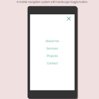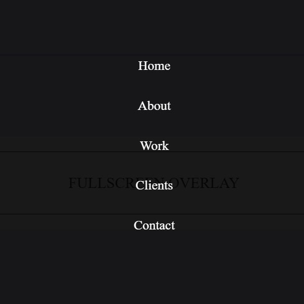
Using full-page menus will save your website space for a permanent menu at the top of the page. In this post, we have included a menu with animation. The background of this menu is dark and its items are white. The Yemeni items are stacked vertically. All items come from the bottom of the screen to the center of the screen when displayed.
HTML
<!-- This script got from www.devanswer.com -->
<header class="ScriptHeader">
<div class="rt-container">
<div class="col-rt-12">
<div class="rt-heading">
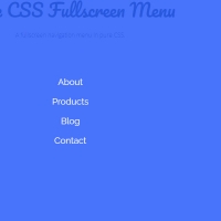
<h1>Fullscreen Menu:<span>Overlay with CSS</span></h1>
</div>
</div>
</div>
</header>
<section>
<div class="rt-container">
<div class="col-rt-12">
<input type="checkbox" id="op"></input>
<div class="lower">
<label for="op">Fullscreen Overlay</label>
</div>
<div class="overlay overlay-hugeinc">
<label for="op"></label>
<nav>
<ul>
<li><a href="#">Home</a></li>
<li><a href="#">About</a></li>
<li><a href="#">Work</a></li>
<li><a href="#">Clients</a></li>
<li><a href="#">Contact</a></li>
</ul>
</nav>
</div>
</div>
</div>
</section><div id="bcl"><a style="font-size:8pt;text-decoration:none;" href="http://www.devanswer.com">Developers Answer</a></div>
CSS
@import url('https://fonts.googleapis.com/css?family=Raleway:400,500,600,700,800,900');
html {
  box-sizing: border-box;
}
*, *:before, *:after {
  box-sizing: inherit;
}
article, header, section, aside, details, figcaption, figure, footer, header, hgroup, main, nav, section, summary {
    display: block;
}
body {
    background:#eee4f5 none repeat scroll 0 0;
    color: #222;
    font-family: "Raleway",sans-serif;
    font-size: 100%;
    line-height: 24px;
    margin: 0;
	padding:0;
}
a{
	font-family: "Raleway",sans-serif;
	text-decoration: none;
	outline: none;
}
a:hover, a:focus {
	color: #373e18;
}
section {
    float: left;
    width: 100%;
	 margin-top:3em;
	 margin-bottom:2em;
}
h2 {
    color: #1a0e0e;
    font-size: 26px;
    font-weight: 700;
    margin: 0;
    line-height: normal;
	text-transform:uppercase;
}
h2 span {
    display: block;
    padding: 0;
    font-size: 18px;
    opacity: 0.7;
    margin-top: 5px;
	text-transform:uppercase;
}
#float-right{
	float:right;
}
/* ******************************************************
	Header
*********************************************************/
.ScriptTop {
    background: #fff none repeat scroll 0 0;
    float: left;
    font-size: 0.69em;
    font-weight: 600;
    line-height: 2.2;
    padding: 12px 0;
    text-transform: uppercase;
    width: 100%;
}
/* To Navigation Style 1*/
.ScriptTop ul {
    margin: 24px 0;
    padding: 0;
    text-align: left;
}
.ScriptTop li{
	list-style:none;
	display:inline-block;
}
.ScriptTop li a {
    background: #6a4aed none repeat scroll 0 0;
    color: #fff;
    display: inline-block;
    font-size: 14px;
    font-weight: 600;
    padding: 5px 18px;
    text-decoration: none;
    text-transform: capitalize;
}
.ScriptTop li a:hover{
	background:#000;
	color:#fff;
}
/* Header*/
.ScriptHeader {
    float: left;
    width: 100%;
    padding-top: 3em;
}
.rt-heading {
    border-bottom: solid 1px #8b73ef;
    padding-bottom: 10px;
    margin: 0 auto;
}
.ScriptHeader h1{
    color: #6a4aed;
    font-size: 28px;
    font-weight: 700;
    margin: 0;
    line-height: normal;
}
.ScriptHeader h2 {
    color: #8b73ef;
    font-size: 18px;
    font-weight: 400;
    margin: 5px 0 0;
    line-height: normal;

}
.ScriptHeader h1 span {
    display: block;
    padding: 0;
    font-size: 22px;
    opacity: 0.7;
    margin-top: 5px;
	text-transform:uppercase;
}
.ScriptHeader span {
    display: block;
    padding: 0;
    font-size: 22px;
    opacity: 0.7;
    margin-top: 5px;
}
/* ******************************************************
	Responsive Grids
*********************************************************/
.rt-container {
	margin: 0 auto;
	padding-left:12px;
	padding-right:12px;
}
.rt-row:before, .rt-row:after {
  display: table;
  line-height: 0;
  content: "";
}
.rt-row:after {
  clear: both;
}
[class^="col-rt-"] {
  box-sizing: border-box;
  -webkit-box-sizing: border-box;
  -moz-box-sizing: border-box;
  -o-box-sizing: border-box;
  -ms-box-sizing: border-box;
  padding: 0 15px;
  min-height: 1px;
  position: relative;
}
@media (min-width: 768px) {
  .rt-container {
    width: 750px;
  }
  [class^="col-rt-"] {
    float: left;
    width: 49.9999999999%;
  }
  .col-rt-6, .col-rt-12 {
    width: 100%;
  }
}
@media (min-width: 1200px) {
	.rt-container {
		width: 1170px;
	}
	.col-rt-1 {
		width:16.6%;
	}
	.col-rt-2 {
		width:30.33%;
	}
	.col-rt-3 {
		width:50%;
	}
	.col-rt-4 {
		width: 67.664%;
	}
	.col-rt-5 {
		width: 83.33%;
	}
}
@media only screen and (min-width:240px) and (max-width: 768px){
	 .ScriptTop h1, .ScriptTop ul {
		text-align: center;
	}
	.ScriptTop h1{
		margin-top:0;
		margin-bottom:15px;
	}
	.ScriptTop ul{
		 margin-top:12px;
	}
	.ScriptHeader h1,
	.ScriptHeader h2,
	.scriptnav ul{
		text-align:center;
	}
	.scriptnav ul{
		 margin-top:12px;
	}
	#float-right{
		float:none;
	}
}
@import "http://webfonts.ru/import/notcourier.css";
.lower{
	min-width: 340px;
	margin: 10% auto;
	padding: 50px;
	background: white;
	opacity: 0.8;
	color: black;
	box-shadow: inset 0 0 0 1px black;
	border: 30px solid white;
	max-width: 720px;
}
.lower:hover{
  background:black;
  color:white;
  box-shadow:inset 0 0 0 1px white;
  border:30px solid black;
}
.lower label {
    display: block;
    font-family: "NotCourierSans";
    font-size: 30px;
    text-align: center;
    text-transform: uppercase;
}
.lower label:hover{
  cursor:pointer;
}
.overlay{
	position: fixed;
	width: 100%;
	height: 100%;
	top: 0;
	left: 0;
	background: rgba(0,0,0,0.9);
}
.overlay label{
	width: 58px;
	height:58px;
	position: absolute;
	right: 20px;
	top: 20px;
	background: url('http://devanswer.com/img/cross.png');
	z-index: 100;
  cursor:pointer;
}
.overlay nav {
	text-align: center;
	position: relative;
	top: 50%;
	height: 60%;
	font-size: 54px;
	-webkit-transform: translateY(-50%);
	transform: translateY(-50%);
}
.overlay ul {
	list-style: none;
	padding: 0;
	margin: 0 auto;
	display: inline-block;
	height: 100%;
	position: relative;
}
.overlay ul li {
	display: block;
	height: 20%;
	height: calc(100% / 5);
}
.overlay ul li a {
    color: white;
    display: block;
    font-family: "NotCourierSans";
    font-size: 26px;
    font-weight: 300;
    text-decoration: none;
    text-transform: capitalize;
    transition: color 0.2s ease 0s;
}
.overlay ul li a:hover,
.overlay ul li a:focus {
	color: #bfe00b;
}
.lower~.overlay-hugeinc{
	opacity: 0;
	visibility: hidden;
	-webkit-transition: opacity 0.5s, visibility 0s 0.5s;
	transition: opacity 0.5s, visibility 0s 0.5s;
}
#op:checked~.overlay-hugeinc{
	opacity: 1;
	visibility: visible;
	-webkit-transition: opacity 0.5s;
	transition: opacity 0.5s;
}
.overlay-hugeinc nav {
	-moz-perspective: 300px;
}
.overlay-hugeinc nav ul {
	opacity: 0.4;
	-webkit-transform: translateY(-25%) rotateX(35deg);
	transform: translateY(-25%) rotateX(35deg);
	-webkit-transition: -webkit-transform 0.5s, opacity 0.5s;
	transition: transform 0.5s, opacity 0.5s;
}
input#op{
  display:none;
}
#op:checked~.overlay-hugeinc nav ul {
	opacity: 1;
	-webkit-transform: rotateX(0deg);
	transform: rotateX(0deg);
}
#op:not(:checked)~.overlay-hugeinc nav ul {
	-webkit-transform: translateY(25%) rotateX(-35deg);
	transform: translateY(25%) rotateX(-35deg);
}