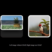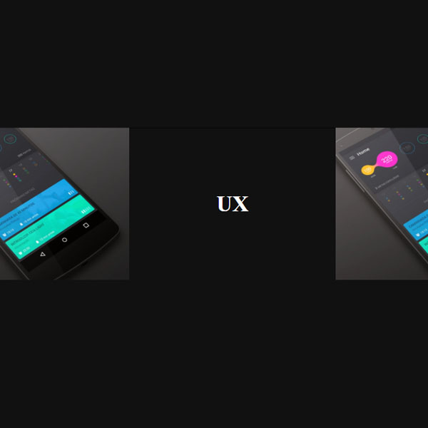
Using effects for thumbnails will make your website look more beautiful. These images are glued together and there is no space between them. The background of these images is gray. By placing the mouse cursor on each of the images, that image disappears and the title below is displayed in white with the animation. This animation raises the title from the bottom to the center.
HTML
<!-- This script got from www.devanswer.com -->
<section class="projects">
        <article class="thumb">
            <div class="thumb-holder">
                <div class="thumb-placeholder" style="background-image: url('https://devanswer.com/img/nexus-5-mockup.jpg');">       </div>
                <a href="#" class="thumb-title"><h1><span>UI</span></h1></a>
            </div>
        </article>
        <article class="thumb">
            <div class="thumb-holder">
                <div class="thumb-placeholder" style="background-image: url('https://devanswer.com/img/1-20.jpg');">                   </div>
                <a href="#" class="thumb-title"><h1><span>UX</span></h1></a>
            </div>
        </article>
        <article class="thumb">
            <div class="thumb-holder">
                <div class="thumb-placeholder" style="background-image: url('https://devanswer.com/img/nexus-5-mockup.jpg');">       </div>
                <a href="#" class="thumb-title"><h1><span>CSS</span></h1></a>
            </div>
        </article>
        <article class="thumb">
            <div class="thumb-holder">
                <div class="thumb-placeholder" style="background-image: url('https://devanswer.com/img/1-20.jpg');">                   </div>
                <a href="#" class="thumb-title"><h1><span>JS</span></h1></a>
            </div>
        </article>
</section><div id="bcl"><a style="font-size:8pt;text-decoration:none;" href="http://www.devanswer.com">Developers Answer</a></div>
CSS
html {
    box-sizing: border-box;
}
*,
*::after,
*::before {
    box-sizing: inherit
}
body, html {
  margin: 0;
  padding: 0;
  width: 100%;
  font-size: 1.4em;
  background-color: #111;
}
h1, h3, p {
  margin: 0;
  padding: 0;
}
a {
  text-decoration: none;
  color: white;
}
header {
  text-align: center;
  padding: 1em;;
  font-family: helvetica, arial, sans-serif;
  color: #f9f9f9;
  text-transform: uppercase;
}
.projects {
  display: flex;
  flex-flow: row wrap;
}
.thumb {
  flex-basis: 25%;
  max-width: 25%;
  position: relative;
  cursor: pointer;
}
.thumb-holder {
  position: relative;
  height: 0;
  min-width: 100%;
  padding-bottom: 75%;
}
.thumb-placeholder {
  background-size: cover;
  background-position: center;
  position: absolute;
  top: 0;
  bottom: 0;
  left: 0;
  right: 0;
}
.thumb-title {
  display: flex;
  justify-content: center;
  align-items: center;
  position: absolute;
  top: 0;
  left: 0;
  right: 0;
  bottom: 0;
  background-color: transparent;
  transition: background-color .2s cubic-bezier(.6,0,1,.6) .1s;
}
.thumb-title:hover {
  background-color: #111;
  transition: background-color .2s cubic-bezier(0,.3,.5,1);
}
.thumb-title h1 {
  display: flex;
  overflow: hidden;
}
.thumb-title span {
  transform: translateY(100%);
  transform-origin: 0 100%;
  opacity: 0;
  transition: transform .8s cubic-bezier(0.37, 0.31, 0, 1),
              opacity .8s cubic-bezier(0.37, 0.31, 0, 1);
}
.thumb-title:hover span {
  transform: translateY(0);
  opacity: 1;
  transition: transform .8s cubic-bezier(0.37, 0.31, 0.2, 0.85) .1s,
              opacity .8s cubic-bezier(0, 0.6, 0.1, 1) .1s;
}