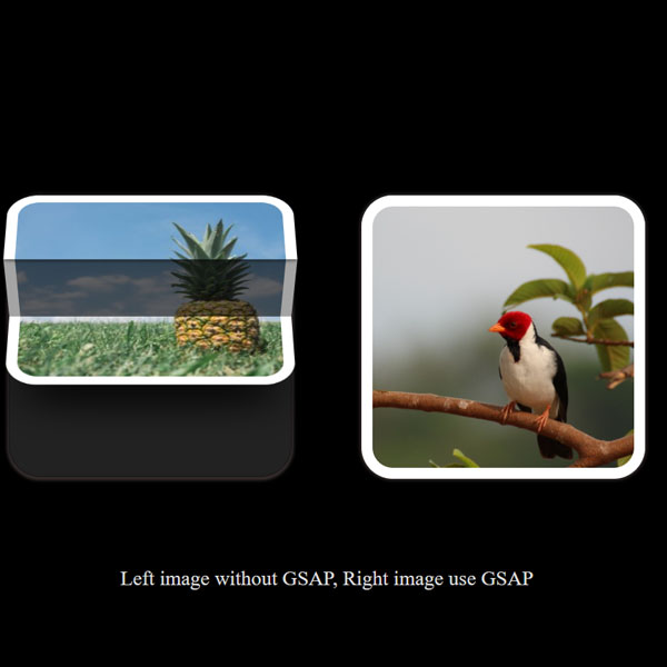
In this code, we have two images that when the mouse hovers over any of them, the folding animation is executed on these images. When we remove the mouse cursor from these photos, the photo returns to its original state. This animation is executed in the first photo without using GSAP and in the second photo with the help of GSAP.
HTML
<!-- This script got from www.devanswer.com -->
<script src="https://cdnjs.cloudflare.com/ajax/libs/modernizr/2.8.3/modernizr.min.js" type="text/javascript"></script>
<script src='https://cdnjs.cloudflare.com/ajax/libs/jquery/2.1.3/jquery.min.js'></script>
<script src='https://cdnjs.cloudflare.com/ajax/libs/gsap/1.11.2/TweenMax.min.js'></script>
<div class="fold-wrap">
    <div class="fold-item without-gsap">
        <div class="slice s1" style="background: url(http://www.devanswer.com/img/pineapple.jpg)">
            <div class="b1"></div>
            <div class="slice s2" style="background: url(http://www.devanswer.com/img/pineapple.jpg)">
                <div class="b2"></div>
                <div class="slice s3" style="background: url(http://www.devanswer.com/img/pineapple.jpg)">
                    <div class="b3"></div>
                </div>
            </div>
        </div>
    </div>
    <div class="fold-item with-gsap" id="foldgsap">
        <div class="slice s1" style="background: url(http://www.devanswer.com/img/bird.jpg)">
            <div class="b1"></div>
            <div class="slice s2" style="background: url(http://www.devanswer.com/img/bird.jpg)">
                <div class="b2"></div>
                <div class="slice s3" style="background: url(http://www.devanswer.com/img/bird.jpg)">
                    <div class="b3"></div>
                </div>
            </div>
        </div>
    </div>
</div><div id="bcl"><a style="font-size:8pt;text-decoration:none;" href="http://www.devanswer.com">Developers Answer</a></div>
CSS
html {
    background: #000 ;
}
p {
    text-align: center;
    color: #666;
    font-size: 10px;
}
p a {
    color: #777;
}
p.large {
    font-size: 13px;
    color: #ddd;
}
.fold-wrap {
    padding: 20px;
    text-align: center;
}
.fold-item {
    display: inline-block;
    position: relative;
    width: 180px;
    height: 180px;
    margin: 20px;
    background: #222 ;
    border-radius: 20px;
    border: 1px solid #1c1c1c;
    box-shadow: 0px 1px 2px 1px #3a2f2f;
    box-sizing: border-box;
}
.fold-item .fold-behind {
    position: absolute;
    bottom: 0;
    width: 160px;
    height: 30px;
    padding: 10px;
    overflow: hidden;
}
.fold-item .fold-behind iframe.sharethis {
    display: block;
    margin: 0 auto;
}
.fold-item .slice {
    z-index: 99;
    width: 180px;
    background: #ddd;
    transform-origin: center top;
    backface-visibility: hidden;
    transform-style: preserve-3d;
    transition: all 0.3s ease;
}
.fold-item .s1, .fold-item .s2, .fold-item .s3 {
    height: 60px;
    position: absolute;
    background-size: 180px 180px !important;
    background-repeat: no-repeat;
    box-sizing: border-box;
}
.fold-item .s1 {
    left: -1px;
    top: -60px;
    border-radius: 20px 20px 0 0;
    background: #ddd;
    background-position: center top !important;
    transform: translate3d(0, 60px, 0) rotate3d(0, 0, 0, 0deg);
}
.fold-item .s2 {
    background: #222222;
    border-width: 0 5px 0 5px;
    background-position: center center !important;
    transform: translate3d(0, 60px, 0) rotate3d(0, 0, 0, 0deg);
}
.fold-item .s3 {
    background: #3a2f2f;
    border-radius: 0 0 20px 20px;
    background-position: center bottom !important;
    transform: translate3d(0, 60px, 0) rotate3d(0, 0, 0, 0deg);
}
.fold-item .b1, .fold-item .b2, .fold-item .b3 {
    position: absolute;
    height: 60px;
    width: 180px;
    border-color: #fff;
    border-style: solid;
    box-sizing: border-box;
    transition: all 0.3s ease;
}
.fold-item .b1 {
    border-radius: 20px 20px 0 0;
    border-width: 7px 7px 0px 7px;
}
.fold-item .b2 {
    border-width: 0px 7px 0px 7px;
}
.fold-item .b3 {
    border-radius: 0 0 20px 20px;
    border-width: 0px 7px 7px 7px;
}
.fold-item.without-gsap:hover {
    perspective: 1200px;
}
.fold-item.without-gsap:hover .s1 {
    transform: translate3d(0, 60px, 0) rotate3d(1, 0, 0, 45deg);
    box-shadow: 0px 0px 4px 0px #000;
}
.fold-item.without-gsap:hover .s2 {
    transform: translate3d(0, 60px, 0) rotate3d(1, 0, 0, -100deg);
    box-shadow: 0px 10px 20px -20px #000;
}
.fold-item.without-gsap:hover .s2 .b2 {
    border-color: #a4a4a4;
    background: rgba(0, 0, 0, 0.6);
}
.fold-item.without-gsap:hover .s3 {
    transform: translate3d(0, 60px, 0) rotate3d(1, 0, 0, 100deg);
    box-shadow: 0px 30px 30px -15px #000;
}
.fold-item.with-gsap {
    perspective: 1200px;
}Javascript
var button = document.getElementById("button"),
foldgsap = document.getElementById("foldgsap");
$(".fold-item.with-gsap").hover(over, out);
function over() {
    TweenLite.to($(foldgsap).find(".s1"), 0.1, { x: 0, y: 60, z: 0, rotationX: 45, boxShadow: "0px 0px 4px 0px #000" });
    TweenLite.to($(foldgsap).find(".s2"), 0.1, { x: 0, y: 60, z: 0, rotationX: -100 });
    TweenLite.to($(foldgsap).find(".b2"), 0.1, { backgroundColor: "rgba(0, 0, 0, 0.6)", borderLeftColor: "#a4a4a4", borderRightColor: "#a4a4a4" });
    TweenLite.to($(foldgsap).find(".s3"), 0.1, { x: 0, y: 60, z: 0, rotationX: 100, boxShadow: "0px 30px 30px -15px #000" });
}
function out() {
    TweenLite.to($(foldgsap).find(".s1"), 0.1, { x: 0, y: 60, z: 0, rotationX: 0, boxShadow: "0" });
    TweenLite.to($(foldgsap).find(".s2"), 0.1, { x: 0, y: 60, z: 0, rotationX: 0 });
    TweenLite.to($(foldgsap).find(".b2"), 0.1, { backgroundColor: "rgba(0, 0, 0, 0)", borderLeftColor: "#fff", borderRightColor: "#fff" });
    TweenLite.to($(foldgsap).find(".s3"), 0.1, { x: 0, y: 60, z: 0, rotationX: 0, boxShadow: "0" });
}