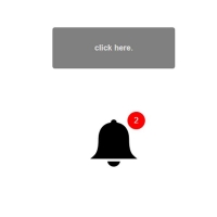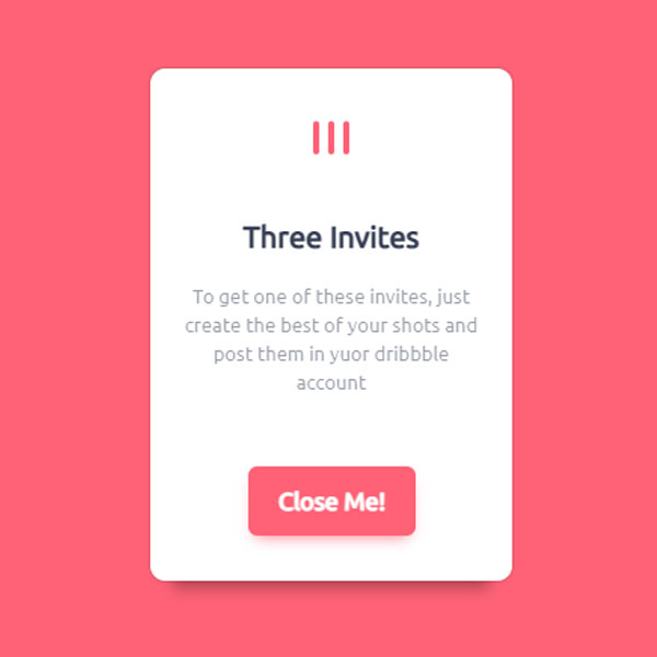
You can use pop-ups at the beginning of the website loading instead of inviting each person to the startup anniversary celebration or establishing your website. Like this code that clicks on the only three lines in the middle of the page to animate a beautiful pop-up. The background of the page in this post is pink. The overall theme of the pop-up is also pink and white. Also, the color of the button at the bottom of the pop-up to close the pop-up is pink.
HTML
<!-- This script got from www.devanswer.com -->
<section class="page">
	<div class="wrapper">
		<input type="checkbox" id="checkbox">
		<label for="checkbox" class="open">
			<div class="lines">
				<div class="line"></div>
				<div class="line"></div>
				<div class="line"></div>
			</div>
		</label>
		<!-- begin content -->
		<section class="content">
			<label for="checkbox" class="close"><span>Close Me!</span></label>
			<div class="logo">
				<div class="logo__line"></div>
				<div class="logo__line"></div>
				<div class="logo__line"></div>
			</div>
			<h1>Three Invites</h1>
			<p>
				To get one of these invites, just create the best of
				your shots and post them in yuor dribbble account
			</p>
		</section>
		<!-- end content -->
	</div>
</section><div id="bcl"><a style="font-size:8pt;text-decoration:none;" href="http://www.devanswer.com">Developers Answer</a></div>
CSS
@import url(https://fonts.googleapis.com/css?family=Ubuntu);
* {
	margin: 0;padding: 0;
}
::-moz-selection {
	background: #FF6277;
	color: #fff;
}
::selection {
	background: #FF6277;
	color: #fff;
}
.page {
	position: relative;
	width: 100%;
	height: 100vh;
	background: #FF6277;
}
.wrapper,
.lines,
.line,
.open:after,
.content {
	position: absolute;
	top: 50%;
	left: 50%;
	transform: translate(-50%, -50%);
}
input[type="checkbox"] {
	display: none;
}
input[type="checkbox"]:checked ~ label .lines .line:first-child {
	transform: translate(-50%, -50%);
	transition: transform .4s cubic-bezier(0.64, 0.57, 0.67, 1.53);
}
input[type="checkbox"]:checked ~ label .lines .line:last-child {
	transform: translate(-50%, -50%);
	transition: transform .4s cubic-bezier(0.64, 0.57, 0.67, 1.53);
}
input[type="checkbox"]:checked ~ label:after {
	opacity: 0;
	transform: translate(-50%, -50%) scale3d(1, 1, 1);
	transition: all .5s cubic-bezier(0.64, 0.57, 0.67, 1.53);
}
input[type="checkbox"]:checked ~ .content {
	transform: translate(-50%, -50%) scale3d(1, 1, 1);
	transition: transform .5s .4s cubic-bezier(0.99, 0.04, 0.57, 1.31), box-shadow .5s .7s;
	box-shadow: 0 0 2px rgba(0, 0, 0, .3), 0 20px 10px -15px rgba(0, 0, 0, .3);
}
input[type="checkbox"]:checked ~ .content .close {
	transform: scale3d(1,1,1);
	transition: transform .5s .7s cubic-bezier(0.99, 0.04, 0.57, 1.31), opacity .5s .7s, background .3s, box-shadow .3s;
	opacity: 1;
}
input[type="checkbox"]:checked ~ .content h1 {
	transform: translate(0, 0);
	transition: transform .5s .6s cubic-bezier(0.99, 0.04, 0.57, 1.31), opacity .8s .8s;
	opacity: 1
}
input[type="checkbox"]:checked ~ .content p {
	transform: translate(0, 0);
	transition: transform .5s .62s cubic-bezier(0.99, 0.04, 0.57, 1.31), opacity .8s .8s;
	opacity: .5
}
input[type="checkbox"]:checked ~ .content .logo .logo__line {
	opacity: 1;
	transform: translate(-50%, 0);
	transition: transform .5s .7s cubic-bezier(0.99, 0.04, 0.57, 1.31), opacity .8s .8s;
}
input[type="checkbox"]:checked ~ .content .logo .logo__line:first-child {
	opacity: 1;
	transform: translate(calc(0% - 50% - 10px), 0);
	transition: transform .5s .8s cubic-bezier(0.99, 0.04, 0.57, 1.31), opacity .8s .8s;
}
input[type="checkbox"]:checked ~ .content .logo .logo__line:last-child {
	opacity: 1;
	transform: translate(calc(0% - 50% + 10px), 0);
	transition: transform .5s .85s cubic-bezier(0.99, 0.04, 0.57, 1.31), opacity .8s .8s;
}
.open {
	display: block;
	width: 30px;
	height: 20px;
/* 	background: rgba(245, 245, 245, .3); */
	cursor: pointer;
}
.open:after {
	content: '';
	width: 200px;
	height: 200px;
	background-color: rgba(245, 245, 245, .3);
	border-radius: 50%;
	opacity: 1;
	transform: translate(-50%, -50%) scale3d(0, 0, 0);
	transition: none;
}
.line {
	width: 4px;
	height: 30px;
	background: rgba(245, 245, 245, 1);
	border-radius: 5px;
	transition: transform .4s 1s cubic-bezier(0.64, 0.57, 0.67, 1.53);
}
.line:first-child {
	transform: translate(-15px, -50%);
}
.line:last-child {
	transform: translate(11px, -50%);
}
.content {
	width: 200px;
	height: 300px;
	background: rgba(255, 255, 255, 1);
	border-radius: 10px;
	transform: translate(-50%, -50%) scale3d(0, 0, 0);
	padding: 20px;
	display: flex;
	flex-direction: column;
	justify-content: center;
	align-items: center;
	color: #384055;
	font: normal 16px/1 'Ubuntu', sans-serif;
	text-align: center;
	transition: transform .5s .5s cubic-bezier(0.99, 0.04, 0.57, 1.31), box-shadow .5s .5s;
}
.content h1 {
	padding-bottom: 20px;
	font-size: 20px;
	transition: transform .5s .02s cubic-bezier(0.99, 0.04, 0.57, 1.31), opacity .5s;
}
.content p {
	line-height: 1.5;
	opacity: .5;
	font-size: 13px;
	padding-bottom: 20px;
	transition: transform .3s cubic-bezier(0.99, 0.04, 0.57, 1.31), opacity .5s;
}
.content h1,
.content p {
	transform: translate(0, 60px);
	opacity: 0;
}
.close {
	position: absolute;
	bottom: 30px;
	background: #FF6277;
	border-radius: 6px;
	color: #fff;
	padding: 15px 20px;
	cursor: pointer;
	font-weight: bolder;
	opacity: 0;
	transform: scale3d(0,0,0);
	transition: transform .5s cubic-bezier(0.99, 0.04, 0.57, 1.31), opacity .5s, box-shadow .3s;
	box-shadow: 0 5px 10px -5px rgba(255, 98, 119, 1);
/* 	box-shadow: 0 5px 10px -5px rgba(0, 0, 0, .5); */
}
.close:active {
	box-shadow: 0 0px 10px -5px rgba(255, 98, 119, 1);
/* 	box-shadow: 0 0px 10px -5px rgba(0, 0, 0, .5); */
}
.close:hover {
	-webkit-animation: bounce .5s;
	        animation: bounce .5s
}
.close span {
	display: inline-block;
	position: relative;
}
.close:hover span {
	-webkit-animation: bounce .5s .03s;
	        animation: bounce .5s .03s
}
.logo {
	position: absolute;
	top: 20px;
	left: 50%;
	transform: translate(-50%, 0);
}
.logo__line {
	position: absolute;
	top: 15px;
	left: 50%;
	transform: translate(-50%, -20px);
	width: 4px;
	height: 22px;
	border-radius: 6px;
	background: #FF6277;
	opacity: 0;
	transition: transform .5s .1s cubic-bezier(0.99, 0.04, 0.57, 1.31), opacity .8s .1s;
}
.logo__line:first-child {
	transform: translate(calc(0% - 50% - 10px), -20px);
	transition: transform .5s .2s cubic-bezier(0.99, 0.04, 0.57, 1.31), opacity .8s .2s;
}
.logo__line:last-child {
	transform: translate(calc(0% - 50% + 10px), -20px);
	transition: transform .5s .3s cubic-bezier(0.99, 0.04, 0.57, 1.31), opacity .8s .3s;
}
@-webkit-keyframes bounce {
	0% {
		transform: translate(0px, 0px);
	}
	40% {
		transform: translate(0px, -12px);
	}
	80% {
		transform: translate(0px, 2px);
	}
	100% {
		transform: translate(0px, 0px);
	}
}
@keyframes bounce {
	0% {
		transform: translate(0px, 0px);
	}
	40% {
		transform: translate(0px, -12px);
	}
	80% {
		transform: translate(0px, 2px);
	}
	100% {
		transform: translate(0px, 0px);
	}
}