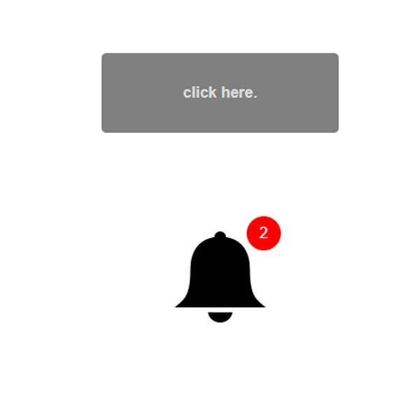
We can use this code when we need a counter on the website. In addition to counting, the counter also plays a ringtone, which means that each time a ringtone is counted, it can be a warning to the user. There is also a ringtone icon next to this counter. This number counts up to twenty, but you can increase or decrease it and count it to your desired number.
HTML
<!-- This script got from www.devanswer.com -->
<script src="https://code.jquery.com/jquery-1.11.1.min.js"></script>
<div class="container">
	<h4 id="noti" style="font-size: 16px">
		click here.
	</h4>
	<div class="cp-notification-wrap">
	  <div id="cp-notification" class="cp-notification">
	    <img src="https://devanswer.com/img/bell.png" alt="" />
	    <div class="cp-notification-alert">0</div>
	  </div>
	</div>
	<audio id="cp-alert" src="https://devanswer.com/codes/files/audio_small-bell-ring-01a.mp3" hidden></audio>
</div><div id="bcl"><a style="font-size:8pt;text-decoration:none;" href="http://www.devanswer.com">Developers Answer</a></div>
CSS
html,body{
  height: 100%;
  margin: 0;
  padding: 0;
  font-family: sans-serif;
}
.cp-notification-wrap{
  display: flex;
  align-items: center;
  justify-content: center;
  height: 100%;
}
h4#noti.des {
  color: gainsboro;
  background-color: gray;
  box-shadow: unset;
}
@keyframes shake{
  50%{
    transform: translate(15px) rotate(14deg)
  }
  60%{
     transform: translate(-15px) rotate(-14deg)
  }
}
.cp-notification{
  position: relative;
}
.cp-notification img{
  transform-origin: center top;
}
.container {
  width: 90%;
  margin: 0 auto;
  padding: 15px;
}
h4#noti {
  text-align: center;
  width: 250px;
  transition: 0.5s;
  margin: 88px auto;
  background-color: hotpink;
  padding: 33px 0;
  border-radius: 5px;
  cursor: pointer;
  box-shadow: 0 0 5px 4px #00000038;
}
h4#noti:hover {
    box-shadow: 0 0 0 0 black;
}
.cp-notification img, .cp-notification-alert{
  transition: transform 150ms;
}
.cp-notification-alert{
  position: absolute;
  width: 36px;
  height: 36px;
  line-height: 36px;
  color: white;
  border-radius: 50%;
  background: red;
  text-align: center;
  top: 0;
  right: 0;
  transform: scale(0) rotateY(180deg);
  backface-visibility: hidden
}
.active img{
  animation: shake 250ms
}
.active .cp-notification-alert{
   transform: scale(1) rotateY(0deg)
}Javascript
function cpAlert(){
	var bell = document.getElementById('cp-notification');
  	var alert = document.getElementById('cp-alert');
  	var alertText = document.getElementsByClassName('cp-notification-alert');
  	var text = $(alertText).text();
  	$(bell).removeClass('active');
  	if (text < 20) {
	  	setTimeout(function(){
	  		var i = parseInt(++text) ;
	    	bell.className += ' ' + 'active';
	        alert.play();
	 		$(alertText).html(i);
	  	},100)
	}
}
$('#noti').one('click', function (){
	cpAlert();
	$(this).addClass('des');
	window.setInterval(function(){
	    cpAlert();
	}, 4000);
});