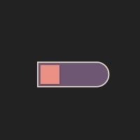
In this post, we have an animation switch. This switch has a blue background. At first, the switch shows an egg that breaks and halves. Clicking on the switch moves a spoonful of this fried egg and the switch rolling circle goes to the left. This switch can be used on websites related to cooking and kitchen appliances.
HTML
<!-- This script got from www.devanswer.com -->
<link rel="stylesheet" href="https://cdnjs.cloudflare.com/ajax/libs/meyer-reset/2.0/reset.min.css">
<label class="egg-switch">
    <input type="checkbox" checked>
    <div>
        <div class="flipper">
            <svg>
                <use xlink:href="#flipper">
            </svg>
        </div>
        <div class="egg">
            <div class="front"></div>
            <div class="back"></div>
        </div>
    </div>
</label>
<svg xmlns="http://www.w3.org/2000/svg" style="display: none;">
    <symbol xmlns="http://www.w3.org/2000/svg" viewBox="0 0 39 18" id="flipper" fill="currentColor">
        <path d="M0.0244740693,1.75473835 C0.00818305726,1.86197078 0,1.97036486 0,2.07892575 L0,15.921377 C0,17.0693688 0.8954305,18 2,18 C2.10445462,18 2.20874874,17.9914953 2.31192515,17.9745638 L17.3119251,15.5130366 C18.2840292,15.3535125 19,14.4826852 19,13.4598497 L19,12.6377416 C19.6666667,11.5984301 20.3333333,11.0787744 21,11.0787744 L39,11.0787744 L39,6.92152835 L21,6.92152835 C20.3333333,6.92152835 19.6666667,6.4018726 19,5.36256109 L19,4.540453 C19,3.51761755 18.2840292,2.64679022 17.3119251,2.48726617 L2.31192515,0.0257389154 C1.2208723,-0.153304839 0.196745571,0.620794577 0.0244740693,1.75473835 Z M12.2049236,12.279252 C12.6185695,12.2575737 12.9714694,12.5753263 12.9931477,12.9889722 C13.0130194,13.3681476 12.747675,13.6962795 12.3847003,13.7650328 L12.2834275,13.7771963 L3.79507644,14.2220519 C3.38143055,14.2437302 3.02853059,13.9259776 3.00685233,13.5123317 C2.98698059,13.1331563 3.25232501,12.8050244 3.61529975,12.7362711 L3.71657251,12.7241076 L12.2049236,12.279252 Z M16.75,5 C16.8683467,5 16.9674868,5.08223341 16.9933973,5.19267729 L17,5.25 L17,12.75 C17,12.8880712 16.8880712,13 16.75,13 C16.6316533,13 16.5325132,12.9177666 16.5066027,12.8073227 L16.5,12.75 L16.5,5.25 C16.5,5.11192881 16.6119288,5 16.75,5 Z M13.7339356,9.6630893 C14.1480861,9.65586028 14.4896817,9.9857353 14.4971398,10.3998858 C14.5035373,10.7795237 14.2269029,11.0981954 13.8617498,11.1542391 L13.7601142,11.1628608 L3.26171343,11.3461111 C2.84756295,11.3533401 2.50596738,11.0234651 2.49850922,10.6093146 C2.49211175,10.2296767 2.76874618,9.91100505 3.13389925,9.85496129 L3.23553482,9.84633957 L13.7339356,9.6630893 Z M3.26171343,6.6630893 L13.7601142,6.84633957 C14.1742647,6.8535686 14.5041397,7.19516417 14.4971402,7.60931465 C14.4902841,7.98895258 14.2026967,8.29777572 13.8358102,8.34104168 L13.7339356,8.34611112 L3.23553482,8.16286085 C2.82138434,8.15563182 2.49150933,7.81403625 2.49850889,7.39988577 C2.50536496,7.02024784 2.79295235,6.7114247 3.15983888,6.66815874 L3.26171343,6.6630893 Z M3.79507644,3.77925197 L12.2834275,4.2241076 C12.6970734,4.24578586 13.0148259,4.59868582 12.9931477,5.01233171 C12.9732759,5.39150712 12.675086,5.69010548 12.306913,5.72054092 L12.2049236,5.7220519 L3.71657251,5.27719627 C3.30292661,5.25551801 2.98517406,4.90261805 3.00685233,4.48897215 C3.02672407,4.10979675 3.32491404,3.81119839 3.69308704,3.78076294 L3.79507644,3.77925197 Z"></path>
    </symbol>
</svg><div id="bcl"><a style="font-size:8pt;text-decoration:none;" href="http://www.devanswer.com">Developers Answer</a></div>
CSS
.egg-switch {
  --background: #171827;
  --shadow: rgba(246, 248, 255, .08);
  --shadow-inner: rgba(13, 15, 24, .8);
  --egg: #fff;
  --egg-back: #f4d2ad;
  --egg-yellow: linear-gradient(135deg, rgba(239,202,51, 1) 50%, rgba(237,139,2, 1) 100%);
  --egg-shadow: rgba(13, 15, 24, .25);
  --flipper: #F6F8FF;
  --flipper-hand: #8A91B4;
  --flipper-shadow: #646B8C;
  perspective: 160px;
  cursor: pointer;
  -webkit-tap-highlight-color: transparent;
}
.egg-switch input {
  display: none;
}
.egg-switch input + div {
  width: 64px;
  height: 32px;
  border-radius: 16px;
  position: relative;
  background: var(--background);
  box-shadow: inset 0 1px 3px 0 var(--shadow-inner), 0 1px 0 0 var(--shadow);
}
.egg-switch input + div .egg {
  position: absolute;
  left: 4px;
  top: 4px;
  z-index: 1;
  -webkit-animation: egg 2s linear forwards;
          animation: egg 2s linear forwards;
  transform-style: preserve-3d;
}
.egg-switch input + div .egg .front:before,
.egg-switch input + div .egg .front:after,
.egg-switch input + div .egg .back:before,
.egg-switch input + div .egg .back:after {
  content: "";
}
.egg-switch input + div .egg .front:before,
.egg-switch input + div .egg .front:after,
.egg-switch input + div .egg .back:before,
.egg-switch input + div .egg .back:after,
.egg-switch input + div .egg .back {
  position: absolute;
  border-radius: var(--border-radius, 50%);
  width: var(--width, var(--size, 24px));
  height: var(--height, var(--size, 24px));
  left: var(--left, var(--spacing, 0));
  top: var(--top, var(--spacing, 0));
  background: var(--background, var(--egg));
}
.egg-switch input + div .egg .front {
  width: 24px;
  height: 24px;
  transform: rotateY(180deg);
  -webkit-backface-visibility: hidden;
          backface-visibility: hidden;
}
.egg-switch input + div .egg .front:before {
  --background: var(--egg);
}
.egg-switch input + div .egg .front:after {
  --size: 12px;
  --spacing: 6px;
  --background: var(--egg-yellow);
  transform: translateZ(0);
  box-shadow: 1px 1px 3px var(--egg-shadow);
}
.egg-switch input + div .egg .back {
  --background: none;
}
.egg-switch input + div .egg .back:before, .egg-switch input + div .egg .back:after {
  --height: 14px;
  --background: var(--egg-back);
}
.egg-switch input + div .egg .back:before {
  --border-radius: 12px 12px 0 0;
  -webkit-clip-path: polygon(0 0, 100% 0, 100% 90%, 75% 100%, 50% 90%, 25% 100%, 0 80%);
          clip-path: polygon(0 0, 100% 0, 100% 90%, 75% 100%, 50% 90%, 25% 100%, 0 80%);
}
.egg-switch input + div .egg .back:after {
  --border-radius: 0 0 12px 12px;
  --top: 10px;
  -webkit-clip-path: polygon(0 0, 25% 20%, 50% 10%, 75% 20%, 100% 10%, 100% 100%, 0 100%);
          clip-path: polygon(0 0, 25% 20%, 50% 10%, 75% 20%, 100% 10%, 100% 100%, 0 100%);
}
.egg-switch input + div .flipper {
  position: absolute;
  display: flex;
  align-items: center;
  top: 7px;
  left: 100%;
  opacity: 0;
  transform-origin: 20px 50%;
  transform: translateX(60px) translateY(-32px) rotate(-30deg) scale(0.8);
  -webkit-animation: flipper 2s linear;
          animation: flipper 2s linear;
}
.egg-switch input + div .flipper:after {
  content: "";
  width: 20px;
  height: 6px;
  border-radius: 2px 1px 1px 2px;
  display: block;
  background: var(--flipper-hand);
  box-shadow: inset 0 -1px 0 0 var(--flipper-shadow);
}
.egg-switch input + div .flipper svg {
  width: 39px;
  height: 18px;
  display: block;
  color: var(--flipper);
}
.egg-switch input:checked + div .flipper {
  -webkit-animation: none;
          animation: none;
}
.egg-switch input:checked + div .egg {
  -webkit-animation: crack 2s linear forwards;
          animation: crack 2s linear forwards;
}
.egg-switch input:checked + div .egg .front:before {
  -webkit-animation: egg-white 0.8s linear forwards 1.4s;
          animation: egg-white 0.8s linear forwards 1.4s;
}
.egg-switch input:checked + div .egg .back:before, .egg-switch input:checked + div .egg .back:after {
  --animate-y: -16px;
  transform: translateZ(-2px);
  -webkit-animation: egg-crack 0.8s linear forwards 1.4s;
          animation: egg-crack 0.8s linear forwards 1.4s;
}
.egg-switch input:checked + div .egg .back:after {
  --animate-y: 16px;
}

@-webkit-keyframes egg {
  0%, 40% {
    transform: rotateY(180deg) translateX(-32px);
  }
  50% {
    transform: rotateY(180deg) translateX(-33px);
  }
  75% {
    transform: translateZ(32px);
  }
  90% {
    transform: scaleX(0.9);
  }
  100% {
    transform: scaleX(0.8);
  }
}

@keyframes egg {
  0%, 40% {
    transform: rotateY(180deg) translateX(-32px);
  }
  50% {
    transform: rotateY(180deg) translateX(-33px);
  }
  75% {
    transform: translateZ(32px);
  }
  90% {
    transform: scaleX(0.9);
  }
  100% {
    transform: scaleX(0.8);
  }
}
@-webkit-keyframes egg-white {
  0% {
    opacity: 0.4;
    transform: scale(0.4);
  }
  60%, 100% {
    transform: scale(1);
  }
  100% {
    opacity: 1;
  }
}
@keyframes egg-white {
  0% {
    opacity: 0.4;
    transform: scale(0.4);
  }
  60%, 100% {
    transform: scale(1);
  }
  100% {
    opacity: 1;
  }
}
@-webkit-keyframes egg-crack {
  0% {
    transform: translateZ(-2px);
  }
  70% {
    transform: translateZ(-2px) scale(0.8) rotate(4deg) translateY(var(--animate-y));
  }
  80% {
    opacity: 1;
  }
  100% {
    opacity: 0;
    transform: translateZ(-2px) scale(0.8) rotate(8deg) translateY(calc(var(--animate-y) * 1.5));
  }
}
@keyframes egg-crack {
  0% {
    transform: translateZ(-2px);
  }
  70% {
    transform: translateZ(-2px) scale(0.8) rotate(4deg) translateY(var(--animate-y));
  }
  80% {
    opacity: 1;
  }
  100% {
    opacity: 0;
    transform: translateZ(-2px) scale(0.8) rotate(8deg) translateY(calc(var(--animate-y) * 1.5));
  }
}
@-webkit-keyframes crack {
  0% {
    transform: rotateY(180deg) scaleX(0.8);
  }
  30% {
    transform: rotateY(180deg) rotateZ(-16deg) translateX(-8px) translateY(12px) translateZ(-24px) scaleX(0.8);
  }
  40% {
    transform: rotateY(180deg) rotateZ(-16deg) translateX(-8px) translateY(12px) scaleX(0.8);
  }
  60%, 80% {
    transform: rotateY(180deg) translateX(-32px) scaleX(0.8);
  }
  100% {
    transform: rotateY(180deg) translateX(-32px);
  }
}
@keyframes crack {
  0% {
    transform: rotateY(180deg) scaleX(0.8);
  }
  30% {
    transform: rotateY(180deg) rotateZ(-16deg) translateX(-8px) translateY(12px) translateZ(-24px) scaleX(0.8);
  }
  40% {
    transform: rotateY(180deg) rotateZ(-16deg) translateX(-8px) translateY(12px) scaleX(0.8);
  }
  60%, 80% {
    transform: rotateY(180deg) translateX(-32px) scaleX(0.8);
  }
  100% {
    transform: rotateY(180deg) translateX(-32px);
  }
}
@-webkit-keyframes flipper {
  30% {
    transform: translateX(-4px);
  }
  40% {
    transform: translateX(-16px);
  }
  50% {
    transform: translateX(-24px);
  }
  60% {
    transform: translateX(-32px) rotateY(50deg) translateZ(16px);
  }
  70% {
    transform: translateX(14px);
  }
  85%, 100% {
    transform: translateX(60px);
  }
  15%, 80% {
    opacity: 1;
  }
  95%, 100% {
    opacity: 0;
  }
}
@keyframes flipper {
  30% {
    transform: translateX(-4px);
  }
  40% {
    transform: translateX(-16px);
  }
  50% {
    transform: translateX(-24px);
  }
  60% {
    transform: translateX(-32px) rotateY(50deg) translateZ(16px);
  }
  70% {
    transform: translateX(14px);
  }
  85%, 100% {
    transform: translateX(60px);
  }
  15%, 80% {
    opacity: 1;
  }
  95%, 100% {
    opacity: 0;
  }
}
html {
  box-sizing: border-box;
  -webkit-font-smoothing: antialiased;
}

* {
  box-sizing: inherit;
}
*:before, *:after {
  box-sizing: inherit;
}

body {
  min-height: 100vh;
  display: flex;
  justify-content: center;
  align-items: center;
  background: #2B3044;
}
body .dribbble {
  position: fixed;
  display: block;
  right: 20px;
  bottom: 20px;
}
body .dribbble img {
  display: block;
  width: 76px;
}
body .twitter {
  position: fixed;
  display: block;
  right: 112px;
  bottom: 14px;
}
body .twitter svg {
  width: 24px;
  height: 24px;
  fill: white;
}