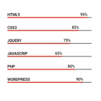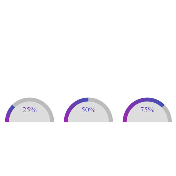
Using different progress bars can also be appealing to your website users. In this post, as you can see, we have a progress bar that looks like a semicircle. This progress bar is arched and its color is blue and purple gradient. The progress percentage of this bar is also the gradient and it is written below it.
HTML
<!-- This script got from www.devanswer.com -->
<div class="half-arc" style="--percentage:25%;">
  <span class="label">25%</span>
</div>
<div class="half-arc" style="--percentage:50%;">
  <span class="label">50%</span>
</div>
<div class="half-arc" style="--percentage:75%;">
  <span class="label">75%</span>
</div>
<div class="half-arc" style="--percentage:100%;">
  <span class="label">100%</span>
</div><div id="bcl"><a style="font-size:8pt;text-decoration:none;" href="http://www.devanswer.com">Developers Answer</a></div>
CSS
html, body {
    display: flex;
    justify-content: center;
    align-items: center;
    min-height: 100vh;
    font-size: 32px;
    gap: 40px;
}
.half-arc {
    position: relative;
    width: 200px;
    height: 100px;
    border-top-left-radius: 120px;
    border-top-right-radius: 120px;
    border-bottom: 0;
    background: #d9d9d9;
    box-sizing: border-box;
    overflow: hidden;
    display: flex;
    align-items: center;
    justify-content: center;
}
.half-arc:before {
    content: "";
    position: absolute;
    display: block;
    top: 0;
    left: 0;
    width: 100%;
    height: 200%;
    border-radius: 50%;
    background-image: conic-gradient(#9c27b0, #3f51b5 calc(var(--percentage, 0) / 2), #bbb 0);
    transition: transform .5s ease-in-out;
    z-index: 1;
    transform: rotate(270deg);
}
.half-arc:after {
    content: "";
    position: absolute;
    display: block;
    background: #dddddd;
    z-index: 2;
    width: calc(100% - 32px);
    height: calc(200% - 32px);
    border-radius: 50%;
    top: 16px;
    left: 16px;
}
.half-arc span {
    color: #673ab7;
    z-index: 3;
    text-align: center;
}