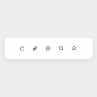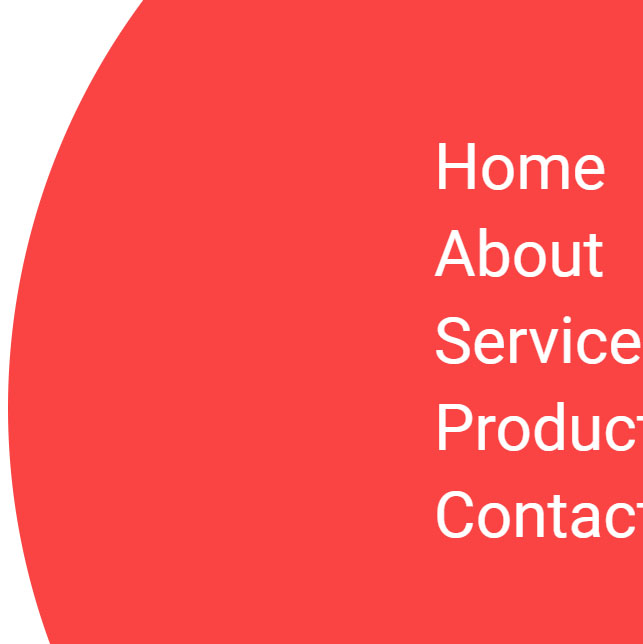
A beautiful hamburger menu that when we click on the hamburger menu button, a circle will appear in the upper right corner and the menu items will be displayed for us. Also, each item in the hover mode has an attractive effect in such a way that the rest of the items fade and a vertical line is created next to the desired item, and when we exit the hover mode, they return to their normal state. If we press the hamburger button after opening the menu, the menu closes in the same way and returns to the top right corner.
HTML
<!-- This script got from www.devanswer.com -->
<div id="menu-btn" class="menu-opened">
    <span class="bar"></span>
    <span class="bar"></span>
    <span class="bar"></span>
</div>
<div id="nav-wrapper">
    <nav>
        <div id="nav-links">
            <ul>
                <li><a href="#">Home</a></li>
                <li><a href="#">About</a></li>
                <li><a href="#">Services</a></li>
                <li><a href="#">Product</a></li>
                <li><a href="#">Contact</a></li>
            </ul>
        </div>
    </nav>
</div><div id="bcl"><a style="font-size:8pt;text-decoration:none;" href="http://www.devanswer.com">Developers Answer</a></div>
CSS
 @import url('https://fonts.googleapis.com/css2?family=Roboto:wght@400;500&display=swap');

    :root {
        --primary-bg: #FA4444;
    }

    * {
        margin: 0;
        padding: 0;
        box-sizing: border-box;
    }

    body {
        overflow: hidden;
        font-family: 'Roboto', sans-serif;
    }

    /* nav wrapper styling */
    #nav-wrapper {
        position: absolute;
        right: -20vmax;
        top: -20vmax;
        background: var(--primary-bg);
        width: 100vmax;
        height: 100vmax;
        border-radius: 50%;
        transition: 500ms cubic-bezier(0,0.2,0.4,1);
    }

    /* menu btn styling */
    #menu-btn {
        position: absolute;
        right: 5%;
        top: 5%;
        z-index: 1000;
        padding: 5px;
    }

    .bar {
        display: block;
        width: 40px;
        height: 5px;
        background: black;
        margin: 7px 0;
    }

    nav {
        position: absolute;
        top: 45%;
        left: 40%;
        transform: translate(-50%,-50%);
    }

    #nav-links li {
        list-style-type: none;
    }

    #nav-links {
        display: flex;
        font-size: 64px;
    }

        #nav-links a {
            display: inline-block;
            text-decoration: none;
            color: white;
            padding: 5px 0;
            transition: all 300ms ease-in;
            position: relative;
        }

            #nav-links a::after {
                position: absolute;
                top: 50%;
                left: 105%;
                content: " ";
                height: 60px;
                transform: translateY(-50%);
                width: 8px;
                background: white;
                opacity: 0;
                transition: 300ms ease-in;
            }


        #nav-links:hover a {
            opacity: .5;
        }

        #nav-links a:hover {
            opacity: 1;
            color: white;
        }

            #nav-links a:hover::after {
                opacity: 1;
            }


    /* #nav-links a:not(:hover){
  color:#d3d3d3;
} */


    .menu-closed {
        width: 0 !important;
        height: 0 !important;
}Javascript
document.querySelector('#menu-btn').addEventListener('click', function () {
        document.querySelector('#nav-wrapper').classList.toggle('menu-closed');
    });