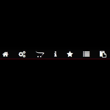
This is a dark-themed menu with menu items marked with icons, and each icon rotates to red in hover mode. In addition, this code is pure CSS and does not require JavaScript or jQuery code, and therefore is very useful for sites that want the beauty and lightness of the code together. The color and type of icon in the item can be changed according to your taste. But the combination of red and black in the hover mode has a unique beauty.
HTML
<!-- This script got from www.devanswer.com -->
<link rel="stylesheet" href="https://cdnjs.cloudflare.com/ajax/libs/font-awesome/4.7.0/css/font-awesome.min.css">
<center>
    <div class="navbar">
        <a href=""><i class="fa fa-home"></i></a>
        <a href=""><i class="fa fa-cogs"></i></a>
        <a href=""><i class="fa fa-opencart"></i></a>
        <a href=""><i class="fa fa-wtench"></i></a>
        <a href=""><i class="fa fa-info"></i></a>
        <a href=""><i class="fa fa-star"></i></a>
        <a href=""><i class="fa fa-list"></i></a>
        <a href=""><i class="fa fa-clipboard"></i></a>
    </div>
</center><div id="bcl"><a style="font-size:8pt;text-decoration:none;" href="http://www.devanswer.com">Developers Answer</a></div>
CSS
  html {
        background: #000;
        margin: 0;
    }

    .navbar {
        position: absolute;
        justify-content: center;
        align-items: center;
        background: #070707;
        height: 35px;
        width: 85%;
        border-radius: 14px 14px 0px 0px;
        border-bottom: 1px solid rgba(255,0,0,0.6);
        position: relative;
        font-size: 25px;
    }

    .fa-home, .fa-cogs, .fa-opencart, .fa-wrench, .fa-info, .fa-star, .fa-list, .fa-clipboard {
        color: #fff;
        float: left;
        margin: 5px 20px;
    }

        .fa-home:hover, .fa-cogs:hover, .fa-opencart:hover, .fa-wrench:hover, .fa-info:hover, .fa-star:hover, .fa-list:hover, .fa-clipboard:hover {
            color: #ff0000;
            transition: 0.5s;
            -webkit-transform: rotate(360deg);
            -moz-transform: rotate(360deg);
            -o-transform: rotate(360deg);
            -ms-transform: rotate(360deg);
            transform: rotate(360deg);
            animation: bounce 1s infinite;
        }

            .fa-home:hover:after {
                color: #ff00ff;
                transition: 0.5s;
                -webkit-transform: rotate(360deg);
                -moz-transform: rotate(360deg);
                -o-transform: rotate(360deg);
                -ms-transform: rotate(360deg);
                transform: rotate(360deg);
            }