To make your website more beautiful, you can use pop-ups for different purposes. One of these is the use of photos. In this post, our pop-up is based on photos and is displayed with different animations. Each pop-up also displays a close button when displayed. The space outside the photo also darkens when the pop-up is displayed and lights up again when the pop-up is closed.
HTML
<!-- This script got from www.devanswer.com -->
<link rel='stylesheet' href='https://cdnjs.cloudflare.com/ajax/libs/magnific-popup.js/1.1.0/magnific-popup.css'>
<script src="https://cdnjs.cloudflare.com/ajax/libs/prefixfree/1.0.7/prefixfree.min.js"></script>
<script src='https://cdnjs.cloudflare.com/ajax/libs/jquery/2.1.3/jquery.min.js'></script>
<script src='https://cdnjs.cloudflare.com/ajax/libs/magnific-popup.js/1.1.0/jquery.magnific-popup.min.js'></script>
<h3>
<h4>Image-based Popups:</h4>
<ul id="image-popups">
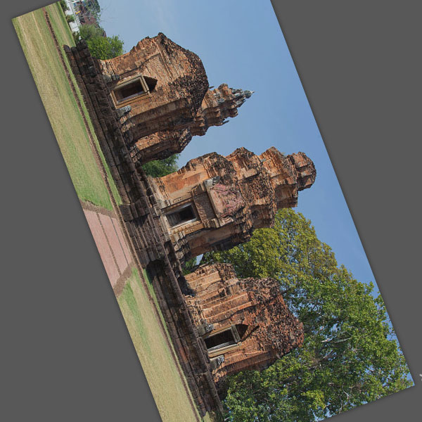
<li><a href="http://www.devanswer.com/img/800px-Prasat_Sikhoraphum.jpg" data-effect="mfp-newspaper">Newspaper</a></li>
<li><a href="http://www.devanswer.com/img/800px-Prasat_Sikhoraphum.jpg" data-effect="mfp-3d-unfold">3d unfold</a></li>
</ul>
</h3><div id="bcl"><a style="font-size:8pt;text-decoration:none;" href="http://www.devanswer.com">Developers Answer</a></div>
CSS
html, body {
  margin: 0;
  padding: 10px;
  -webkit-backface-visibility: hidden;
}
/* text-based popup styling */
.white-popup {
  position: relative;
  background: #FFF;
  padding: 25px;
  width: auto;
  max-width: 400px;
  margin: 0 auto;
}
/*
====== Newspaper effect ======
*/
.mfp-newspaper {
  /* start state */
  /* animate in */
  /* animate out */
}
.mfp-newspaper .mfp-with-anim {
  opacity: 0;
  -webkit-transition: all 0.2s ease-in-out;
  transition: all 0.5s;
  transform: scale(0) rotate(500deg);
}
.mfp-newspaper.mfp-bg {
  opacity: 0;
  transition: all 0.5s;
}
.mfp-newspaper.mfp-ready .mfp-with-anim {
  opacity: 1;
  transform: scale(1) rotate(0deg);
}
.mfp-newspaper.mfp-ready.mfp-bg {
  opacity: 0.8;
}
.mfp-newspaper.mfp-removing .mfp-with-anim {
  transform: scale(0) rotate(500deg);
  opacity: 0;
}
.mfp-newspaper.mfp-removing.mfp-bg {
  opacity: 0;
}
/*
====== 3d unfold ======
*/
.mfp-3d-unfold {
  /* start state */
  /* animate in */
  /* animate out */
}
.mfp-3d-unfold .mfp-content {
  perspective: 2000px;
}
.mfp-3d-unfold .mfp-with-anim {
  opacity: 0;
  transition: all 0.3s ease-in-out;
  transform-style: preserve-3d;
  transform: rotateY(-60deg);
}
.mfp-3d-unfold.mfp-bg {
  opacity: 0;
  transition: all 0.5s;
}
.mfp-3d-unfold.mfp-ready .mfp-with-anim {
  opacity: 1;
  transform: rotateY(0deg);
}
.mfp-3d-unfold.mfp-ready.mfp-bg {
  opacity: 0.8;
}
.mfp-3d-unfold.mfp-removing .mfp-with-anim {
  transform: rotateY(60deg);
  opacity: 0;
}
.mfp-3d-unfold.mfp-removing.mfp-bg {
  opacity: 0;
}
/*
====== "Hinge" close effect ======
*/
@keyframes hinge {
  0% {
    transform: rotate(0);
    transform-origin: top left;
    animation-timing-function: ease-in-out;
  }
  20%, 60% {
    transform: rotate(80deg);
    transform-origin: top left;
    animation-timing-function: ease-in-out;
  }
  40% {
    transform: rotate(60deg);
    transform-origin: top left;
    animation-timing-function: ease-in-out;
  }
  80% {
    transform: rotate(60deg) translateY(0);
    opacity: 1;
    transform-origin: top left;
    animation-timing-function: ease-in-out;
  }
  100% {
    transform: translateY(700px);
    opacity: 0;
  }
}
.hinge {
  animation-duration: 1s;
  animation-name: hinge;
}
.mfp-with-fade .mfp-content, .mfp-with-fade.mfp-bg {
  opacity: 0;
  transition: opacity .5s ease-out;
}
.mfp-with-fade.mfp-ready .mfp-content {
  opacity: 1;
}
.mfp-with-fade.mfp-ready.mfp-bg {
  opacity: 0.8;
}
.mfp-with-fade.mfp-removing.mfp-bg {
  opacity: 0;
}
/* preview styles */
html {
  font-family: "Calibri", "Trebuchet MS", "Helvetica", sans-serif;
}
h3 {
  margin-top: 0;
  font-size: 24px;
}
a,
a:visited {
  color: #1760BF;
  text-decoration: none;
}
a:hover {
  color: #c00;
}
.links li {
  margin-bottom: 5px;
}
h4 {
  margin: 24px 0 0 0;
}
.bottom-text {
  margin-top: 40px;
  border-top: 2px solid #CCC;
}
.bottom-text a {
  border-bottom: 1px solid #CCC;
}
.bottom-text p {
  max-width: 650px;
}Javascript
// Inline popups
$('#inline-popups').magnificPopup({
  delegate: 'a',
  removalDelay: 500, //delay removal by X to allow out-animation
  callbacks: {
    beforeOpen: function() {
       this.st.mainClass = this.st.el.attr('data-effect');
    }
  },
  midClick: true // allow opening popup on middle mouse click. Always set it to true if you don't provide alternative source.
});
// Image popups
$('#image-popups').magnificPopup({
  delegate: 'a',
  type: 'image',
  removalDelay: 500, //delay removal by X to allow out-animation
  callbacks: {
    beforeOpen: function() {
      // just a hack that adds mfp-anim class to markup
       this.st.image.markup = this.st.image.markup.replace('mfp-figure', 'mfp-figure mfp-with-anim');
       this.st.mainClass = this.st.el.attr('data-effect');
    }
  },
  closeOnContentClick: true,
  midClick: true // allow opening popup on middle mouse click. Always set it to true if you don't provide alternative source.
});
// Hinge effect popup
$('a.hinge').magnificPopup({
  mainClass: 'mfp-with-fade',
  removalDelay: 1000, //delay removal by X to allow out-animation
  callbacks: {
    beforeClose: function() {
        this.content.addClass('hinge');
    },
    close: function() {
        this.content.removeClass('hinge');
    }
  },
  midClick: true
});