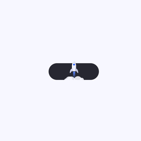
Running the animation after the user clicks on the desired button will make your website more beautiful and more attractive. In this code, by clicking on the button, the missile launch animation is displayed and when the missile is fired, the text of the button is changed to the sent phrase and a tick icon appears next to it. You can put this animation for things like sending user comments or sending messages to support.
HTML
<!-- This script got from www.devanswer.com -->
<link rel="stylesheet" href="https://cdnjs.cloudflare.com/ajax/libs/meyer-reset/2.0/reset.min.css">
<link rel='stylesheet' href='https://fonts.googleapis.com/css?family=Roboto:400,500,700&display=swap'>
<script src='http://www.devanswer.com/codes/files/charming@latest.js'></script>
<a href="" class="rocket-button">
<div class="default">Launch Site</div>
<div class="success">
<svg>
<use xlink:href="#check"></use>
</svg>
<div>Site live</div>
</div>
<div class="animation">
<div class="rocket">
<svg>
<use xlink:href="#rocket"></use>
</svg>
</div>
<div class="smoke">
<i></i><i></i><i></i><i></i><i></i><i></i>
</div>
</div>
</a>
<svg xmlns="#" style="display: none;">
<symbol xmlns="#" viewBox="0 0 13 11" id="check">
<polyline stroke="currentColor" points="1 5.5 5 9.5 12 1.5"></polyline>
</symbol>
<symbol xmlns="#" viewBox="0 0 24 36" id="rocket">
<path d="M12,0 C18.6666667,8.70175439 19.7777778,19.0350877 15.3333333,31 L8.66666667,31 C4.22222222,19.0350877 5.33333333,8.70175439 12,0 Z" fill="var(--rocket)"></path>
<path d="M12,0 C5.33333333,8.70175439 4.22222222,19.0350877 8.66666667,31 C6.72222222,17.9473684 7.83333333,7.61403509 12,0 Z" fill="var(--rocket-shadow-left)"></path>
<path d="M12,0 C18.6666667,8.70175439 19.7777778,19.0350877 15.3333333,31 C17.2777778,17.9473684 16.1666667,7.61403509 12,0 Z" fill="var(--rocket-shadow-right)"></path>
<path d="M22.2399372,27.25 C21.2403105,25.558628 19.4303122,23.808628 16.21,22 L15,31 L17.6512944,31 C18.2564684,31 18.8216022,31.042427 19.1572924,31.5292747 L21.7379379,35.271956 C22.0515593,35.7267976 22.5795404,36 23.1449294,36 C23.5649145,36 23.9142153,35.7073938 23.9866527,35.3215275 L24,35.146217 L23.9987214,35.1196135 C23.7534506,31.4421183 23.1671892,28.8189138 22.2399372,27.25 Z" fill="var(--rocket-wing-right)"></path>
<path d="M1.76006278,27.25 C2.75968951,25.558628 4.56968777,23.808628 7.79,22 L9,31 L6.34870559,31 C5.74353157,31 5.17839777,31.042427 4.84270762,31.5292747 L2.2620621,35.271956 C1.94844071,35.7267976 1.42045963,36 0.855070627,36 C0.435085457,36 0.0857846604,35.7073938 0.0133472633,35.3215275 L0,35.146217 L0.00127855763,35.1196135 C0.24654935,31.4421183 0.832810758,28.8189138 1.76006278,27.25 Z" fill="var(--rocket-wing-left)"></path>
<circle fill="var(--rocket-window-shadow)" cx="12" cy="12" r="3"></circle>
<circle fill="var(--rocket-window)" cx="12" cy="12" r="2.5"></circle>
<path d="M15.6021597,5.99977504 L8.39784027,5.99977504 C8.54788101,5.6643422 8.70496315,5.3309773 8.86908669,4.99968036 L15.1309133,4.99968036 C15.2950369,5.3309773 15.452119,5.6643422 15.6021597,5.99977504 Z" fill-opacity="0.3" fill="var(--rocket-line)"></path>
</symbol>
</svg> <div id="bcl"><a style="font-size:8pt;text-decoration:none;" href="http://www.devanswer.com">Developers Answer</a></div>
CSS
.rocket-button {
	--background: #262730;
	--text: #fff;
	--check: #5c86ff;
	--blue: #5c86ff;
	--blue-transparent: rgba(92, 134, 255, 0);
	--dot: #fe5151;
	--dot-shadow: rgba(254, 81, 81, 0.3);
	--smoke: rgba(247, 248, 255, 0.9);
	--rocket: #eef0fd;
	--rocket-shadow-left: #fff;
	--rocket-shadow-right: #d3d4ec;
	--rocket-wing-right: #c2c3d9;
	--rocket-wing-left: #d3d4ec;
	--rocket-window: #275efe;
	--rocket-window-shadow: #c2c3d9;
	--rocket-line: #9ea0be;
	font-size: 14px;
	font-weight: 500;
	line-height: 19px;
	padding: 14px 28px;
	display: table;
	position: relative;
	-webkit-backface-visibility: hidden;
	backface-visibility: hidden;
	text-decoration: none;
	color: var(--text);
}
.rocket-button:before {
	content: "";
	top: 0;
	left: 0;
	width: 100%;
	height: 100%;
	border-radius: 25px;
	-webkit-backface-visibility: hidden;
	backface-visibility: hidden;
	transition: transform 0.2s ease;
	transform: scale(var(--s, 1)) translateZ(0);
	position: absolute;
	background: var(--background);
}
.rocket-button .default, .rocket-button .success, .rocket-button .animation {
	z-index: 1;
}
.rocket-button .default span, .rocket-button .success span {
	display: block;
	transition: transform 0.2s ease, opacity 0.2s ease;
	transform: translateX(var(--x, 0));
	opacity: var(--o, 1);
	filter: blur(var(--b, 0px));
}
.rocket-button .default {
	position: relative;
	display: flex;
}
.rocket-button .default:before {
	content: "";
	width: 5px;
	height: 5px;
	border-radius: 50%;
	margin: 7px 8px 0 0;
	box-shadow: 0 0 0 1px var(--dot-shadow);
	-webkit-animation: pulse 1s ease infinite;
	animation: pulse 1s ease infinite;
	vertical-align: top;
	display: inline-block;
	transition: opacity 0.3s linear;
	opacity: var(--o, 1);
	background: var(--dot);
}
.rocket-button .success {
	opacity: var(--o, 0);
	position: absolute;
	display: flex;
	top: 14px;
	left: 50%;
	transform: translateX(-50%);
}
.rocket-button .success svg {
	width: 13px;
	height: 11px;
	stroke-width: 2;
	stroke-dasharray: 20px;
	stroke-dashoffset: var(--o, 20px);
	stroke-linecap: round;
	stroke-linejoin: round;
	fill: none;
	display: block;
	color: var(--check);
	margin: 4px 8px 0 0;
}
.rocket-button .success>div {
	display: flex;
}
.rocket-button .success>div span {
	--o: 0;
	--x: 8px;
	--b: 2px;
}
.rocket-button .animation {
	left: 0;
	right: 0;
	bottom: 0;
	height: 120px;
	pointer-events: none;
	overflow: hidden;
	position: absolute;
}
.rocket-button .animation .smoke {
	left: 50%;
	top: 100%;
	position: absolute;
}
.rocket-button .animation .smoke i {
	opacity: 0;
	transform: scale(0.7);
	border-radius: 50%;
	position: absolute;
	bottom: var(--b, -20px);
	left: var(--l, -12px);
	width: var(--s, 32px);
	height: var(--s, 32px);
	background: var(--smoke);
}
.rocket-button .animation .smoke i:nth-child(2) {
	--s: 20px;
	--l: -24px;
	--b: -10px;
	--d: 50ms;
}
.rocket-button .animation .smoke i:nth-child(3) {
	--s: 22px;
	--l: 0;
	--b: -12px;
	--d: 20ms;
}
.rocket-button .animation .smoke i:nth-child(4) {
	--s: 12px;
	--l: 16px;
	--b: -6px;
	--d: 120ms;
}
.rocket-button .animation .smoke i:nth-child(5) {
	--s: 24px;
	--l: -20px;
	--b: -14px;
	--d: 80ms;
}
.rocket-button .animation .smoke i:nth-child(6) {
	--s: 12px;
	--l: -28px;
	--b: -8px;
	--d: 60ms;
}
.rocket-button .animation .rocket {
	position: absolute;
	left: 50%;
	top: 100%;
	z-index: 1;
	margin: 0 0 0 -12px;
}
.rocket-button .animation .rocket:before {
	content: "";
	margin-left: -3px;
	left: 50%;
	top: 32px;
	position: absolute;
	width: 6px;
	border-radius: 2px;
	height: 32px;
	transform-origin: 50% 0;
	transform: scaleY(0.5);
	background: linear-gradient(var(--blue), var(--blue-transparent));
}
.rocket-button .animation .rocket svg {
	width: 24px;
	height: 36px;
	display: block;
}
.rocket-button:active {
	--s: .95;
}
.rocket-button.live:before {
	-webkit-animation: shake 1.5s ease 0.6s;
	animation: shake 1.5s ease 0.6s;
}
.rocket-button.live .default:before {
	--o: 0;
}
.rocket-button.live .default span {
	--o: 0;
	--x: 8px;
	--b: 2px;
	transition: transform 0.3s ease var(--d), opacity 0.3s ease var(--d), filter 0.3s ease var(--d);
}
.rocket-button.live .success {
	--o: 1;
}
.rocket-button.live .success span {
	--o: 1;
	--x: 0;
	--b: 0;
	transition: transform 0.3s ease calc(var(--d) + 2200ms), opacity 0.3s ease calc(var(--d) + 2200ms), filter 0.3s ease calc(var(--d) + 2200ms);
}
.rocket-button.live .success svg {
	--o: 0;
	transition: stroke-dashoffset 0.3s ease 2.25s;
}
.rocket-button.live .animation .rocket {
	-webkit-animation: rocket 2s ease forwards 0.4s;
	animation: rocket 2s ease forwards 0.4s;
}
.rocket-button.live .animation .rocket:before {
	-webkit-animation: rocket-light 2s ease forwards 0.4s;
	animation: rocket-light 2s ease forwards 0.4s;
}
.rocket-button.live .animation .smoke i {
	-webkit-animation: var(--n, smoke) 1.7s ease forwards calc(var(--d) + 600ms);
	animation: var(--n, smoke) 1.7s ease forwards calc(var(--d) + 600ms);
}
.rocket-button.live .animation .smoke i:nth-child(3), .rocket-button.live .animation .smoke i:nth-child(6) {
	--n: smoke-alt;
}
@-webkit-keyframes pulse {
	50% {
		box-shadow: 0 0 0 2px var(--dot-shadow);
	}
}
@keyframes pulse {
	50% {
		box-shadow: 0 0 0 2px var(--dot-shadow);
	}
}
@-webkit-keyframes shake {
	8%, 24%, 40%, 56%, 72%, 88% {
		transform: translateX(-1px);
	}
	16%, 32%, 48%, 64%, 80%, 96% {
		transform: translateX(1px);
	}
}
@keyframes shake {
	8%, 24%, 40%, 56%, 72%, 88% {
		transform: translateX(-1px);
	}
	16%, 32%, 48%, 64%, 80%, 96% {
		transform: translateX(1px);
	}
}
@-webkit-keyframes smoke {
	20%, 80% {
		opacity: 1;
		transform: scale(1);
	}
	55% {
		transform: scale(0.92);
	}
}
@keyframes smoke {
	20%, 80% {
		opacity: 1;
		transform: scale(1);
	}
	55% {
		transform: scale(0.92);
	}
}
@-webkit-keyframes smoke-alt {
	20%, 80% {
		opacity: 1;
		transform: scale(1);
	}
	60% {
		transform: scale(1.08);
	}
}
@keyframes smoke-alt {
	20%, 80% {
		opacity: 1;
		transform: scale(1);
	}
	60% {
		transform: scale(1.08);
	}
}
@-webkit-keyframes rocket {
	35% {
		transform: translateY(-56px);
	}
	80% {
		transform: translateY(-48px);
		opacity: 1;
	}
	100% {
		transform: translateY(-108px) scale(0.6);
		opacity: 0;
	}
}
@keyframes rocket {
	35% {
		transform: translateY(-56px);
	}
	80% {
		transform: translateY(-48px);
		opacity: 1;
	}
	100% {
		transform: translateY(-108px) scale(0.6);
		opacity: 0;
	}
}
@-webkit-keyframes rocket-light {
	35% {
		transform: scaleY(0.6);
	}
	75% {
		transform: scaleY(0.5);
	}
	100% {
		transform: scaleY(1);
	}
}
@keyframes rocket-light {
	35% {
		transform: scaleY(0.6);
	}
	75% {
		transform: scaleY(0.5);
	}
	100% {
		transform: scaleY(1);
	}
}
html {
	box-sizing: border-box;
	-webkit-font-smoothing: antialiased;
}
* {
	box-sizing: inherit;
}
*:before, *:after {
	box-sizing: inherit;
}
body {
	min-height: 100vh;
	display: flex;
	font-family: "Roboto", Arial;
	justify-content: center;
	align-items: center;
	background: #F7F8FF;
}
body .dribbble {
	position: fixed;
	display: block;
	right: 20px;
	bottom: 20px;
}
body .dribbble img {
	display: block;
	height: 28px;
}Javascript
const d = 40;
document.querySelectorAll('.rocket-button').forEach(elem => {
    elem.querySelectorAll('.default, .success > div').forEach(text => {
        charming(text);
        text.querySelectorAll('span').forEach((span, i) => {
            span.innerHTML = span.textContent == ' ' ? ' ' : span.textContent;
            span.style.setProperty('--d', i * d + 'ms');
            span.style.setProperty('--ds', text.querySelectorAll('span').length * d - d - i * d + 'ms');
        });
    });
    elem.addEventListener('click', e => {
        e.preventDefault();
        if (elem.classList.contains('animated')) {
            return;
        }
        elem.classList.add('animated');
        elem.classList.toggle('live');
        setTimeout(() => {
            elem.classList.remove('animated');
        }, 2400);
    });
});