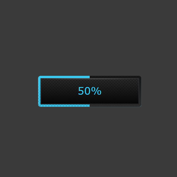
This code will be very useful for us when the user wants to download a file or wants to upload a file. There is a button in this code that by clicking on this button, the text of the button becomes the progress of this download or upload and is blue. Also, the progress of this download or upload is displayed as a blue border around the button.
HTML
<!-- This script got from www.devanswer.com -->
<script src="https://cdnjs.cloudflare.com/ajax/libs/prefixfree/1.0.7/prefixfree.min.js"></script>
<button>download</button><div id="bcl"><a style="font-size:8pt;text-decoration:none;" href="http://www.devanswer.com">Developers Answer</a></div>
CSS
html {
    background: #3a3a3a;
}
body {
    text-align: center;
}
button {
    box-sizing: border-box;
    margin-top: calc(50vh - 2em);
    border: solid 0.25em transparent;
    padding: 1px;
    width: 10em;
    border-radius: 5px;
    box-shadow: 1px 1px 1px -1px rgba(85, 85, 85, 0.75), 1px 1px 2px -1px rgba(85, 85, 85, 0.75);
    background: radial-gradient(rgba(90, 90, 90, 0.65) 25%, rgba(90, 90, 90, 0) 75%) 0 0/100% 0.125em no-repeat padding-box, repeating-linear-gradient(45deg, rgba(12, 12, 12, 0.35), transparent 1px, transparent 3px, rgba(12, 12, 12, 0.35) 4px) content-box, repeating-linear-gradient(-45deg, rgba(12, 12, 12, 0.35), transparent 1px, transparent 3px, rgba(12, 12, 12, 0.35) 4px) content-box, linear-gradient(#2a2a2a, #050505) content-box, linear-gradient(#323232, #232323) padding-box, linear-gradient(#3bc8ef, rgba(59, 200, 239, 0.1)) 0/0 100% no-repeat border-box, repeating-linear-gradient(45deg, rgba(34, 34, 34, 0.25), transparent 1px, transparent 3px, rgba(34, 34, 34, 0.25) 4px) border-box, repeating-linear-gradient(-45deg, rgba(34, 34, 34, 0.25), transparent 1px, transparent 3px, rgba(34, 34, 34, 0.25) 4px) border-box, linear-gradient(#3bc8ef, #3bc8ef) 0/0 100% no-repeat border-box, linear-gradient(#151515, #2e2e2e) border-box;
    color: #fff;
    font: 500 1.25em/2.4 verdana, sans-serif;
    text-transform: uppercase;
    cursor: pointer;
}
button:not(.loading):active {
    transform: scale(0.98);
}
button:focus {
    outline: none;
    box-shadow: 1px 1px 1px -1px rgba(59, 200, 239, 0.5);
}
.loading {
    position: relative;
    color: transparent;
    cursor: auto;
}
.loading:after {
    position: absolute;
    top: 0;
    right: 0;
    bottom: 0;
    left: 0;
    color: #3bc8ef;
    content: attr(data-perc);
}Javascript
var rID = null;
var load = function (el, s, t) {
    var perc, k = 2;
    if (t % k === 0) {
        perc = t / k;
        el.dataset.perc = perc + '%';
        el.style.backgroundSize =
            s.replace(/0px/g, el.dataset.perc);

        if (perc === 100) {
            cancelAnimationFrame(rID);
            rID = null;
            return;
        }
    }
    rID = requestAnimationFrame(
        load.bind(this, el, s, ++t)
    );
};
document.querySelector('button')
    .addEventListener('click', function () {
        var s;

        if (!rID) {
            this.classList.toggle('loading');
            s = getComputedStyle(this).backgroundSize;
            if (this.classList.contains('loading'))
                load(this, s, 0);
            else {
                this.dataset.perc =
                    this.style.backgroundSize = ''
            }
        }
    }, false);