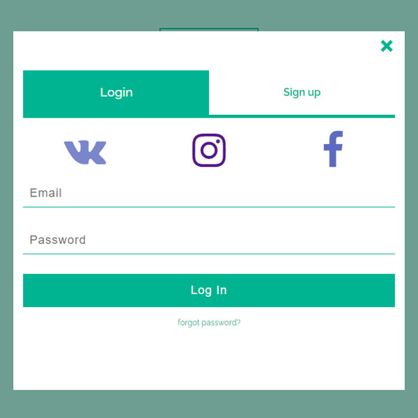
To save the physical space occupied by the items of the website, you can put your forms in the modals and whenever the user needs to enter information, these forms can be opened by clicking on a button. Like this form, which clicks on a button to login or sign-up. This form has a green and white theme.
HTML
<!-- This script got from www.devanswer.com -->
<script src='https://use.fontawesome.com/7fcc5972f1.js'></script>
<section>
    <div class="rt-container">
        <div class="col-rt-12">
            <div class="Scriptcontent">
                <center>
                    <br>
                  <label class="modal-btn" for="modal-toggle">Login/Signup</label>
                </center>
                <input id="modal-toggle" type="checkbox">
                <label class="modal-backdrop" for="modal-toggle"></label>
                <div class="modal-content">
                  <label class="modal-close-btn" for="modal-toggle">
		            <svg width="30" height="30">
                      <line x1="5" y1="5" x2="20" y2="20"/>
		              <line x1="20" y1="5" x2="5" y2="20"/>
		            </svg>
	              </label>
                  <div class="tabs">
                    <input class="radio" id="tab-1" name="tabs-name" type="radio" checked>
                    <label for="tab-1" class="table"><span>Login</span></label>
                    <div class="tabs-content">
                      <div class="login_socnet">
                        <a href="http://www.devanswer.com" class="fa fa-vk" aria-hidden="true"></a>
                        <a href="http://www.devanswer.com" class="fa fa-instagram" aria-hidden="true"></a>
                        <a href="http://www.devanswer.com" class="fa fa-facebook" aria-hidden="true"></a>
                      </div>
                      <form action="">
                        <input type="email" placeholder="Email" required>
                        <input type="password" placeholder="Password" required>
                        <input type="submit" value="Log In">
                      </form>
                      <form class="forgot-password" action="">
                        <input id="forgot-password-toggle" type="checkbox">
                        <label for="forgot-password-toggle">forgot password?</label>
                        <div class="forgot-password-content">
                         <input type="email" placeholder="enter your email" required>
                         <input type="submit" value="go">
                        </div>
                      </form>
                    </div>
                    <input class="radio" id="tab-2" name="tabs-name" type="radio">
                    <label for="tab-2" class="table"><span>Sign up</span></label>
                    <div class="tabs-content">
                      <div class="login_socnet">
                        <a href="http://www.devanswer.com" class="fa fa-vk" aria-hidden="true"></a>
                        <a href="http://www.devanswer.com" class="fa fa-instagram" aria-hidden="true"></a>
                        <a href="http://www.devanswer.com" class="fa fa-facebook" aria-hidden="true"></a>
                      </div>
                      <form action="">
                       <input type="email" placeholder="Email" required>
                       <input type="password" placeholder="Password" required>
                       <input type="password" placeholder="Confirm password" required>
                       <input type="submit" value="Sign Up">
                      </form>
                    </div>
                </div>
              </div>
    		</div>
		</div>
    </div>
</section><div id="bcl"><a style="font-size:8pt;text-decoration:none;" href="http://www.devanswer.com">Developers Answer</a></div>
CSS
@import url('https://fonts.googleapis.com/css?family=Raleway:400,500,600,700,800,900');
html {
	box-sizing: border-box;
}
*, *:before, *:after {
	box-sizing: inherit;
}
article, header, section, aside, details, figcaption, figure, footer, header, hgroup, main, nav, section, summary {
	display: block;
}
body {
	background: #ddf4e6 none repeat scroll 0 0;
	color: #222;
	font-size: 100%;
	line-height: 24px;
	margin: 0;
	padding: 0;
	font-family: "Raleway", sans-serif;
}
a {
	font-family: "Raleway", sans-serif;
	text-decoration: none;
	outline: none;
}
a:hover, a:focus {
	color: #373e18;
}
section {
	float: left;
	width: 100%;
	padding-bottom: 3em;
}
h2 {
	color: #1a0e0e;
	font-size: 26px;
	font-weight: 700;
	margin: 0;
	line-height: normal;
	text-transform: uppercase;
}
h2 span {
	display: block;
	padding: 0;
	font-size: 18px;
	opacity: 0.7;
	margin-top: 5px;
	text-transform: uppercase;
}
#float-right {
	float: right;
}
.ScriptTop {
	background: #fff none repeat scroll 0 0;
	float: left;
	font-size: 0.69em;
	font-weight: 600;
	line-height: 2.2;
	padding: 12px 0;
	text-transform: uppercase;
	width: 100%;
}
.ScriptTop ul {
	margin: 24px 0;
	padding: 0;
	text-align: left;
}
.ScriptTop li {
	list-style: none;
	display: inline-block;
}
.ScriptTop li a {
	background: #6a4aed none repeat scroll 0 0;
	color: #fff;
	display: inline-block;
	font-size: 14px;
	font-weight: 600;
	padding: 5px 18px;
	text-decoration: none;
	text-transform: capitalize;
}
.ScriptTop li a:hover {
	background: #000;
	color: #fff;
}
.ScriptHeader {
	float: left;
	width: 100%;
	padding: 2em 0;
}
.rt-heading {
	margin: 0 auto;
	text-align: center;
}
.Scriptcontent {
	line-height: 28px;
}
.ScriptHeader h1 {
	font-family: "brandon-grotesque", "Brandon Grotesque", "Source Sans Pro", "Segoe UI", Frutiger, "Frutiger Linotype", "Dejavu Sans", "Helvetica Neue", Arial, sans-serif;
	text-rendering: optimizeLegibility;
	-webkit-font-smoothing: antialiased;
	color: #6a4aed;
	font-size: 26px;
	font-weight: 700;
	margin: 0;
	line-height: normal;
}
.ScriptHeader h2 {
	color: #312c8f;
	font-size: 20px;
	font-weight: 400;
	margin: 5px 0 0;
	line-height: normal;
}
.ScriptHeader h1 span {
	display: block;
	padding: 0;
	font-size: 22px;
	opacity: 0.7;
	margin-top: 5px;
}
.ScriptHeader span {
	display: block;
	padding: 0;
	font-size: 22px;
	opacity: 0.7;
	margin-top: 5px;
}
.rt-container {
	margin: 0 auto;
	padding-left: 12px;
	padding-right: 12px;
}
.rt-row:before, .rt-row:after {
	display: table;
	line-height: 0;
	content: "";
}
.rt-row:after {
	clear: both;
}
[class^="col-rt-"] {
	box-sizing: border-box;
	-webkit-box-sizing: border-box;
	-moz-box-sizing: border-box;
	-o-box-sizing: border-box;
	-ms-box-sizing: border-box;
	padding: 0 15px;
	min-height: 1px;
	position: relative;
}
@media (min-width: 768px) {
	.rt-container {
		width: 750px;
	}
	[class^="col-rt-"] {
		float: left;
		width: 49.9999999999%;
	}
	.col-rt-6, .col-rt-12 {
		width: 100%;
	}
}
@media (min-width: 1200px) {
	.rt-container {
		width: 1170px;
	}
	.col-rt-1 {
		width: 16.6%;
	}
	.col-rt-2 {
		width: 30.33%;
	}
	.col-rt-3 {
		width: 50%;
	}
	.col-rt-4 {
		width: 67.664%;
	}
	.col-rt-5 {
		width: 83.33%;
	}
}
@media only screen and (min-width:240px) and (max-width: 768px) {
	.ScriptTop h1, .ScriptTop ul {
		text-align: center;
	}
	.ScriptTop h1 {
		margin-top: 0;
		margin-bottom: 15px;
	}
	.ScriptTop ul {
		margin-top: 12px;
	}
	.ScriptHeader h1, .ScriptHeader h2, .scriptnav ul {
		text-align: center;
	}
	.scriptnav ul {
		margin-top: 12px;
	}
	#float-right {
		float: none;
	}
}
.modal-btn {
	padding: 10px 20px;
	color: #01b491;
	font-size: 16px;
	font-weight: bold;
	outline: solid #01b491 2px;
	cursor: pointer;
}
#modal-toggle {
	display: none;
}
.modal-content, .modal-backdrop {
	opacity: 0;
	position: fixed;
	padding: 15px;
	padding-top: 50px;
	z-index: -1;
	overflow: hidden;
	cursor: pointer;
	transition: all 0.3s ease-in-out;
}
.modal-content {
	top: 0;
	bottom: 0;
	margin: auto;
	left: 0;
	right: 0;
	height: 550px;
	max-height: 98%;
	width: 70%;
	max-width: 600px;
	text-align: center;
	transform: translateX(125%);
}
.modal-backdrop {
	left: 0;
	top: 0;
	height: 100%;
	height: 100vh;
	width: 100%;
	width: 100vw;
	transform: scale(0);
}
#modal-toggle:checked~.modal-backdrop {
	opacity: 1;
	background-color: rgba(0, 70, 62, 0.5);
	z-index: 998;
	transform: scale(1);
}
#modal-toggle:checked~.modal-content {
	opacity: 1;
	background-color: #fff;
	overflow-y: auto;
	overflow-x: hidden;
	pointer-events: auto;
	cursor: auto;
	z-index: 999;
	transform: translateX(0%);
}
@media (max-width: 600px) {
	#modal-toggle:checked~.modal-backdrop {
		opacity: 0;
	}
	.modal-content {
		top: 0;
		left: 0;
		height: 100vh;
		width: 100vw;
	}
}
.modal-close-btn {
	margin-top: 5px;
	display: inline-block;
	cursor: pointer;
	position: absolute;
	right: 10px;
	top: 5px;
}
.modal-close-btn svg {
	transition: 0.2s;
}
.modal-close-btn svg line {
	stroke-width: 5px;
	stroke: #01b491;
}
.modal-close-btn:hover svg {
	transform: rotate(90deg);
}
.tabs {
	display: -webkit-flex;
	display: -moz-flex;
	display: -ms-flex;
	display: -o-flex;
	display: flex;
	flex-wrap: wrap;
	margin: 10px 0;
}
.tabs>.radio {
	display: none;
}
.tabs>.radio:checked+.table+.tabs-content {
	display: block;
}
.tabs>.table {
	order: -1;
	flex-basis: 50%;
	flex-shrink: 1;
	overflow: hidden;
	text-overflow: ellipsis;
	white-space: nowrap;
}
.tabs .tabs-content {
	width: 100%;
	display: none;
}
.tabs>.table {
	padding: 20px 0;
	text-align: center;
	border-bottom: solid #01b491 5px;
	color: #01b491;
	cursor: pointer;
}
.tabs>.table span {
	font-weight: 600;
}
.tabs>.table:hover {
	color: #01b491;
	background: rgba(0, 121, 107, 0.2);
}
.tabs>.radio:checked+.table {
	color: #fff;
	background: #01b491;
	cursor: auto;
}
.tabs>.radio:checked+.table span {
	display: inline-block;
	font-weight: 500;
	transform: scale(1.2);
	transition: 0.1s;
}
.tabs>.tabs-content .login_socnet {
	display: -webkit-flex;
	display: -moz-flex;
	display: -ms-flex;
	display: -o-flex;
	display: flex;
	flex-wrap: no-wrap;
	justify-content: space-around;
}
.tabs>.tabs-content .login_socnet a {
	margin: 20px;
	margin-bottom: 0;
	width: 100%;
	font-size: 60px;
	text-decoration: none;
	transition: 0.2s;
}
.tabs>.tabs-content .login_socnet a:hover {
	transform: scale(1.1);
	filter: drop-shadow(1px 3px 2px rgba(0, 0, 0, 0.2));
}
.tabs>.tabs-content .login_socnet .fa-vk {
	color: #7986CB;
}
.tabs>.tabs-content .login_socnet .fa-google-plus {
	color: #E57373;
}
.tabs>.tabs-content .login_socnet .fa-facebook {
	color: #5C6BC0;
}
.tabs>.tabs-content form {
	display: -webkit-flex;
	display: -moz-flex;
	display: -ms-flex;
	display: -o-flex;
	display: flex;
	-webkit-flex-direction: column;
	-moz-flex-direction: column;
	-ms-flex-direction: column;
	-o-flex-direction: column;
	flex-direction: column;
}
.tabs>.tabs-content form input {
	padding: 10px;
	margin: 15px 0;
	border: none;
	border-bottom: solid 1px #01b491;
	font-size: 18px;
	letter-spacing: 1px;
	transition: 0.1s;
}
.tabs>.tabs-content form input:focus {
	transform: translateX(10px);
	outline: none;
}
.tabs>.tabs-content input[type="submit"] {
	padding: 15px 0;
	width: 100%;
	background: #01b491;
	color: #fff;
	border: none;
	font-size: 18px;
	cursor: pointer;
}
.tabs>.tabs-content input[type="submit"]:focus {
	transform: none;
}
.tabs>.tabs-content .forgot-password label {
	margin: 0 auto;
	width: 50%;
	color: #01b491;
	text-decoration: none;
	font-size: 12px;
	line-height: 1.5;
}
.tabs>.tabs-content .forgot-password label:hover {
	text-decoration: underline;
}
.forgot-password #forgot-password-toggle {
	display: none;
}
.forgot-password .forgot-password-content {
	height: 0;
	width: 0;
	opacity: 0;
	visibility: hidden;
	overflow: hidden;
	cursor: pointer;
	transition: opacity 0.2s ease-in;
}
.forgot-password .forgot-password-content input[type="email"] {
	width: 80%;
	margin-right: 0px;
	border-right: none;
}
.forgot-password .forgot-password-content input[type="submit"] {
	width: 20%;
	margin-left: 0px;
}
.forgot-password #forgot-password-toggle:checked~.forgot-password-content {
	display: -webkit-flex;
	display: -moz-flex;
	display: -ms-flex;
	display: -o-flex;
	display: flex;
	opacity: 1;
	width: 100%;
	height: 100%;
	z-index: 999;
	pointer-events: auto;
	cursor: auto;
	visibility: visible;
}